How well could you use a website if your hands had limited muscle control and movement? One task you’d have trouble doing is scrolling through web pages.
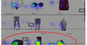
Google Analytics is one of the most popular analytics tools on the web. Ptengine is just like it, except it can track user engagement through heatmaps.
What do you notice about the website above? It doesn’t have a navigation bar. The text links are floating in space and obscured by the background image.
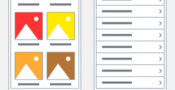
Figuring out your content layout is a tricky task on mobile devices. Desktop devices give you all the screen space to work with, but you have limited screen space on mobile devices.
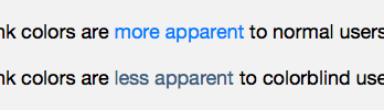
Color communicates a lot information on interfaces. But not so much for color blind users. They often have trouble distinguishing between different colored objects.
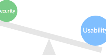
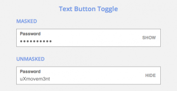
Getting users to complete your form when asking for personal data is a challenge. Most won't give that out because they’re afraid of spammers and hackers.
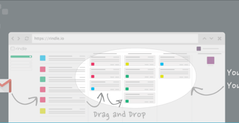
Designing the user experience of a website involves more than figuring out what goes on each page. It’s also about figuring out how those pages flow together.
Designers don’t just like to design, sometimes they like to read. But there are many design articles on the web that go unread because of the lack of exposure.