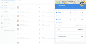
Creating the best user experience calls for more than following best practices. You have to see what users are actually doing on your site to find out where the problems are.
It isn’t easy to figure out when to use a salad fork or dinner fork just by looking at them. This difficulty is caused by the fork’s similar form and function.
If an app is a product, then the walkthrough is its instruction manual. A walkthrough appears during onboarding—when new users open an app for the first time.
Form abandonment is like someone agreeing to meet up with you but then canceling last minute. Users who are interested in your site have no trouble starting the form.
What if you could see what your users saw when they had trouble using your site? You would be able to refine and redesign your site to better meet their needs.
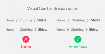
If you’re ever lost in a large territory, the first thing you’d want to know is where you are. Once you know that you can figure out how far you are from your destination.
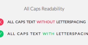
All caps text is like a spice, you don’t want to overuse it. A little can go a long way when you use it on content and menu headings to contrast it from body text.
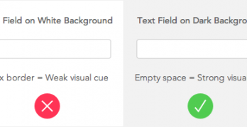
All clickable user interface elements need visual cues. Without them, users won’t know they're clickable. Buttons and links have size, color, placement, and shape.
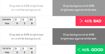
The color gray comes in many different shades. You can find them on different elements across most sites. Dark gray is often used for headings and body text.
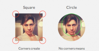
What shape are your app’s profile pictures? Chances are they’re square. A square isn’t the best shape to use because it makes it hard to visually process faces.