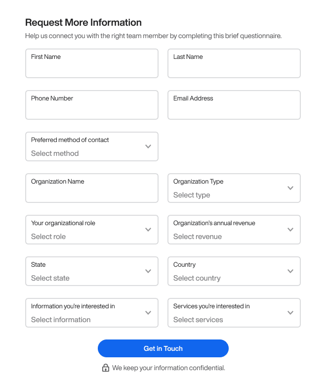
Forms How to Make Users Fill Out the Longest 13 Field FormFebruary 16, 20240 Comments Many websites attract users to their home page but lose them on the form. Low…
Forms A Better Way to Display Data Than “Field: Value”January 5, 20240 Comments How well do you display data to your users? If all you do is present…
Forms How to Simplify the Most Confusing Toggle SegmentsJanuary 4, 20240 Comments Does your website or app have any toggle components? If it does, it's essential to…
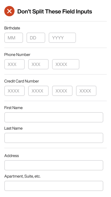
Forms Why You Should Never Split Text Field InputsDecember 11, 20230 Comments Garbage input leads to garbage output. Most designers and developers understand this concept and will…
Forms How to Make 18 Checkboxes Selectable for Mobile UsersDecember 8, 20230 Comments Checkboxes aren't easy to select with the finger. A finger is much fatter than a…
Forms How to Simplify 4 Nested Modals into Only 1November 12, 20230 Comments Managing multiple windows on a screen is no easy task. It's common for users to…
Forms 8 Rules for Switching to Infield Top-Aligned Form LabelsOctober 31, 20230 Comments Are you using left-aligned or top-aligned labels on your form fields? If so, your users…
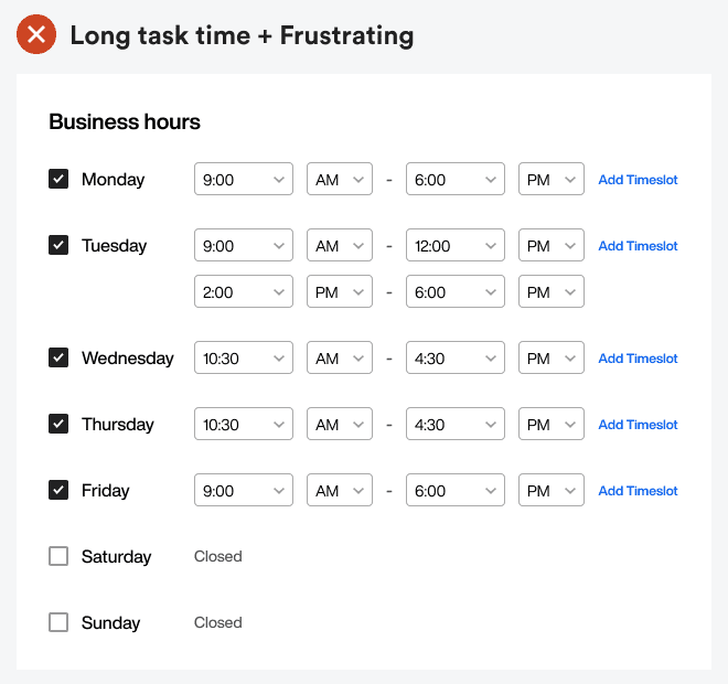
Forms How to Simplify Time Fields Without Using Select MenusOctober 20, 20230 Comments The sight of numerous select menus on a form can discourage anyone from completing it.…
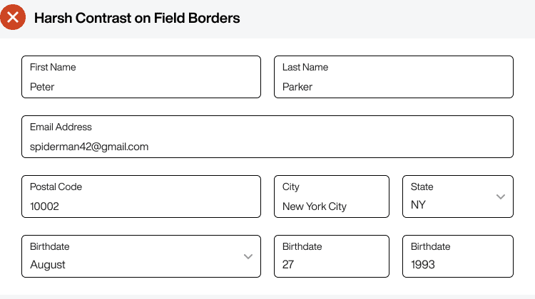
Forms How to Make Form Fields Accessible Without Harsh ContrastOctober 11, 20230 Comments Every designer advocates for accessibility on forms, but they never discuss the issue of harsh…
Forms 1 Text Field vs 118 Option Select MenuOctober 7, 20230 Comments The birthdate field isn’t the easiest to fill out on a form. It’s common for…
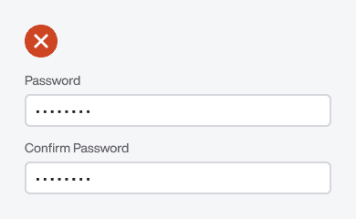
Forms Why “Confirm Password” Is the Slowest Field to Fill OutSeptember 28, 20230 Comments Which field is the hardest for users to fill out on a signup form? The…
Forms How to Use Placeholder Hints for Better Form InputSeptember 22, 20230 Comments Many designers are misusing placeholder hints on their fields. As a result, it creates clutter…
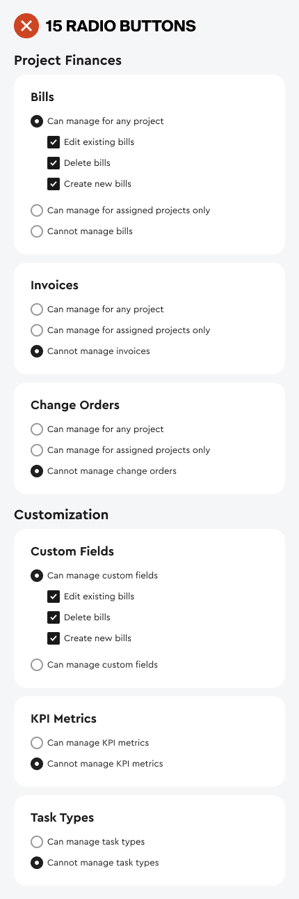
Forms How to Simplify a Long 15-Option Settings PageSeptember 20, 20230 Comments How fast can users customize the settings on your app? Settings pages are notorious for…
Forms The Best UX Design for Form Field Help TextSeptember 13, 20230 Comments Field labels are the first thing users read on a form. The second thing they…