How fast can users customize the settings on your app? Settings pages are notorious for being slow and hard to use. There are always so many options that take too long to read and understand.
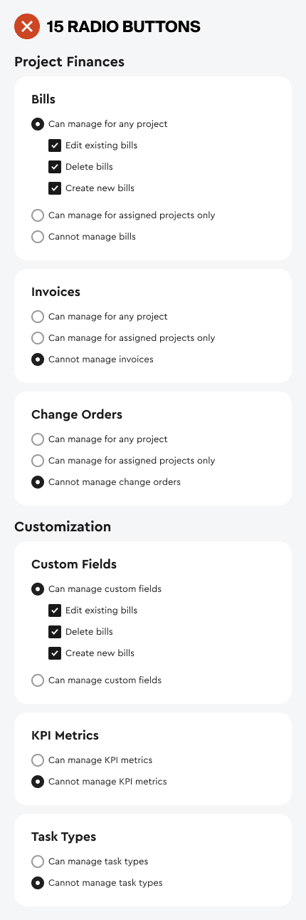
For example, this settings page has 15 radio button options that users have to read. If they misread a setting, they can easily select the wrong option and ruin their app experience. That’s why it’s essential to reduce the clutter on your settings page by designing for binary and conditional logic.
Subscribe to read the full article
Become a paying subscriber of UX Movement Newsletter to get exclusive access to this article and other subscriber-only content.
Book

Affiliate
