Content How to Make Any Information-Heavy Design Look Less BusyAugust 10, 20230 Comments There are many words to describe an information-heavy design. Some may call it cluttered, complicated,…
Mobile Stacked Lists: The Best Way to Fit Tables on Mobile ScreensAugust 8, 20230 Comments Viewing a table on a mobile screen is not a pleasant experience. The user has…
Buttons How to Convert Your Light UI Colors into Dark ModeAugust 2, 20230 Comments Does your interface have a dark mode? If not, you're missing your chance to give…
Content How to Fix Ugly Interfaces with Better Brand ColorsJuly 26, 20230 Comments Every designer eventually runs into the problem of choosing colors for their interface. They start…
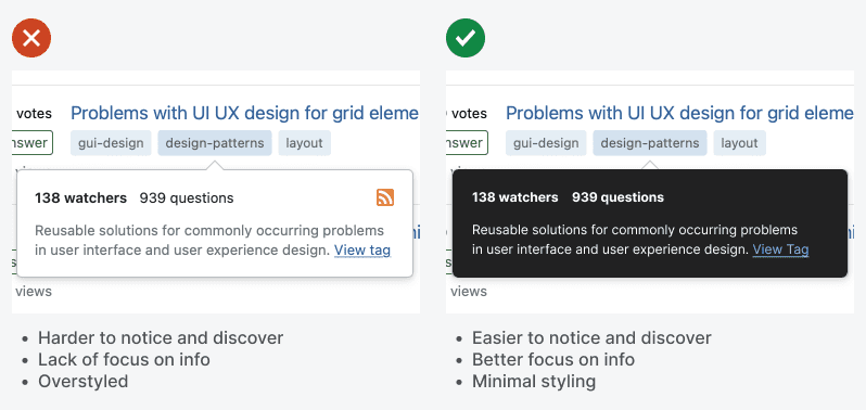
Forms Why You Should Display Your Tooltips in Dark ModeJuly 24, 20230 Comments Tooltips are useful components that offer contextual information users need for their tasks. However, a…
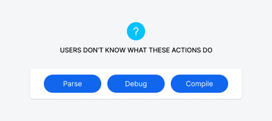
Buttons How to Make Technical Button Actions More PredictableJuly 24, 20230 Comments Suppose you have a button on your interface that users don’t understand. When they see…
Content Why Multi-Color Charts Are Colorblind InaccessibleJuly 12, 20230 Comments Many interfaces use charts to help users visualize data. But unfortunately, most of those charts…
Content How to Turn Raw Data Lists into Rich Interactive ChartsJune 30, 20230 Comments How informative is the data on your interface? If you display your raw data in…
Mobile Why It’s Bad to Explain Features on Your Onboarding ScreenJune 26, 20230 Comments When users open an app for the first time, they aren’t sure what to expect.…
Mobile Why Dots Are Terrible Indicators for CarouselsJune 16, 20230 Comments What are those dots on a carousel? Some users might have an idea, but most…
Content The Formula for Perfect Corners on CardsJune 9, 20230 Comments What makes cards aesthetically pleasing are the corners. When the corner radius of the inner…
Mobile Collection Carousel: A Mobile Pattern to End Swipe ErrorsMay 26, 20230 Comments Carousels are a great way to increase user engagement. They allow users to browse content…
Navigation How to Design an Intuitive Category CarouselMay 18, 20230 Comments Carousels are not just for displaying homepage banners. They are versatile components that can showcase…
Navigation The Myth of Low Engagement CarouselsMay 12, 20230 Comments There's a myth that carousels have poor user engagement and should never be used. However,…