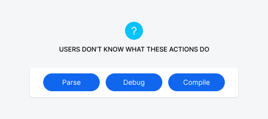
Suppose you have a button on your interface that users don’t understand. When they see it, they hesitate to click it because they aren’t sure what will happen. What’s the best way to inform users?
This issue often comes up when the button label is hard to understand. It may use technical jargon or a confusing word. You could rewrite the label to make it more clear. However, this isn’t always an option because sometimes there’s no better way to describe the action than to use the technical term.

Subscribe to read the full article
Become a paying subscriber of UX Movement Newsletter to get exclusive access to this article and other subscriber-only content.

