Wireframes come in different fidelities. You have low-fidelity wireframes that don’t resemble the final product as much, but still capture the interface layout and controls.
When a user interface prompts users to take action, they'll see at least two buttons. One button is primary to the user's task and the other is secondary.
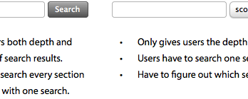
Search is an essential feature for websites to have. Without it, users would have to rely on the navigation to find what they want. With it, users can find specific information faster.
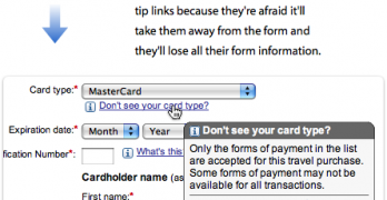
When designers think about forms, they usually think about text fields and submit buttons. Checkboxes often get ignored because they aren't used as often.
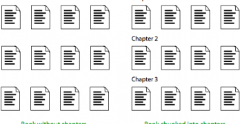
Every website has content. But not every website has content that's easy to scan and understand. That's because they're not chunking their content into scannable pages.
Have you ever read the comments left at the end of an article or video? Comments used to offer useful, supplementary information that you couldn't get from the content itself.
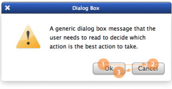
Designers often question where to place their 'Ok' and 'Cancel' buttons on dialog boxes. The 'Ok' button is the primary action that completes the task.
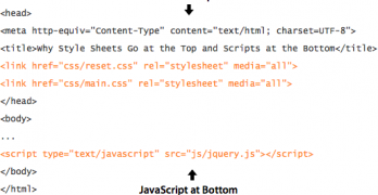
Best practices for web design don't just exist on the user interface. They also exist on the back-end where the code is. Where you place your style sheets and scripts can affect how your site loads.
What kind of first impression does your website make? A lot of that depends on how you design your home page. The home page is the front door of your website.
There are many user interface pattern libraries for desktop interfaces. But mobile pattern libraries have now taken over. After sifting through many, I've collected the best.
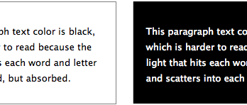
Many websites use black text on a light background to display their content because it's easy to read. However, using white text on a dark background also has its advantages.
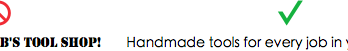
Where you place your call to action buttons can affect whether users click them or not. Most designers only focus on how their call to action buttons look.