Have you ever wondered which tool, Adobe Photoshop or Fireworks, is better suited for web and application design? There are many designers who use Fireworks.
Many people start using calculators at a young age, and more so when they get older. They use it to do math at school, and they’ll eventually use it to manage their finances.
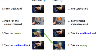
People use automated teller machines (ATM) everyday all over the world. But some of these ATMs cause users to make errors that could cost them more than they can bargain for.
Target recently redesigned their website. While many have their own opinions about it, there a few positive things designers can learn from Target's checkout form. At first glance it may not look like much, but once you dig deeper you'll find a diamond in the rough.
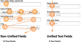
Filling out forms are painful when they're time-consuming. A form that's efficient to fill out can save users time. But it can also save companies a lot of money.
What happens when a website puts their login fields in the upper corner of the home page? Users can easily mistake the login fields for a site search box and get confused.
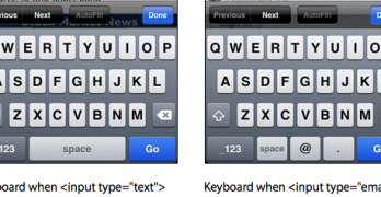
Typing is easy when users do it on a desktop computer. But it's harder to do on a mobile device because not all the keys are visible on the keyboard at once.
Designers use rounded corners so much today that they're more of an industry standard than a design trend. Not only are they found on software user interfaces, but hardware product designs as well.
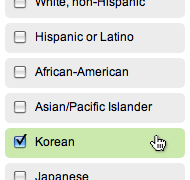
Checkboxes and radio buttons are an essential element of forms. But most of the time, they're not easy to click. This is because their click targets are small.
Icons are visual cues that help users use interfaces more efficiently. Instead of reading each word on an interface, users can scan for the icon that represents the task they're trying to do.
A carousel isn't just a device you'll find at the airport or amusement park. It's also a widget that's found on websites. Designers use them to display visual items in a way that's quick for users to browse.
Nothing turns users off more than a long and complicated form. There are many ways designers can simplify their forms to make them faster and easier to fill out.
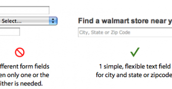
Users use forms to do many things. Finding a local store to shop at is one thing that should take them little time and effort to do. However, most store locator forms are hard to use and take up too much time.
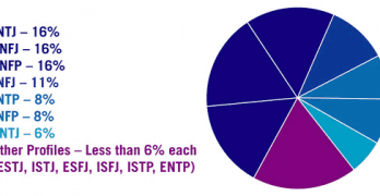
What personality preferences do you and other designers share? According to a survey by Michael Roller, most designers share the Myers-Briggs preferences of intuition and judgment.