Users used to see popup windows everywhere on the web. Today, modal windows have taken its place. With modal windows dominating the web, popup windows are now a thing of the past.
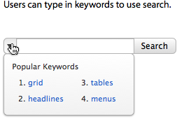
Most search boxes on websites allow users to search for information using keywords. But sometimes users might not have a keyword in mind to search for.
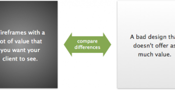
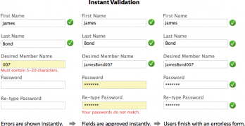
There are different ways to align labels on forms. Designers either place them above or to the left of a textbox. But placing them inside the textbox was never much of a thought until now.
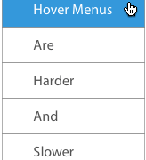
Do you know how your hover menu is affecting user navigation? Hover menus are a popular way to navigate. But the way they open causes usability problems that designers aren't aware of.
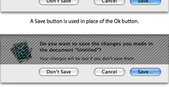
On a dialog box, clicking the 'Ok' button means the user wants the system to act. Clicking the 'Cancel' button means the user wants to go back to the original screen.
The submit button is the last thing users see when they fill out your form. If they have trouble finding it, they could abandon your form, and you could lose that sign up.
Your buttons may call users to act, but do they compel users to act? Buttons come in different shapes and forms, but it isn't effective if it doesn't compel users to act.
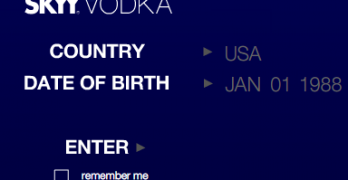
If you've ever visited a beer and alcohol website, it's likely you've met an age verification page. Age verification pages ask users for their birth date to make sure they are of legal age to enter their site.
Have you ever wondered why most websites put their Contact Us page last in their navigation? They do this because users follow a natural pattern when they visit a new site.
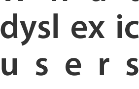
Web accessibility doesn't only extend to color blind users, but dyslexic users too. Dyslexia is a learning disability that impairs a person's fluency or accuracy in being able to read, write, and spell.
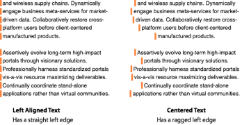
Text is a beautiful thing. It not only has function, but form as well. When you're creating text, it's likely that you're not only thinking about what your text should say, but how it should look.