Target recently redesigned their website. While many have their own opinions about it, there a few positive things designers can learn from Target’s checkout form. At first glance it may not look like much, but once you dig deeper you’ll find a diamond in the rough.
1. Crystal Clear Page Headings
When the user gets to the checkout form, there’s no question in their mind where they are. The large, bold and centered heading at the top makes it clear to users what page they’re on and what task they’re about to do. At the same time, its diminished with a gray color so that it doesn’t take the focus away from the more important section headings in the form.

2. Input Mask for Phone Field
Phone numbers are one of the toughest things to get from a user. The user not only needs to know why you’re asking them for their phone number, but they also need to know what format to type it in. Target tells their users why they need their phone number by adding a short note to the right of the field label. But the best part about their phone field is that they control the user’s format by using an input mask. This way they’re able to get the format they want from the user every time without confusing them.
- Do it yourself: Masked Input Plugin

3. Instant Field Validation and Confirmation
Most forms that use instant field validation only validate for user errors. That’s not enough. Target goes the extra mile by also confirming success when the user corrects their error. This gives users the assurance they need to move forward to the next step on the form. Keeping users in the dark makes them wonder if they have corrected their error and if their information will go through. If you make the user think that after they fill out your form there’s a chance it might not go through, the user won’t want to fill out your form because they’ll feel like they’re going to end up doing all that work for nothing. Instant field confirmation puts their worries to rest.
- Learn how to do it the right way: Why Long Forms Need Instant Field Validation

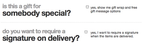
4. Making Checkbox Questions That Users Often Ignore Unavoidable
Text fields and dropdown lists are widgets on forms that easily catch users’ attention. They’re big, visual and shout at the user. Checkboxes, on other hand, are small, placed below the form and easy to ignore. Target makes their checkboxes unavoidable by using a large font to emphasize the questions in an elegant way. This not only makes the questions easier to read than plain text, but it also makes them impossible to miss as users move down the form.
5. Unsaturated Button Color for Secondary Actions
Target treats their primary and secondary buttons differently. They use a strong, saturated red color on primary actions that submit the user’s information. But then they use a weak, unsaturated blue color on secondary actions that modify the user’s information. This helps users differentiate between these two types of actions. Many sites make the mistake of using the same color on all of their form buttons. By using color contrast and saturation, Target makes their primary and secondary action buttons clear.
- Learn more about primary and secondary actions: The Visual Weight of Primary and Secondary Action Buttons

6. Fast Spinning Loading Icon
In any checkout, the user has to wait for their information to process. Target cleverly gives users a feeling of fast load times by making their loading icons spin faster than normal. While this doesn’t actually make the load times faster, the effect it has on the user’s perception of time is what’s impressive.

7. Credit Card Icons to Illustrate What They Accept
Not every store accepts every credit card. Users need to know which ones they can use for their purchase. Target shows icons of the credit cards and gift cards they accept. This quickly tells users which cards they can use at a glance. Users can then select the one they want to use in the dropdown list with ease.
![]()
8. Putting Promo Code Fields at the End of the Process
Promo codes are useful for giving customers special discounts. However, putting promo code field at the beginning of your form can hurt your form conversion rate. Target puts their promo code fields for customer and employee discounts at the end of the form process, which keeps users more committed to completing their checkout.
- A study on how promo codes affect conversion rates: Do Coupon Codes Increase Checkout Abandonment?

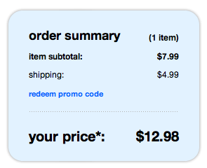
9. Highlighting the Order Summary Box
Users will want to know how much they’re spending as the products in their cart add up. Target highlights their order summary box with a light, unsaturated blue color fill that contrasts with the rest of the elements on the page, making it easy for users to see.
Effective Form Techniques
Target’s site redesign isn’t perfect in every way. However, they have managed to turn their checkout form into an interesting and productive user experience by using effective form techniques that most retail store sites would never think to use. These nine hidden gems in target’s checkout form can offer designers new insight they can use to improve their checkout forms. The checkout form isn’t the most exciting area of a site to design. But when designed right, it’s the one area that can reap the most rewards.
Book

Affiliate

All very interesting other than the input phone mask.
That works well when you’re thinking of one single geographic area. Phone number masks are different all over the world, so by choosing a typical US mask, you’re saying to everyone else:
“We don’t want your business”.
Target.com is only for the US, so this isn’t a problem for them. However, if you are concerned about multiple countries, you could ask country information first and then format your fields (phone, city/state, postal code, etc.) based on the standards for that country.
Yes, According to me your saying is correct….I think phone mask format should be for all over the world.
Well said 🙂 My vote: No phone masks! In general, nicely designed checkout process. Very neat indeed. As far as #3 goes, though, the only validation that takes plase is whether the information entered is alpha or not. :/
Are they asking the user to be concerned about parenthesis, spaces, and dashes? Using Chrome in the US I didn’t see a phone number that matched the screenshot above.
I would never ask a user to supply parenthesis in a phone number. I would give them a simple suggestion so they don’t have to think about it, but then would use a validator to normalize it before it is saved.
>2. Input Mask for Phone Field
No no no no no.
I don’t have a phone number in that format.
Good point Jez – but considering Target’s target market I think they can get away with it – don’t you think?
Nice Article! These are all great methods to boost user experience and increase conversion rates on forms!
Wow, a disgusting blog that seems to focus on business interests over customer usability. The promo code box should always be placed on the *first* page, not the last one, so you don’t have to enter your address and all other junk just to see if a promo code is going to work on your site or not. It doesn’t actually help “your conversion rate”, it simply frustrates the heck out of your potential customers! It also probably ensures that you will never have those customers coming back to your site if they discover their promo code doesn’t work in the end…
Also, input ask in the phone field is completely inappropriate, since numbers can take any format, and it needs to allow for country codes and regional variations.
I would tend to disagree.
The promo code box from a business strategy standpoint probably makes more sense to be on the last page or end of the checkout. But I don’t think it takes away from the usability aspect.
Why? Well people scanning the web for coupon codes comes to mind…Godaddy and many other sites suffer from this. If you have a legitimate coupon code it should work no matter when you type it in, hence a closed loop UX. I think highlighting it in the order summary box is very nicely done.
Since the Target online shop is designed for US customers, this makes very good sense. I will agree with you, if buying from abroad, the format could be updated. For example, select country, then the phone field updates to allow for country codes.
Business strategy usually drives UX, it is unfortunate at times, but what is disgusting about that?
On a different note, I like the idea of a faster spinner, I may use this on a future project.
You can squeeze the speed perception of the spinner further by delaying its display by up to 400ms.
So while the content is being loaded, you deliberately delay showing the spinner for a while. It gives the content a head start and if the delay is short enough won’t contribute to the users perceived load time. It’s basically cuts 400ms off the perception.
I think it was some Google research where I originally heard this, but I can’t remember exactly.
Promo code boxes are an interesting beast. Their very existence can actually cause a decrease in conversions, as some people see them and then instantly go to Google looking for discount codes and then either don’t find what they want, find a better code for a competitor or just plain old get distracted.
My number 1 rule is simple: only show discount code boxes if you have an active code and if you do, make sure you have multiple discount codes in public places and make them easy to find.
Yes, exactly! I heard someone once say that as soon as they see a promo box and don’t have a code they immediately think, “everyone else is paying less for this than I am”, feels ripped off and leaves. Since hearing that I can’t help but seeing them that way, too. Use sale prices across the board or don’t, but drop the promo boxes.
I agree. The “everyone else is paying less for this than I am” syndrome is an issue around the placement and visual styling of the discount code box. People will be actively looking for it so I feel that target have done well to put the code input in-line rather than highlighting it in any way.
This only works for discounts that are code-based. If you are looking for discounts based on the user’s circumstance that do not require an employee number, the whole game changes 😉
Some people have mentioned that users may abandon their purchase when the search for discount codes. In a way, this is an argument for leaving the discount code toward the end of the purchase process. From the business perspective, the user will have already put effort into the checkout process and will be more committed. From the user perspective, a legitimate discount code from a reliable source is expected to work. This is my opinion but I feel that there is a strong logic to this.
Again, this is a US-only site.
Wow. Do you really need to resort to characterizing the blog disgusting because you disagree with their praise of the placement of the promo code? Effective design is always a compromise between customer usability and business interests—a designer who doesn’t understand that is not going to get many clients.
Hi Ryan,
Regarding point 2 of your post,
“Also, input ask in the phone field is completely inappropriate, since numbers can take any format, and it needs to allow for country codes and regional variations.”
The business rules drive that – so you will notice that if you select a country other than the US, the formatting is removed. This is so that any combination of numbers may be inputted. The system cannot validate whether international numbers are valid so it at least allows guests the option to enter the right numbers!
About point 1,
“The promo code box should always be placed on the *first* page, not the last one, so you don’t have to enter your address and all other junk just to see if a promo code is going to work on your site or not.”
Don’t think you actually took the time to browse the site before you made that comment! If you navigate to the cart page, you will find that you can, in fact, enter the promo codes right there as well. All checkout pages allow guest the opportunity to enter the promo codes.
What a wonderful world it would be if we could focus entirely on customer usability rather than having business interests clutter our thinking. If it wasn’t for business interests we’d all be out of a job, unless of course you can make your living by simply being you. I always get a kick out of the mentality that certain elements “should always be placed” “here” and “not there” when it’s based on personal opinion. Show me the data! Placement of elements are a matter of pattern audits, how well you listen to your customers, and the steps taken to ensure you are doing the right thing for your company and your customers.
I agree, nice article! Target is a good role model site in my opinion and my team uses it for comparison in our pattern audits.
Awesome article, as usual. In regards to the phone mask field, and putting the US vs. other countries issue aside, it has always bothered me a bit that the phone mask field itself is almost twice as long as it should be in length. If they know exactly how many chars to accept, then the field should be just slightly larger in width than that.
What great ideas. I’m going to have to see what I can incorporate as I go public.
Having a red submit button – the same color as error messages – is a bit of a sticky situation. I’m sure it’s red because that is Target’s main color, but it sends mixed messages.
Regarding requiring phone numbers, most companies that do so use it to track and identify purchasers, and many sell the numbers to others or use it for their own marketing. Most companies when asked will either claim that the phone number is required by the credit card company for validation, or it’s required by UPS or FedEx for s hipping. I have personally spoken to representatives of all of these. The facts are that credit companies specifically prohibit merchants from requiring telephone numbers, and both UPS and FedEx confirm that phone numbers are simply not required by them and the merchants who claim so are lying.
Target has their own support department and they are the ones who would call, if say, you put in an address and it got a return to sender.
Also, they have never sold my phone number; I get no sales calls on the number I put in.
I liked the article overall, but I was slightly annoyed by alignment issues on the gift-box/signature box, hence: http://olekbeluga.com/targetgiftbox.png
One Thing a UX Should Know About Analyzing Designs
If you’re going to break down the design piecemail by each element, at least include one screenshot of the entire checkout page so I don’t have to go all the way to Target’s checkout.
Agreed Matt! I understand this is a problem in books but this really bothers me on web pages. It really disrupts the article for me (maybe they expect you to memorise the form first?!)
But I don’t want to use my landline for my purchases as I’m usually out and about. – masking of phone field forces me to use only 1 type of telephone number.
I would suggest leaving the Coupon Code in the Shopping Cart.
If you look at the study, 27% of customers abandoned the cart to look for a coupon. While that seems like a lot, it’s better to see the customer leave the item in their shopping cart rather than bail during the actual checkout process. You can always work on getting them back through cart remarketing.
I have found that users are not always committed to completing checkout when there is a good chance they feel that they can save money on a purchase.
Another good article to read can be found at http://www.uxbooth.com/blog/stopping-shopping-cart-abandonment/. They have discussed this same issue and talk about both sides of the coin.
I know targets color is red, but I still wouldn’t have chosen red for the primary submit action especially seeing the instant field validation colors. A complimentary green?
And they don’t really need to ask for the card type in the payment form either, its obvious from the number
Yep agreed on both points there. The red button immediately looks like cancel or delete on the page.
To be honest, their checkout isn’t anything special, not sure it deserves too much attention.
This is really good user interaction design.
But does it cost a lot to develop those functions?
I really think the Cart icon in the header doesn’t pop enough…it should be white
Wow that’s a really impressive form. I wish that people would put more thought into simplifying the use of forms on the web. I’ll definitely be using a few of the design features in my next project.
Good user interface makes all the difference. A great example is Mint.com and how they created an amazing user experience.
#5 should say Order! instead of submit.
🙂
love your site btw…always right on!
Sandy
Hi Anthony,
Thanks for the article. I have observed in my experience that in some situations the validation cannot be done in real time because the certain value won’t get to the front end until it hit the server or dependency server. The back end team always comes back and say that we cannot go with the way it’s been designed even though that is the best recommended solutions. We have to compromise the solutions to meet the back end systems. I know it’s painful for users but there is no other option. I am talking about a large enterprise application with several dependencies from the 3rd party venders and different server. It would be great if you can share your thoughts on this.
It can be done with basic information values, such as detecting invalid characters in a field like a number when the field should be all text.
Take a look at the jQuery plugins at the bottom of the article: Why Long Forms Need Instant Field Validation
Phone number masking is ridiculous and causes anyone who possibly types one of the digits in wrong to fight with JavaScript. Everyone’s had that moment that you have to grab your mouse and start poking around a field because the old JS crap they pumped into the form thinks you need your hand held to do something as simple as enter a 10-digit numeric string. “Please enter a valid phone number” – they haven’t entered anything yet. JavaScript should not bum-rush your users and honestly, HTML5 form validation would have been more than sufficient here, if not much better.
These designers seem to forget that the entire would has autocomplete for this crap anyway. Of course, there are always the fools that disable it (a mistake they wrote into the new form standards – it’s already being abused) and a lot of this crappy JS causes the browser’s autofill to not work. This is ridiculous, seeing as how autocomplete helps to ensure you get the correct data and the user didn’t typo-out trying to negotiate an inaccessible form.
The world has assumed for far too long that users need their hands held through forms. Forms need to be straight valid HTML, and people need to stop building them wrong with obtrusive JavaScript and wrapping form elements in DIVs. I’ll bet you 10 dollars that Target form doesn’t pass markup validation. And god forbid if you were a blind folk and had to use a screen reader.
Designers have over-thought forms into dysfunctional garbage since the early 2000s. “Fast impressive spinnies & primary visual weight…” Here’s a crazy concept – it’s a checkout form, not a FAFSA application. I won’t see the submit button because I’m confident in my ability to push autocorrect + enter.
And if the form sucks so bad that the enter key doesn’t work, I’ll dump the cart and go somewhere else on principle alone.
Hi Anthony,
Thanks for the article. I have observed in my experience that in some situations the validation cannot be done in real time because the certain value won’t get to the front end until it hit the server or dependency server. The back end team always comes back and say that we cannot go with the way it’s been designed even though that is the best recommended solutions. We have to compromise the solutions to meet the back end systems. I know it’s painful for users but there is no other option. I am talking about a large enterprise application with several dependencies from the 3rd party venders and different server. It would be great if you can share your thoughts on this.
Excellent article discussing important nuances between a basic order form, and one tailored to meet the goals of the vender and ultimately higher conversions. I appreciate the formatting issue because it’s amazing how many different variations customers provide their phone number in. We just want to slap the number in our database, and it’s frustrating how many people exclude area codes, or type one giant number. Also at issue are promo codes, and the debate on where to place them. As this article states, there’s a growing amount of evidence that supports placing them at the end of the process. Great read!
I know targets color is red, but I still wouldn’t have chosen red for the primary submit action especially seeing the instant field validation colors. A complimentary green?
And they don’t really need to ask for the card type in the payment form either, its obvious from the number
Phone number masking is ridiculous and causes anyone who possibly types one of the digits in wrong to fight with JavaScript. Everyone’s had that moment that you have to grab your mouse and start poking around a field because the old JS crap they pumped into the form thinks you need your hand held to do something as simple as enter a 10-digit numeric string. “Please enter a valid phone number” – they haven’t entered anything yet. JavaScript should not bum-rush your users and honestly, HTML5 form validation would have been more than sufficient here, if not much better.
These designers seem to forget that the entire would has autocomplete for this crap anyway. Of course, there are always the fools that disable it (a mistake they wrote into the new form standards – it’s already being abused) and a lot of this crappy JS causes the browser’s autofill to not work. This is ridiculous, seeing as how autocomplete helps to ensure you get the correct data and the user didn’t typo-out trying to negotiate an inaccessible form.
The world has assumed for far too long that users need their hands held through forms. Forms need to be straight valid HTML, and people need to stop building them wrong with obtrusive JavaScript and wrapping form elements in DIVs. I’ll bet you 10 dollars that Target form doesn’t pass markup validation. And god forbid if you were a blind folk and had to use a screen reader.
Designers have over-thought forms into dysfunctional garbage since the early 2000s. “Fast impressive spinnies & primary visual weight…” Here’s a crazy concept – it’s a checkout form, not a FAFSA application. I won’t see the submit button because I’m confident in my ability to push autocorrect + enter.
And if the form sucks so bad that the enter key doesn’t work, I’ll dump the cart and go somewhere else on principle alone.
Wow that’s a really impressive form. I wish that people would put more thought into simplifying the use of forms on the web. I’ll definitely be using a few of the design features in my next project.
The world has assumed for far too long that users need their hands held through forms. Forms need to be straight valid HTML, and people need to stop building them wrong with obtrusive JavaScript and wrapping form elements in DIVs. I’ll bet you 10 dollars that Target form doesn’t pass markup validation. And god forbid if you were a blind folk and had to use a screen reader.
Having a red submit button – the same color as error messages – is a bit of a sticky situation. I’m sure it’s red because that is Target’s main color, but it sends mixed messages.
5 should say Order! instead of submit.
I know targets color is red, but I still wouldn’t have chosen red for the primary submit action especially seeing the instant field validation colors. A complimentary green?