Imagine a user who is ready to sign up for your site. They go to your form and enter their information. The way you align your field labels affects how quick users can fill out your form.
Do you want to provide users with a painless experience or do you want to give them a hassle? If you want to make their experience quick and easy, use top aligned labels on your form fields.
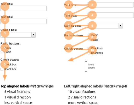
Top aligned labels are faster and easier to fill out than left and right aligned labels. This is because top aligned labels only need half as many visual fixations. Top aligned labels also allow users to move down the form in one visual direction. Left and right aligned labels require two visual directions to fill out.
The only drawback with top aligned labels is that they can make the form long. But users are scrolling more often these days, so this isn’t a problem. By reducing the whitespace between fields, you can decrease the form length. You can also break the form up into multiple pages to make the form shorter.
The difference between top and left/right aligned labels is clear. Top aligned labels are easier on the eyes and make forms easier to fill out. Although they can make the form longer, users will benefit more from the less time and effort it takes to complete it.
If top aligned labels can give users a better experience with forms, it’s worth adopting. Designers should think more about their field label alignment. It can make the difference between users completing a form or abandoning it.
Book

Affiliate

Very interesting, I can see how this would work better.
Do you mind if I copy and paste this to my blog? Of course, you would get all the credit along with links to your site.
Please let me know.
I have just begin to follow you on Twitter because I appreciate your “geekiness”! It is an awesome title – Geeky. I learn the most from those like you who spend time, more time, and still MORE time learning everything you can! So….. thank you!
just
Kate
I never have understood the attraction to left alignment of labels when it often introduces big gaps of white space. It breaks the notion of saccades – that eye movement of 36 characters then pause. The eye pauses abruptly due to one label being long and the other labels being short introducing large gaps. I have always advocated right aligned labels or top, but you know there are those die hard “if’s left, it’s always left because that is the way we have always done it”. Right, wrong – obstinacy is wrong. And yes I did some testing on smart phones recently and left aligned labels do NOT work when a user zooms in, and 90% of the users I tested zoomed in only to find they could not find the label. Okay they were a diverse user set from 30 to 50 of professionals.
we use left aligned on our site to cut down on the size of the form. Top aligned, the form would take up the whole screen. But I think I’ll a/b test our landing page to see if it improves the conversions.
Top-aligned labels are the way to go especially if you want to translate the website into other languages. The same text in another language might be shorter or longer and some languages are right-to-left instead of left-to-right. Top-aligned solves both problems. Plus, it becomes possible to add descriptions below each text box in case the user really needs to know what they are filling in.
Wouldn’t have thought of internationalization here, good point.
So if you used top aligned labels…is there a rule to stacking them? Can/should you have form fields going 2 or 3 across or should you just have 1 input field per line?
That’s true that top aligned labels are better than left or right ones. They really make filling out forms quicker and easier. And there is no doubt that when users find filling out forms difficult or complicated they simply decide to abandon it. Designers should be careful what forms to choose.
I already new to put my forms into a single column, but I never considered the labels. Very useful …
Hi – Luke Wroblewski (www.lukew.com) has been talking about this for a few years – he even has the eye tracking data to back this up.
The ‘top align/right align/left align’ issues are all covered on articles on his site.
Nice Article. Never thought about visual fixations in designing a form. Makes sense
That’s how we do it – completely by accident though!
Although we seem to align radio buttons horizontally AND vertically depending on what the answers are….for instance
Rate it:
* 1 * 2 * 3 * 4 * 5
Chose a theme
* Standard
* Custom
Very good points and taking this into consideration with future web and form designs.
Only drawback of top aligned labels is that they can be interpreted by users as bottom aligned labels. There should always be enough space between the input field above and the label beneath to prevent this.
What’s the scientific basis to prove the difference in the number of fixations the user has to do in both types of forms?
It makes sense for a left-aligned label to require more effort since there’s a visual gap between the actual label and the field, but what about right-aligned ones? The user has to traverse the title of the label, to read it, at which point his eyes will be right at the beginning of the field. Even if we go by the notion that users skim through text of the web, they still read the beginning and the end of words to understand them.
Furthermore, user do read in lines. Isn’t it actually more effort to read a label, then having to move the eyes back to the beginning of the form? I’m skeptical as to whether top aligned design is really only a single fixation instead of two.
Very simple change to make, something i had never considered, also just as relevant to Forms as part of desktop applications
I couldn’t agree more. I’ve filled out so many forms where I start thinking, “who the heck designed this?”. Great stuff. I’m glad somebody stepped up and said something about this!
First of all isn’t this just a summary of the article Luke W wrote back in 2007? Second of all it’s complete nonsense. The difference in how quickly a user can fill out a form comes from cognitive processing not visual fixations and saccadic eye movements. If you are designing web forms and your primary goal is for users to fill them out as quickly as possible, your form fields should be right aligned.
Agreed.
Even if we accept the article’s premise, top-aligned labels make it vastly harder for a user to scan the labels. With left-aligned labels everything in the left ‘column’ is a title. With top-aligned forms a column will contain;
The labels
Different form elements (text entry, drop down menu, etc.)
More time required to hunt out helpful labels = less speed in form completion.
Top-aligned labels are the way to go especially if you want to translate the website into other languages. The same text in another language might be shorter or longer and some languages are right-to-left instead of left-to-right. Top-aligned solves both problems. Plus, it becomes possible to add descriptions below each text box in case the user really needs to know what they are filling in.
I never thought of it this way. Very profound. I’ll be thinking of this every time I create a form. Thanks for sharing!
Looks convincing. We switched one of our forms. Let’s wait and see…
I already new to put my forms into a single column, but I never considered the labels. Very useful …
I find it very funny that the comment area does not use the format you provide.
As a developer since 1995 specializing in mobile and international sites I can tell you that vertically aligned forms work on all mobile phones, and they are the only one that always work on all mobile phones.
Translation is also reverent since sometimes translation greatly increases or decreases that amount of space a phrase takes up horizontally.
I recently had to translate a website into Simplified Chinese and it had a bunch of radio buttons in table columns … it was a nightmare and required complete reformatting.
Excellent analysis–I had never seen labels broken down into number of visual fixations before. Great stuff!
I find it very funny that the comment area does not use the format you provide.
As a developer since 1995 specializing in mobile and international sites I can tell you that vertically aligned forms work on all mobile phones, and they are the only one that always work on all mobile phones.
Translation is also reverent since sometimes translation greatly increases or decreases that amount of space a phrase takes up horizontally.
I recently had to translate a website into Simplified Chinese and it had a bunch of radio buttons in table columns … it was a nightmare and required complete reformatting.
I actually think Walmart.com was doing some interesting work with form fields. They put the labels on the left side, but it was all encapsulated in the form field nicely and minimized scrolling. Scrolling is a bit more problematic with form fields since it can make editing/ or reviewing difficult.
Thanks for the Good Article 🙂
top aligned labels would not take so much space if you use labels within input text field, that will save space without the need in reducing labels font size
I wish more heads down designers would promote vertical UIs designed for portrait display for just this reason. Data entry forms could take advantage of single column, top labels with less scrolling.
I’m sure there are plenty of businesses out there who have adapted, but it definitely could benefit a larger audience.
I think vertically aligned form elements are easier on the eyes, indeed. Good remark!
Thanks for the insight, always looking for ways to make the user experience a better one. Where did you get your research information for the article?
I think it also depends on your use case.
I use a bug tracking application with forms, and after the switch from left aligned labels to labels above the input, I find it much harder to scan the fields. It would probably be easier to fill out if you had to fill each field. But if you’re scanning a large form for only a few fields, this design seems worse.
Very useful.
And if we hide Label (screen reader still can read label) and use Placeholder to guide, maybe it’s faster top aligned label, isn’t it?