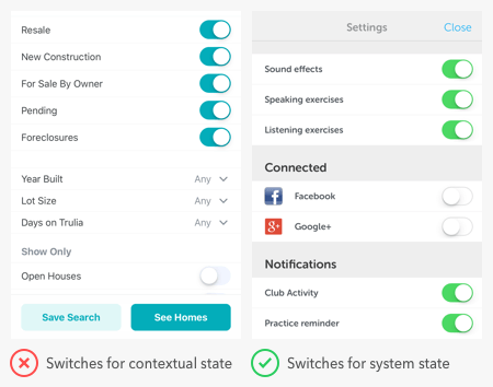
Most users know how to toggle the switches on electrical devices, but get confused with the interface ones. They often have trouble discerning whether a switch is indicating a status or command.
Toggle buttons should do three things — change states, show the current state, and reveal unselected options. If your toggle button doesn’t do all these things, it has poor usability.
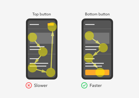
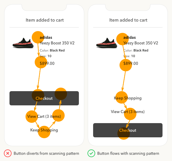
Did you know that where you place your buttons affects how fast users complete their task? Quicker task completion results in a more satisfying experience.
Every company knows how vital user research is for designing great products. But the biggest problem that keeps them from doing user research is the lack of time.
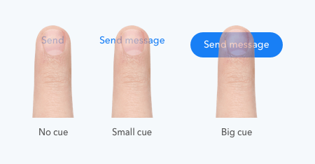
The usability standards for buttons are higher for mobile apps than desktop apps. With a smaller screen and finger navigation, mobile buttons must be easy to tap, read, and recognize.
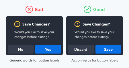
What your buttons say is as important as how they look. Using the wrong words on your button labels cause users confusion, more work, and slower task times.
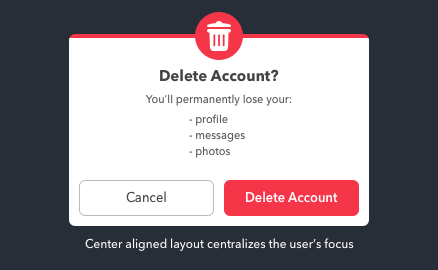
Data loss is one of the greatest frustrations users can experience with computers. They not only lose their data but also their time and money they put into it.
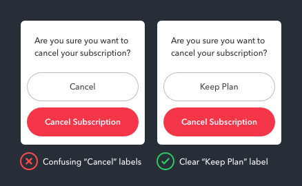
Cancel buttons sometimes have different names. “Not Now” and “Maybe Later” are some dismissive labels one could use. But there’s one case when the Cancel button should not...
What does the Cancel button do exactly? It dismisses the user’s current screen and brings them back to their previous one. This dismissive button is a safeguard to prevent...
Personas have been a staple of UX deliverables for a long time. But the big problem with personas today is that they’re hard to digest, so people don’t use them.
To tap or not to tap — that is the question on the user’s mind when they see a call to action button. The more buttons there are, the longer users take to decide.