What does the Cancel button do exactly?
It dismisses the user’s current screen and brings them back to their previous screen. This dismissive button is a safeguard to prevent unwanted changes to the system. But when it looks like a call to action button, it’s hard to recognize.
The Cancel button should signify a fallback to safety, not a call to action. In other words, your Cancel button should never have a color.
A Neutral Color for a Neutral Button
A colored button signals a call to action. A Cancel button is not a call to action because no changes to the system occur after users press it. You shouldn’t emphasize it with color, or you’ll give users that impression. Instead, you need to let them know that the button won’t make any changes and is an escape from action.

The Cancel button should have a neutral color to signify the neutral, non-committal button. When users see that the Cancel button has no color, they’ll recognize it as the fallback to safety easier. It’s critical for users who need to escape a confirmation screen to notice this.
When each button on a screen has a color, they’re competing for attention. The competition causes users to ponder each action longer. A neutral colored Cancel button makes it faster for them to decide by not competing. Users who are prepared to take action also won’t get distracted by the neutral button.
“Cancel” Has Many Names
Not all Cancel buttons have a “Cancel” label, but they function the same as one. For example, a Cancel button could have the label, “Not Now,” “No Thanks,” “Maybe Later,” or “Skip” depending on the context. If the button has a dismissive behavior, treat it as a Cancel button because it serves the same function.
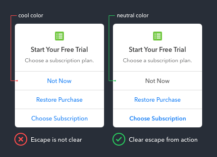
The more buttons there are on a screen, the more necessary an exit is. When all buttons have a color, the escape isn’t clear. But when the Cancel button is a neutral color, it makes the button choices more intuitive.
A Dark Enough Gray
When using gray on a button, it’s essential to make the gray dark enough. Otherwise, the button isn’t legible and may look like it’s in a disabled state.
To ensure your button is legible, check the color contrast with a WCAG 2.0 contrast ratio tool such as Color Review. This tool tells you if your gray passes the accessibility standards for text color.

Neutralize Your Cancel Button
When most users activate a confirmation screen, they’re ready to take action. But for those that activate it by mistake or change their mind about taking action, the Cancel button is their safety.
A colored Cancel button sends out the wrong signals. It causes users to perceive it as a call to action instead of a fallback to safety. Neutralize your Cancel button, so users have an easier time exiting your confirmation screens.
Book

Affiliate

To me, the neutral gray text and outline makes these cancel buttons look like they are disabled, and therefore not clickable. So if this is your recommended style for cancel buttons, how would you style a disabled button to clearly differentiate the two?
Use transparency for disabled buttons instead of gray. Don’t make the gray too light on your Cancel buttons. Follow WCAG 2.0 contrast ratio guidelines. I’m using #555555 on a white background and it passes both AA and AAA.
I thought about introducing a simple X in the corner of the modal (even customizing it to the OS based on browser footprint. Makes it act like a window that you can escape just like on desktop.
The X icon signifies “close.” Closing a screen is different from canceling a process. When users are in a modal state, it’s better to use a Cancel button so they know for certain their process is canceled and no changes were made.
Absolutely wrong. A Cancel button button DOES need a colour, preferably the same colour as the rest of your CTA buttons / links. Otherwise how else does the average user know that it is a clickable option?
Note that when I say it should be the same colour, yes of course, it should appear as a secondary-level priority button, ie: outline-colour rather than fill-colour.
If you have this button as a grey button, then you are not only making it harder to notice, but much more importantly, you are giving the false impression that this is a disabled button.
Your claim of the Cancel button “is not a call to action” is false… It might not be a major action, but it IS still an action, that action being a dismissal action.
Hard to notice – Use a button shape and align it next to other buttons and users will have no trouble recognizing it as a button.
Disabled – Don’t use a light gray. Use a gray that’s dark enough and check it with the WCAG 2.0 color contrast ratio tool.
Call to action – A dismissal action is not a call to action because you’re not calling users to click it. Also, no changes to the system occur after it’s pressed. Therefore, Cancel is not a call to action.
Another example of UI overregulation in a attempt to homogenize every experience.
There is no one answer you can blanket apply to the universe of experiences. What if the whole site is gray, I can’t see my button! What if the design is brutalist and I can’t use 2 colors to help it stand out enough like these examples? What if your article is actually very wrong per my audience’s previously learned experience, which is really what each site must cater to?
Stop your navel gazing, get over yourselves, and find ways to enable beautiful, intuitive, enjoyable experiences rather than throw up roadblocks in the name of your own self-important “correctness.”
It’s an interesting concept. I don’t personally think the gray buttons look inactive, if they are dark enough. But still, I would like to see articles like this backed up with A/B test results or other statistics. Otherwise it sounds like personal opinion. No matter how plausible an idea may seem, the deciding factor is extensive testing to see how users actually react.
I would offer a word of caution here: there are times when highlighting and even prioritizing a “cancel” button is the right thing to do. In this category, I would include times when a user is about to complete an irreversible, destructive action like deleting an account. In these instances, you might wish to downplay the “Continue” button, and activate or at least equalize the “Cancel” button so that the user has to more intentionally choose the destructive action.
Echoing this comment from @mmcwatters about irreversible and/or destructive actions. Making “cancel” buttons neutral in color /can/ work in /some/ applications, but would like to know OP’s opinion on defaulting a “cancel” button as the highlighted button in dangerous actions.
A potential option in favor of neutral cancel buttons is an always-spot-colored “ok” button, where the “ok” button container is filled with the spot color when it is default/active (e.g. can be selected by hitting Enter), and is outlined in the spot color with no fill when it is not active. Thoughts?
see: https://www.nngroup.com/articles/ok-cancel-or-cancel-ok/ (last bullet point)
Well written article, however the suggestions appear very subjective – sharing your own personal interpretation of how users experience cancel buttons and what makes the right experience.
Do you have any qualitative or quantitive data to support your claims?
As other comments show a difference in opinion, would be nice to see some real data to support this suggested design pattern.
Thanks for writing the article, nice and is valid. Grey is a colour as is black and white. I think what you mean to say is cancel buttons should have a neutral colour, with that I would agree.
I agree with you, it should be neutral. And PLEASE, PLEASE, PLEASE put the cancel option TO THE LEFT of the CTA.
Google Chrome’s bookmark star has changed the order and placed “Remove” where “Done” should be. They did this a long time ago and I still have to double check before hitting anything because it simply doesn’t make any sense.
We have some dialog modals that show information / summary reports which have “close” buttons at the bottom of the content.
Our normal pattern is the light/muted “cancel” button and a colored/primary “submit” button on those dialogs… but we aren’t sure which button treatment to apply to the summary report modals.
What are your thoughts on the scenario where “close” is the only action?
Cancel buttons are for modal states. To press Cancel means you want to cancel the current mode or process. When you’re viewing information you are not in a mode or process because there are no actions that come after that. A Close button is appropriate in this context. However, If you’re having issues, I’m not sure if a modal window is the best approach for viewing information.
I think the red color on the buttons is more important in the case of brands that do not use red color as one of the main colors of their identity.
Do you have evidence or data to back this up? Seems very definitive advice without any reference or case study? Unless I’ve missed it.
How to understand the iOS Cancel button is colored?
The article makes some good points! However, I think it would be helpful to include alternative options in case we can’t use a grey outlined button. One suggestion could be to use a text variant without an outline or fill, with the text color matching the filled color of the action button.
cancel | BUTTON |