When you see a ‘Submit’ button on a form, what comes to your mind? One could reason that clicking the button submits the user’s information into the system for processing. A ‘Submit’ button describes what the system does well, but it doesn’t describe what the user does at all.
When users fill out a form, they’re doing a task. The action button should affirm what that task is so users know exactly what happens when they click that button. The more clear your form is, the more you’ll get users to complete it.
A form button that says ‘Submit’ gives users the impression that the form isn’t focused on completing a specific task. It also gives the impression that your website isn’t user-friendly because you’re speaking in a technical way most users aren’t familiar with. If this is the impression they get, you can bet you’re going to lose a few users.
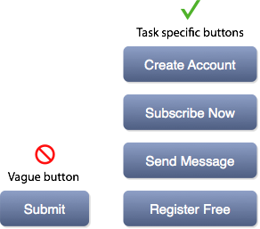
Your form button should describe exactly what the user is doing in their task. For example, if they’re signing up for an account, a button that says ‘Create Account’ tells users that clicking the action button creates an account. It’s clear and specific to their task.
If the button had said ‘Submit’, users would question what happens when they click the form button. Avoid making them uncertain by using a button label that describes the result of the user’s task.
‘Submit’ buttons still exist on forms today. The good thing is that fixing them is simple. It requires nothing more than labeling your buttons with a task-specific action. It might not seem like a huge difference at first, but when more users are completing your form, you’ll know that they respond best to task-specific buttons.
Book

Affiliate

It always comes down to A/B testing to see which button creatives works the best.
Good thinking. Now let me check the multivariate tests results for this.
Thanks for posting. I think you raise a good point about the button saying exactly what will happen when you press it. I can’t tell you how many times poor web design has led to my purchasing something I had no real intent of purchasing, or posting a comment that I definitely did not want to post. At the same time, however, depending on what the button’s function is, most people can figure out what “Submit” is referring to in the context.
I really agree with you dude! status=currently changing(^_^)
Interesting post. This also make the form more humane.
Hi there,
This is not something I’d really considered much before; something I made a passive effort to do – after reading this I think I will be making much more effort to ensure all of my buttons are appropriately labelled (or valued in HTML terms hehe)
Matt
Interestingly, many designers know about it, but not all of them remember it when it comes to design a new website 🙂
Hi,
Interesting post but I dont agree with everything in it. I think your point about having an explicit button labels describing tasks is only valide for 1 page long forms or to facilitate the uptake of a process at the start (e.g. a “Register now” button on a page that then leads to an application forn).
When it comes to application processes containing multiple steps for example, the use of a submit button at the end is perfectly valid. Even if I agree that the term is system-centric, users recognise the button as being the last click before completion of the process. In other words, “submit” is for many part of the form jargon and users expect to see “next” and “submit” buttons. Equally in those situations, i dont think the final action needs to be explicitly labeled on the button. Using another label may even confuse users who would expect a “submit” button.
Re application processes: Yes, you can get away with Next and Submit in a process flow, but why make users work harder? Design it in a more user-centred way and reduce the load for users. Next is okay mid-process, but the final submit button should be explicitly stating what they’re submitting, and affirming that the user has successfully completed the task.
Actually, now that I think of it, I rather like the official sounding confirmation that my multi step form or changes are being ‘submitted’ for processing.
If you fill in a long process, it feels weird to have ‘Register’ at the end, vs. the more definitive sounding ‘submit.
So ‘Register’ to start the process and ‘submit’ to finish feel right anecdotally.
“Submit Registration” would be your button text
This is purely anecdotal. But when it comes to finishing a form, or an application, I can’t stand seeing anything but “Submit.”
Any button that doesn’t say “submit” forces me to read it and figure out what is going to happen. “Submit” is very clear…the data you filled in is going to be sent to the right channels.
Depends on the context obviously. If it’s a CTA, then alluring text seems fine. But if it’s more than that, anything but “submit” can easily be confusing.
For a registration form, what about “Complete registration”? For forms, it’s a weird thing because “Submit” actually seems like legitimate, non-generic English for the task.
If you turn that form into a multistep/page process, “Submit” becomes a little more problematic. I think you’d just need to differentiate the last step from the middle steps. (Switch from “Next” to “Submit” or the like). If you just use Submit on every page, it’s a lot less clear which one means “i’m done with my form.”
There’s another level here.
We — the builders of the things — are not our users. We understand how the form hooks up to the database and that HTML comes with a submit button.
What we prefer doesn’t matter. What’s more important is the thought sequence going on in our customers’ heads. When they get to the end of our form, they’ve been paying us with attention (and anxiety over what we’re going to do with their details.) The least we can do is give them a little encouragement, by reminding them why they’re doing this onerous task for us.
Plus, as others have pointed out, “Submit” is computer language. Must we lowly users really kowtow to our robot overlords?
true those button turn me off too
This website is a great repository of web UX rules. I am glad I found you on the web!
Hello
and what is with buttons in a wizard?
should they call “next” or is a other term better?
If it’s in a wizard, give the user a clue to what comes next. This is especially important so the user knows if they are going to another input screen, or if they are finalizing/submitting the full form.
Next/Previous works fine. It doesn’t need any extra work for the person filling out the form to understand it’s a multi-step form.
Maybe make it “Next Step”/”Previous Step” if you’re so inclined.
Hi there,
This is not something I’d really considered much before; something I made a passive effort to do – after reading this I think I will be making much more effort to ensure all of my buttons are appropriately labelled (or valued in HTML terms hehe)
Matt
I came upon a door to a shop today that said “Open”. I was totally stumped. I couldn’t figure out if it was for going into or coming out of. It could have said, “Come in and buy” or something more helpful. Damned system centric sign.
While I waited to be told what to do I played an online wrestling game on my phone. It had my avatar pinned in a sumission hold, and guess what? That’s right, not a Submit button is sight.
lol, you sir have just won the internet! Made my day. Hopefully someday you read this and know someone appreciates how awesome you are!
I was just discussing this yesterday with a co-worker designer. This was exactly the perfect resource to end the conversation. (Most of the stuff I’d found was on landing pages and not for contact forms, so it was a slight mismatch of princple to example.)
I loathe “submit” why not “yield ye knave!” or “I didn’t take any time to consider this part of my website”. Always take measures to tailor your site to your audience!
I’ve always grumbled at [Submit] buttons.
I REFUSE to “submit” to my software.
It’s something like the thought, “No. I’m the boss here. You’re the tool. You submit to ME!”
Great analysis and comments.
Nobody ever wants to “submit”.
Especially not to government tyranny.
I agree with the ideas here. However I feel that testing is required to see what works better. “submit” in a sense also tells the user that the task is complete. However message specific like “send message” also tells the user the same thing. In the matter of feelings, I say that since buying decisions are made based on feelings, one can also ague that “create account” for example, may give the user a second chance to re-think their decisions.
I can’t agree. People like conventions and are highly enculturated into them. You could add the odd explanatory button, but sparingly.
“Close” is these days is hardly seen any more because users are now more savvy than twenty years ago and know to look for the little cross.
“Apply” means to stay on the form of course.
“Next” is well understood conventionally for a multi-step process.
“Cancel” can be improved upon at times. “Continue shopping” already has established semantics in the world of e-commerce, during a checkout process. Its a good idea to pair these with the forward action button.
“Continue” is actually better than “Back” if the form is purely informational.
“Back” is dying, not just because your device provides one, but that can be a case of navigational design intruding on the user semantics. Plus users don’t like to have to imagine seeing something before they can just see it.