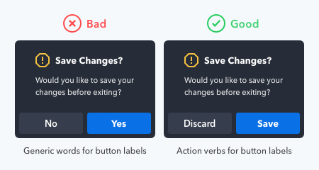
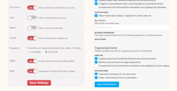
What your buttons say is as important as how they look. Using the wrong words on your button labels cause users confusion, more work, and slower task times.
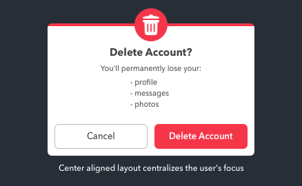
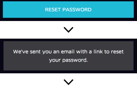
Data loss is one of the greatest frustrations users can experience with computers. They not only lose their data but also their time and money they put into it.
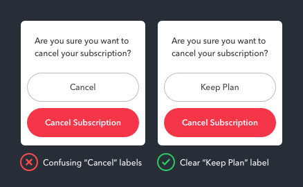
Cancel buttons sometimes have different names. “Not Now” and “Maybe Later” are some dismissive labels one could use. But there’s one case when the Cancel button should not...
What does the Cancel button do exactly? It dismisses the user’s current screen and brings them back to their previous one. This dismissive button is a safeguard to prevent...
It isn’t easy to figure out when to use a salad fork or dinner fork just by looking at them. This difficulty is caused by the fork’s similar form and function.
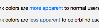
Color communicates a lot information on interfaces. But not so much for color blind users. They often have trouble distinguishing between different colored objects.
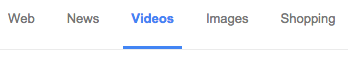
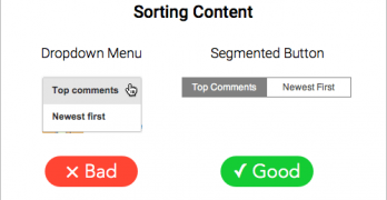
Content filters allow users to find what they want without going through an entire archive. But many make the mistake of hiding the options in a dropdown menu.
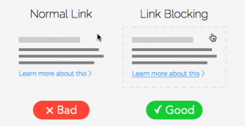
User research has proven that the larger a target is, the faster and easier it is to click. That means if you turn a link into a button, you can increase your click-through rate.
Icons placed next to button labels are like bullet points placed next to items in a list. Both can make information easier to find and scan, as long as they're placed in the right spot.