Most websites with large navigation menus overwhelm users by showing them too many items at once. This happens when the user opens a dropdown menu in the navigation.
Sometimes designers need inspiration when they're designing a user interface. User interface pattern libraries can give us different ideas we never thought of before.
Low color contrast has always been a common problem in web design. The problem with low color contrast is that it makes text and buttons hard for users see.
Imagine how many different websites users log into everyday. Now think about how many times in their life a user will have used a login form to type in their username and password.
“Features win over simplicity, even when people realize that it is accompanied by more complexity,” is what Don Norman states in his “Simplicity is Highly Overrated” article.
Can you believe a woman got fired from her job for using all caps in an email? There's something about all caps text that turns people off. Using it in a social context means you're yelling.
What does ABC, CNN and Fox News all have in common? They only use Arial as their font for their text. This makes the headings hard to distinguish when users scan.
A list of links can look like a big blob of paragraph text if they're not formatted right. This is evident when you try to scan the headlines on USA Today and LA times.
There's a new Digg design and everyone wants to give their opinion about it. Some users like it, some hate it, but for me, I am more interested in what we can learn from the their new user interface.
Gradients are often used on user interfaces to give it a natural look and feel. They act as a single light source lit from above mimicking the sun. This effect gives objects depth in appearance.
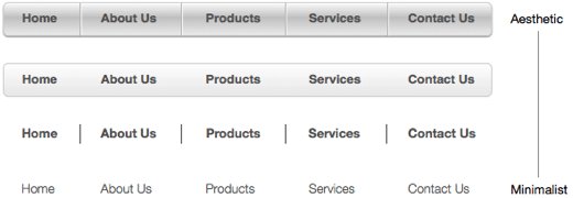
The term "minimalist" is thrown around a lot in the design world. If you're going to use this word you should understand what it means and use it correctly.