When users navigate an interface, they have a need for speed. The faster it is for them to find what they’re looking for, the more time they’ll save on their task.
A common navigation pattern that needs speed is the three-level menu. You’ll often find it on dashboard interfaces and desktop applications. The way to increase the navigation speed of a three-level menu is to use the optimal layout.
A research study (A comparison of three-level menu navigation structures for web design) has shed some light on which layout is fastest to navigate. They evaluated various three-level menu layouts based on several criteria categories.
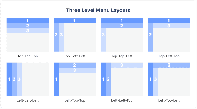
The navigation layouts include top-top-top, top-left-left, top-top-left, top-left-top, left-left-left, left-top-top, left-left-top, and left-top-left. The level notations are ordered by priority and hierarchy (i.e., primary[1]-secondary[2]-tertiary[3]). The criteria categories include navigation time, user hesitation, cursor movement, selection errors, and user preference.
Navigation Time
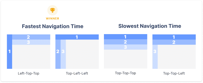
The study discovered that a left primary is faster to navigate than a top primary. This effect also applies to left secondary menu levels. It also found that navigation is faster when the primary level is separate from the secondary and tertiary levels. Overall, left-top-top and top-left-left were the fastest, and top-top-top and top-top-left were the slowest.
User Hesitation
A hesitation is when the user hesitates to move their cursor from one menu level to another. The left-top-top had the least hesitation out of all the layouts, and the top-top-left had the most. There was a significant decrease in hesitation when the secondary and tertiary levels were on the same plane.

Cursor Movement
The frequency of cursor movements to the incorrect plane represented a cursor movement. There were fewer cursor movements when the primary menu was on the left. Fewer cursor movements also occurred when the secondary level was split from the primary. Many cursor movements occurred when secondary and tertiary menus were on different planes. But when they were on the same plane, users performed better.
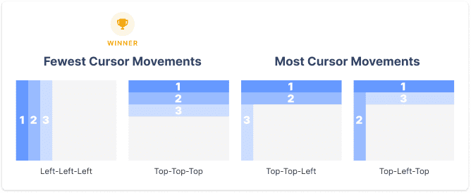
Left-left-left and top-top-top had the fewest cursor movements, while top-top-left and top-left-top had the most. This effect makes sense because when all menu levels are on the same plane, it’s harder for users to move their cursor to the wrong plane.
Selection Errors
The number of excessive clicks represented a selection error. When the primary level was on the left plane, the least amount of selection errors occurred. A left primary reduced selection errors by 80% compared to a top primary.
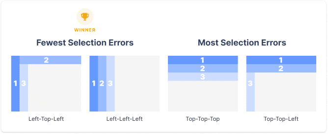
A significant number of selection errors occurred when both the primary and secondary were on the top plane. Top-top-top and top-top-left performed the worst. Fewer selection errors occurred when the secondary and tertiary levels were on a separate plane from the primary. Left-top-left and left-left-left performed the best.
User Preference
The majority of users preferred using a left primary than a top one. Left-top-top and left-left-left were most preferred. There was a strong preference for grouping the primary and secondary levels and secondary and tertiary levels. Top-left-top and left-top-left were the least preferred. This effect implies that users don’t like jumping back and forth between planes.
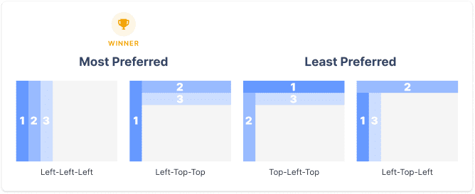
Best vs. Worst Overall Performance
An overall score was given to each layout based on their performance for all criteria categories combined. The best performing navigation layout was left-top-top, followed by left-left-left. The two worst-performing ones were top-top-left and top-left-top. Out of the two best, left-top-top was faster than left-left-left by approximately 17 seconds.

Left-left-left is slower than left-top-top because when all the menus are on the left, it requires users to scroll through the list of items. As the levels expand and go deeper, users have to scroll more and can no longer view all the primary items on a single screen. However, the benefit left-left-left has is that users can consume more content per screen view. Users spend less time navigating the content screen, but it’s a tradeoff for more time navigating the menu.
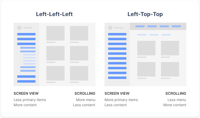
The screen view advantage for left-top-top allows users to view more primary items at a time no matter how deep they navigate. However, they see less content per screen due to the top navigation bars. As a result, users experience less menu scrolling but more content scrolling.
Author’s Recommendation
No matter which navigation layout you choose, left-left-left and left-top-top are both winners. There are give-and-takes between screen view and scrolling, so it’s important to evaluate what’s more important for your UX.
If your users navigate between different primary categories a lot, go with left-top-top to minimize menu scrolling, and maximize menu viewing. If your interface displays a lot of content with large and heavy visuals (e.g., photos, videos, graphics), go with left-left-left to minimize content scrolling and maximize screen view.
It’s possible you can increase the content screen view for left-top-top and still reap the benefits of less menu scrolling. By temporarily hiding the top navigation bar when users scroll down the screen, they can get a full content view. When they scroll up, the bar will reappear. The assumption is that users are viewing content when they’re scrolling down. When they scroll up, their intention to navigate is more likely.
In my opinion, left-top-top is the winning navigation layout. Not only is it a few seconds faster than left-left-left, but it allows users to recognize which primary category they’re on. When you have multiple menu levels expanded in the left sidebar, it takes more effort to recognize which level you’re on. It’s also easier to mix up secondary and tertiary items since they’re so near each other.
A left-top-top layout makes scanning primary categories easy. It distinguishes secondary and tertiary categories from primary and places them on different vertical levels. Therefore, users are less likely to mix up secondary and tertiary items when scanning horizontally.
Of course, left-top-top isn’t the best choice for every use case and interface context because there are exceptions to every rule. But overall, it appears to perform superiorly to all other three-level menus.
UX Design Implications
There are three significant design implications from this study that will dramatically optimize the navigation speed of your three-level menu.
1: The primary menu should be on the left instead of the top. (~17 seconds saved)
This conclusion makes sense because organizing menu items in the form of a columned list makes them easier to scan. The user can see a cluster of items in a single view when they’re in a column instead of a row. With a top primary, the user can only view items individually as they scan across the row.
2: The primary menu should be on a different plane than the secondary and tertiary menus. (~23 seconds saved)
This conclusion makes sense because the primary menu is the parent category, which has higher priority over child categories. When the secondary and tertiary levels are separate from the primary, it clearly distinguishes the hierarchy and prevents visual clutter on the same plane.
3: Secondary and tertiary menus should be on the same plane. (~9 seconds saved)
This conclusion makes sense because the secondary and tertiary levels are both child categories of the parent category, making them more related. Placing them on the same plane makes navigating from child to child more intuitive and easier to follow.
If you’re designing a three-level menu for a desktop application, keep these UX insights in mind. They’ll especially apply to dashboard interfaces where efficiency is crucial. If you currently have a three-level menu that uses a slow navigation layout, consider redesigning it. A fast navigation layout will give your users the speed they need to accomplish tasks with greater satisfaction.


Hey Anthony, nice article! It would be nice to see some real-life examples of those layouts. Could you add some? Especially for the left-top-top layout. Thanks!
For everyone looking for examples. Discord.com has a wonderful LEFT, LEFT, TOP function, and the app exploded in the last 5 years. It’s common-speak now, when if five years ago you said “I made millions off a discord stock group” no one would know what you’re saying.
The study you mention was done in 2004. It would be interesting to do that same study now, in 2020. I wonder if our experience navigating varying websites and digital spaces would show the same results.
Thanks Anthony for a very detailed article, now I understand why the bounce rate on my website was very high. Thanks to you, I will redesign my website immediately for higher conversions.
I primarily design for web applications and this was an insightful read! Curious to know how the user hesitation metric was recorded and measured?
Found this really interesting until I saw the report was done 16 years, this is a life time in the world of digital, so not sure the results can really be trusted.
Left navigations were a lot more popular in this era, and I suspect in most cases the norm, so users would have found them more familiar, which in turn usually means the users would find them faster to interact with.
It’s a shame, as this kind of research can be really useful when putting together ideas for navigation if it was with the current times.
This seemed so promising… yet I could not disagree more! First of all, the study this article is based on is… 14 years old! Second of all, it assumes that being able to scan primary items at all times is more beneficial than scanning secondary or tertiary items. Why? In most cases, I would actually think that people are more likely to need ‘the next item down’ rather than browsing a completely different section. Lastly, it doesn’t take into account any visual design consideration such as the size of the items, the spacing between them, any visual cues implying hierarchy, etc. Sorry to be a party pooper but this simply seems wrong.
Yes, the referenced study is old. However, that doesn’t necessarily negate the findings. There have been many old research studies that still hold true today. One simple example, is the F-pattern for scanning pages where the user behavior has remained the same regardless of time.
In my opinion, the user’s navigation needs and behavior remain the same as well. There are more novelties in navigation patterns and visual design today than before, which can affect certain details here and there, but it doesn’t affect the overall implications of the study.
I learned a lot from your article about The Fastest Navigation Layout .This is very cool, Can I translate your article into Chinese and share it with my friends? I’ll post the original author and the original link.
Sure, but leave the link to the translated article in this comment.
I love that you took the time to explain this but I would definitely want to see it done again with smartphones! Since we designed for mobile first now, and the left is difficult to access with larger phone screens and most users primarily reaching with their thumbs. I wonder if we can apply the same principles, add in mobile reach, and hypothesize that right bottom bottom is best now?
Hi Anthony,
For User Hesitation, you write that top-left-left performed the worst in your text, but the associated image has top-top-left as having the most user hesitation. Can you please clarify if it is top-left-left or top-top-left that has the most user hestiation?
Thanks!
Fixed the typo. Top-Top-Left had the most user hesitation. Image is correct.
This is gold! Thank you so much for this article!
Would you consider breadcrumbs a part of navigation? I am interested to hear how do they fit into all of this as they are most often on the top. Are they a part of this study?
Hej hej,
thanks for the summary. The referenced “study” is a master thesis from 2004. Since 2004 a lot has changed. The iPhone was introduced in 2007, touch devices became more important and are nowadays more in use as Desktop-PCs. In 2009 Desktop PCs were about 98% in use with 2% for tablets/mobiles. In 2023 we have about 40% for Desktop PCs and and about 60 for tables/mobiles (see [1]).
The critique is, that the study is too old to outline user preferences for layouts, navigation and so on. Too much has changed and the content should not be considered as still valid.
[1] https://gs.statcounter.com/platform-market-share/desktop-mobile-tablet