When you pair buttons with menu items, you have to be careful with how you design them. If your menu selection cue looks the same as a button, you can cause interaction errors.
Users can misperceive the selection cue as a call-to-action. They can also accidentally click the menu item when they intended to click the button. These errors happen when the menu selection cue and button look too similar.
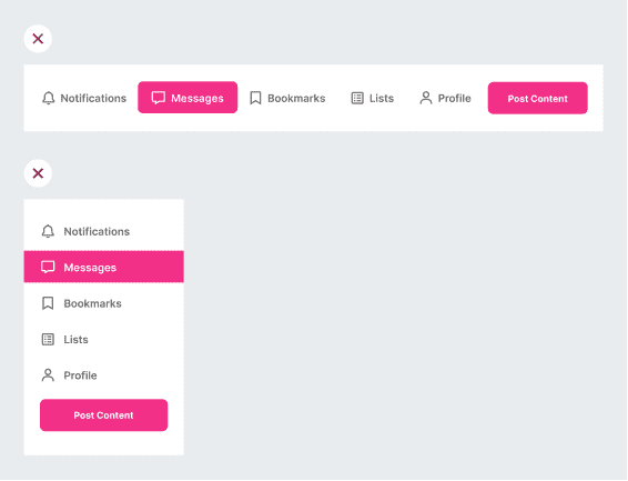
Many designers like to use a color fill on the selected menu item. However, this color fill looks the same as the one on the button. As a result, users will visually react to it the same way. To decrease interaction errors, you have to design your selection cue differently.
Subscribe to the read full article…
If you want to learn how to design menu selection cues that don’t cause interaction errors, subscribe to read the full article. For only $9/mo, you’ll get unlimited access to our entire archive of premium UX articles.
Book

Affiliate
