Typefaces come in different forms. The most common forms seen on the web are regular, bold and italic. But there’s a trending typeface that designers should use on their user interfaces more often.
When used correctly, light typefaces can give you a clear and beautiful effect on your text. However, when used wrong, it can make your text hard for users to read. Here are some do’s and don’ts for using light typefaces.
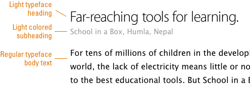
Do Use It to Contrast Headings from Body Text
When headings and body text don’t have enough contrast with each other, they can clash. A heading and body text do contrast in size, but that’s not enough if you want to make your text easy to read. A light typeface can give your text that extra contrast it needs to help users quickly distinguish between the two.
If there’s not enough contrast, a heading and body text can easily bleed together. You could also use a lighter text color to enhance the contrast, but color blind users might not notice a difference. That’s where a light typeface can come in handy.
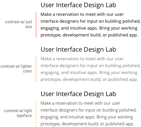
If you have subheadings, you should either use a lighter font weight or color to enhance the contrast between all three. Use a lighter color on one, light typeface on another and regular typeface on the other. Play around with the contrast to see which type of text looks better with which style.
Do Use It to Make Headings Look Less Garish
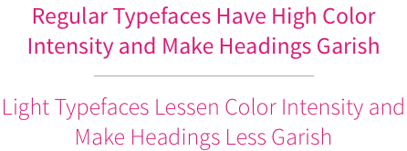
Headings in a regular or bold typeface can look garish because of the high color intensity around the letters. A light typeface can thin out the font weight and diminish the color intensity. The result is a colorful heading that doesn’t overwhelm the user’s eyes.
Do Use It to Make Your Website Look More Modern
One way to show users that your website is modern and up-to-date is to use a light typeface. Users who visit your site will get the impression that your brand is hip and trendy if you use a light typeface right. However, don’t go crazy and use it on everything because of its appeal. You should never compromise readability for aesthetics sake.

Do Use It to Save Ink When Printing Documents
Light typefaces aren’t just useful for websites, but documents too. If your user has to print a document off your website, such as a receipt, contract, ticket or coupon, use a light typeface so they don’t use too much of their printer ink. You can also save ink by using a light typeface on any documents you create.

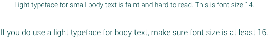
Don’t Use Light Typefaces for Small Body Text
Users can have trouble reading light typefaces on small body text because of how faint it looks. If you want to use a light typeface on body text, make sure the size of your body text is at least a medium size and has strong color contrast with the background. You want to make your text look appealing, but you don’t want to sacrifice readability for it.
Don’t Use It with a Light Color on a Light Background
Light typefaces are already light as it is. Using it with a light color on a light background is a recipe for readability problems. Instead, make sure there’s high color contrast between the text and background. When using light typefaces, color contrast is very important.

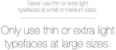
Don’t Use Thin or Extra Light in Small or Medium Text Sizes
Some fonts not only have a light typeface, but they also have a thin or extra light typeface. You should not use this in small or medium-sized text otherwise, it’ll look faint. Only use it in large text sizes so that users can read the thin or extra light typeface without any struggle.
Don’t Use a Light Typeface on Everything
A light typeface is like a spice. Use it to enhance your text just like you would use a spice to enhance the flavor of food. Too much of it and you’ll lose the special effect it has. Balance it out and use different typeface styles together for the best results.

Final Thoughts
Light typefaces can give your text beauty and clarity when you use it right. No matter what typeface you use, you should always make your text easy to read. Some older users could have trouble seeing and reading a light typeface even if you follow these do’s and don’ts.
Make sure your light typeface is at a readable size, and that your users can adjust the font size if they choose. Bad readability is a big problem on the web that designers shouldn’t take lightly. Do your part by keeping in mind these best practices when you use light typefaces.
Book

Affiliate

Very nice article. It gives quick guidelines to help us choose when to use light fonts. Will add this to my checklist.
Nice and really worth reading. Thanks
Thank you, I recently underwent a design change on one of my projects, and was reading up on similar insights as yours. The biggest challenge was getting the overall color contrast to work on the whole website, not just parts of the content.
Another thing to keep in mind is “don’t use light type as a web-font when you care about readability on Windows.” Most of the light web-fonts I’ve experimented with have looked clean on Mac, but almost unreadable on a PC. The advice about saving light typefaces for large text helps keep sites looking good on PCs.
That is because Windows uses different antialiasing method than the Mac. Actually, it’s more technically advanced because it uses subpixels, e.g. to display a thin grey line this system uses colour subpixels and can actually display thinner lines. On Mac, everything is monochrome and heavier blurred which causes thin lines to look thicker but it looks worse for small whitespaces. For that reason, small text with bold or heavy version might look worse on Mac than on PC, it all depends also on font quality, especially hinting.
Another reason for this might be quite simple – you might use Retina display on Mac which actually uses 4x more device pixels to display the same resolution when compared to non-Retina display.
Great article. This will be helpful for some friends of me.
My recommendation is “never use light fonts”. Because they are always less readable and less understandable than normal fonts. Don’t sacrifice user abilities and needs to any fads of webdesign…
Loved it, good info and details around readability
Our recent research on legibility of light and ultra-light fonts: http://dl.acm.org/citation.cfm?id=2996745
Article download link: http://www.interux.com/publications/Burmistrov-NordiCHI16.pdf
Thanks for sharing Ivan, good to see some research-proven reasoning on UX forum.
Maybe too many web designers are falling into the “use light fonts to make your website look modern” trap, but WordPress may be to blame — almost all of the recommended themes use light fonts. Whate very it is, I wish this trend to use light fonts ends soon.
‘you could also use a lighter text color to enhance the contrast, but color blind users might not notice a difference. That’s where a light typeface can come in handy.’
That is untrue, they won’t see a change in hue between red and green if they suffer protanopia or deuteranopia (most common) but they WILL notice a change in lightness like anybody else.
On the first image, second example falls short with WCAG AA. https://webaim.org/resources/contrastchecker/
Also note, that they show ‘normal text’ as regular as the light version would suffer on legibility.
This article has many good points but mains is a bit missed – we should care about legibility first and next if something is not too garish.
In general, lighter font versions has been designed for large text so using it as a small text causes problems.
Very interesting article. Sometimes it is difficult for me, I’m not a design expert, determine which text is best for each occasion because we generally want to highlight a word using only capital letters and that is a mistake.
On my website https://www.panamalegalcenter.com/ I will be trying to implement what I have learned about better use of characters and texts. Because I almost always exceed capitalization and bold in many words that do not need it. From what I see the contrast is also important to know how to highlight words without using capitals or bold excessively.
Another consideration is that the elderly demographic is huge right now, and older people often have more trouble reading lighter fonts. I came here to find out if anyone is addressing this issue, because I find many sites difficult to read.