Icons regularly used across different apps and websites are easier to interpret and more recognizable. The more users see and interact with them, the more they can assign a symbolic meaning.
There are sixteen universal icons that users come across more than others. They signify affordances, which are the potential actions a component can do. It’s important to use them when you design so that users can interpret different affordances correctly. When they do, the interface will behave how they expect.
You should consistently use the sixteen universal icons on your interface whenever applicable. Using them regularly reinforces familiarity and recognition so users can interact with the interface easier.
Icon 1: X
Affordance: Close
Usage: Use the ‘X’ to close information views when the view is no longer needed.

Icon 2: Chevron
Affordance: Disclose
Usage: Use the chevron to disclose elements and information in a spatial or navigational direction.

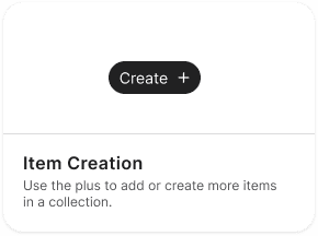
Icon 3: Plus
Affordance: Item Creation
Usage: Use the plus to add or create more items in a collection.
Icon 4: Minus
Affordance: Item Removal
Usage: Use the minus to remove items from a collection.

Subscribe to read the full article
Subscribe to read the full article and download the 16 universal icons in SVG format to use on your designs.
Book

Affiliate
