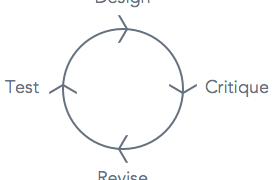
A box with a page title and arrows pointing to other boxes isn’t a sitemap that gives much information. It doesn’t allow others to visualize the page-to-page user experience you intend to design.
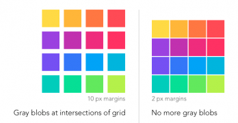
Imagine looking at a grid of images and gray ghostlike blobs appear on your screen. This isn’t a hallucination, it’s what users see when the hermann grid illusion takes effect.
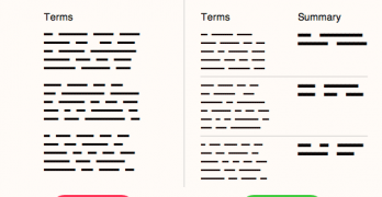
Have you ever read the terms of service agreement you agree to when you sign up for a website? A survey shows only 7% of users read the full terms when signing up.
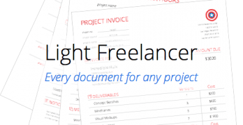
Picture yourself as a client who hired a freelance designer for a project. This freelancer has good design skills, but doesn’t handle project logistics well.
Icons placed next to button labels are like bullet points placed next to items in a list. Both can make information easier to find and scan, as long as they're placed in the right spot.
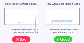
A website study found that out of 3 million home page visits only about 1% clicked a carousel slide. How could a large, graphical element on the home page get such few clicks?
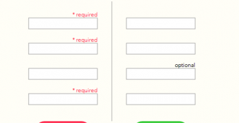
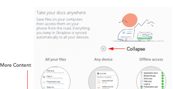
Are most of your users skipping the optional fields on your form? You might not need that extra information, but having it could help you learn more about your users.
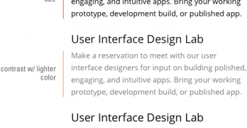
Typefaces come in different forms. The most common forms seen on the web are regular, bold and italic. But there’s a trending typeface that designers should use on their user interfaces more often.
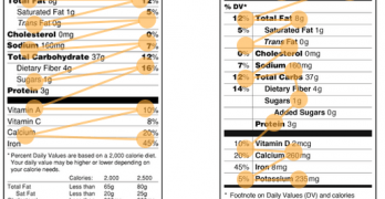
Nutrition labels have looked the same for decades. But the FDA plans to redesign them. By comparing the old and new, you can see why the new design is faster to scan and easier on the eyes.
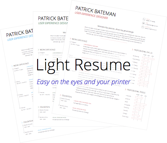
Your resume only has six seconds to make an impression when you apply for a job. Eye-tracking research shows that this is the average time a recruiter spends reviewing each resume they get.
Most modal windows on the web take over your screen when they open. They pop up on the page and block you from viewing the content underneath until you close it.
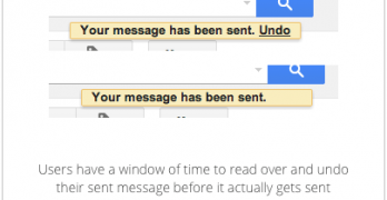
Have you ever sent a message and realized that you made a mistake? Users do this all the time and are left with regret and embarrassment after they press the send button.
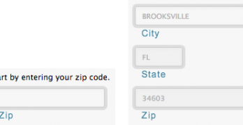
An effective form is not only one that users fill out, but also one that returns the desired information. For this to happen, you have to control user input to prevent garbage output.
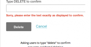
Everyone knows how frustrating it is when you delete something you didn't mean to delete. Whatever gets deleted is usually gone forever and the user is back to where they started.