The term “minimalist” is thrown around a lot in the design world. If you’re going to use this word you should understand what it means and use it correctly.
The first thing you should understand is that simple does not equal minimalist. They are similar like the number 2 and 2.5 are similar, but they’re not the same. Minimalist lives at the end of the spectrum, where simple does not.
Signal-to-Noise Ratio Comparison
A truly minimalist design would have the highest possible signal-to-noise ratio. The signal is the information that’s communicated, the noise is any extraneous information that dilutes the signal.
The key in creating a minimalist design is to shoot for maximum signal and minimum noise. When you do this, you will have reduced user processing loads and established a clear focus on the meat of your information.
In minimalist design, removing unnecessary elements places an emphasis on essential information, thus making the signal strong and the noise non-existent.
The signal strength also increases when you highlight essential information, giving it even more emphasis and contrast relative to less essential information. In order to call a design minimalist, it needs to have the highest possible signal-to-noise ratio.

Too Minimalist Is Not Ideal
There’s a danger when your design is too minimalist. The image below shows the spectrum of aesthetic and minimalist navigation bars. As the navigation bar gets more minimalist, it starts to look less like buttons and more like page text. This can cause users to confuse the button labels with page text.
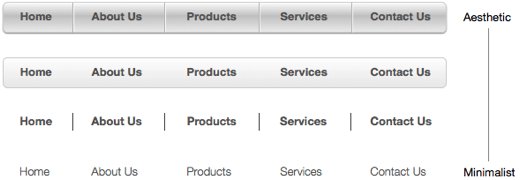
The ideal amount of minimalism is one that’s balanced with aesthetics. Users need to be able to identify buttons and links from text. Too much aesthetic and you could create too much noise. But when you find the right balance, you could create the perfect design.
Book

Affiliate

So true, but the point is , most of the time, minimalism and simplicity are paired together, so it comes out to the same result.
I’d argue that making design simpler goes beyond the kind of styling decisions you’re talking about here. Maybe the users don’t actually need to know what the exact population numbers are — they only need the relative size — so a simpler design would include a graphical representation of population. I think designers should be thinking about what kind of data users may need and offering these kind of alternatives to their clients.
A graph is not necessarily a simpler version than a table. It’s an entirely different version of representing data altogether. One is not better or simpler than the other, they are just two different perspectives in looking at data. Both are useful in their own ways. What you are getting into is information visualization, which is a separate topic from minimalism itself.
If you define “minimalist” as having highest signal/noise ratio, then in the navbar example, the first one has slightly more noise but significantly more signal – the graphic representation makes it clear these are clickable buttons. In the last one it’s not obvious at all. So I would probably say try hard to remove noise, but be careful not to remove too much signal with it…
Excellent point Josef. The nav bar might not necessarily be all noise depending on the context of the navigation. Even though there is more going on with it visually, if there are other links on the page they may compete with it and reduce its signal.
Agree with you 100%
Great article! Thx!
To quote you: “Minimalist is good, but sometimes simple is good enough.”, you make it sound like simple is easy, but I think it is far from it. To make things minimal or simple requires a skill very few people master well. Great (minimalistic but not simple) post!
Loved your explanation of Minimalism, if a client wants minimal I always charge double, because it has to be strategic and planned simplicity.
Thanks for this good and short summary. This is always good to remember differences between both.
Nice article Anthony! I liked the comparison between signal and noise. Sometimes the most pure can be the most beautiful.
A Minimalist article, simple and to the point… Thanks
This was a fantastic read, and I think your point is well put.
I would love to see some of the same analysis applied to UX examples… since that’s where I wish I were clearer on what people find more useful/intuitive (promoting the highest signal-to-noise ratio, to continue your metaphor).
So for example: icons vs. text for common navigation links. Which is noisier, a page with sections that you can scroll to, or those sections on individual pages?
Thank you for writing this. The term “minimalist” is definitely thrown around.
Nice explanation.