Have you ever passed on a product because you didn’t like its color? Color affects the way we feel about websites, but it can also affect the way we use them.
Color combinations form the first impression users get when they visit your site. If your site uses colors that are easy on the eyes, they’ll invest time into exploring your content. If you don’t, they won’t give your content a second thought.
Saturated vs. Desaturated Colors
The key to choosing the right color combinations for your site is color saturation. Saturation is the amount of gray in a color. The more saturated a color is the less gray it has. The less saturated a color is the grayer it is.

Saturated colors are dynamic and stimulate the eyes. They attract a lot of attention and can slow users down in their task. This is why they work best on elements that require more user attention, such as buttons, links, alerts, and notifications. Using saturated colors on backgrounds or large elements can cause eye strain.
Desaturated colors help ease task efficiency because they soothe the eyes more. It’s best to use them on background elements that take up more screen space, such as menus, headers, and panels.
There’s a difference between desaturated colors in the tone they convey. Desaturated bright colors convey a more friendly tone. Desaturated dark colors convey a more serious tone. The right color combination for your site will depend on your content and how you want users to perceive you.
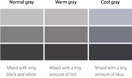
Saturated Gray
A safe color to use with other colors is gray. Gray is a neutral color that won’t compete with saturated or desaturated colors. There are different shades of gray that can complement the colors of your site.
If your site uses cool colors, a gray mixed with a tint of a cool color would complement it. If your site uses warm colors, a gray mixed with a tint of a warm color would complement it. To add tint to your gray, increase the color saturation.
The color combinations you choose can affect the way users feel about your site. Don’t turn users off by using off-putting colors. Make the right impression by using color saturation on your site the right way.
Book

Affiliate

Thanks! I’m color blind and always concerned about how others perceive the color choices I make. It’s great to have some concrete information like that to help me make more informed decisions.
Since you are colorblind, you may benefit from this Google Chrome extension:
Chrome Daltonize!
In fact, it’s even useful for designers who are not colorblind as it can also simulate the three different kinds of colorblindness and permit “assisted empathy”
I’m still looking for a plugin that simulates poor vision found among older users.
Very helpful/useful tool. thanks!
This is such an informative post! Thank you very much! I’ve always been interested in all tiny effects that color has on user. This post gives another insight — great!
Hi, thank you for the post! I was wondering if you could provide some information as to what kind of user testing was done to come up with these points? I am interested in image/color perception and would like to replicate a test with experienced and naive users. Thanks in advance!
Wondering the same as Dali. I initially read this and it all seems plausible, but then I wondered what evidence exists for these claims. Some references would be nice. Also wondering if these statement are true across cultures as well. Any experiences that point to this?
I was only the other day discussing this with a colleague of mine with regards to a design decision we were making. Essentially we were managing user focus between 2 page elements, but found a great compromise in the end!
Excellent article! Thanks for making the concept of color saturation (and its effects on website color choices) so clear.
What about a book author’s website where the aim is not to sell the book but for fans to connect to the author? What if the aim is for the website to be a place for users spend a significant time at? In this case, should the background be a Saturated color?
Also, do you have recommendations for color tools that allow you to specifically manipulate saturation levels?
No, because using a saturated color for a background won’t make users stay on the author’s site longer, it’ll make them leave. Saturated colors can irritate our eyes if looked at too long.
Do you remember how websites looked during the 90’s? One of reasons they looked so awful was because many of them used saturated colors for backgrounds.
Reserve saturated colors for buttons, where the area is much smaller and more contained. It’ll make your button look stronger.
Check out this tool that makes adjusting color saturation easy:
http://www.colorjack.com/studio/
I was looking for something like this a couple of days ago, and this post explains the psychology of color saturation simpler and quicker than any of the websites I found at that time. Thanks for the good tips
Small things make Big differences. Yes, those shades of gray can make the difference that I found in my a/b testing.
Very helpful article – thanks
This is an awesome tutorial. Some web designers choose colors at random and don’t think about the effect those colors (even different hues) will have on their visitors. Great article!!
Hi there! It is very interesting, though would be nice to get to know source of that information. Any book, or article you could share? Cheers!
Interesting article! Is this an opinion piece, or was there any research done and data collected?
Cheers,
Hilary