Buttons Why Your Buttons Should Have a Max Border-RadiusJune 8, 20210 Comments Most interface elements have a boxy shape. Think of text fields, menus, cards, modals, and…
Buttons Remove vs. Delete: When to Use WhichMay 22, 20210 Comments Did you know that data removal and deletion are different affordances? It’s important not to…
Buttons The Proper Way to Use Plus Icons on InterfacesMay 18, 20212 Comments Creating new data is a different affordance than performing a command. Performing a command enables…
Buttons Visual Cues to Help Users Perceive Drag-and-DropMay 10, 20210 Comments Drag-and-drop is an affordance that’s harder to perceive than clicking. Unlike clicking, you can’t just…
Buttons Overusing Accent Colors Lowers User Efficiency on InterfacesMarch 30, 20213 Comments Your interface likely uses an accent color to highlight interactive elements. It’s usually your brand…
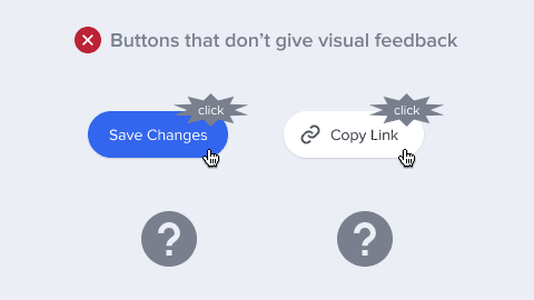
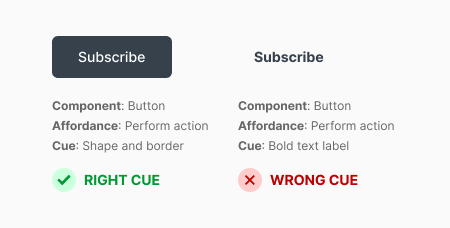
Buttons The Proper Visual Cues for Common Interface AffordancesFebruary 3, 20210 Comments What makes an interface intuitive? An interface is intuitive if users can use it correctly…