Buttons Don’t Use Inverted Color Cues on Toggle ButtonsJanuary 12, 20210 Comments A user made the mistake of posting their private information publicly. They accidentally set their…
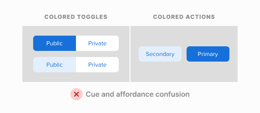
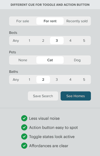
Buttons Why Toggle Buttons Should Never Look Like Action ButtonsDecember 31, 20201 Comment Toggle buttons should never look like action buttons. A common mistake is to use the…
Buttons Color Contrast Mistakes to Avoid on ButtonsNovember 4, 20200 Comments Imagine a user stuck with indecision when they encounter a pair of buttons on your…
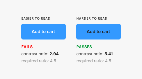
Buttons The Myths of Color Contrast AccessibilityOctober 16, 201966 Comments There’s a growing demand for designers to make their interfaces accessible to all users. It’s important to accommodate users with disabilities...
Buttons When You Need to Show a Button’s Loading StateAugust 16, 20197 Comments Buttons have more than an enabled and disabled state. They also have a loading state. The loading state isn't usually shown to users because most actions happen within seconds.
Buttons Why You Shouldn’t Gray Out Disabled ButtonsAugust 8, 201958 Comments How should disabled buttons appear when they’re inactive? The way most designers indicate an inactive…