There’s a growing demand for designers to make their interfaces accessible to all users. It’s important to accommodate users with disabilities, but there are many myths to color contrast accessibility being perpetuated by misinformed people.
They often parrot these myths to discredit a design, without understanding in which situations a color contrast standard applies. Not only that, but they assume an interface is inaccessible whenever color contrast is used to convey information.
Because of this, designers often feel the need to obsess over accessibility, and are misled into believing their interface isn’t accessible when it actually is. This article debunks common color contrast accessibility myths and sets the record straight.
Myth 1: The WCAG requirements are always optimal
The Web Content Accessibility Guidelines (WCAG) is a set of principles used as the standard for determining accessible color contrast. However, these guidelines do not always measure up in practical application. Instead of following them dogmatically, you should use them to guide your design decisions, not dictate them.
One case where the WCAG standards aren’t applicable is with the brightness contrast of white text. Both buttons below have a blue background, but one has white text, and the other has black. When you survey users on which button is easier to read, the majority will tell you the button with the white text is more readable (source). But the accessibility color contrast ratios tell a different story.
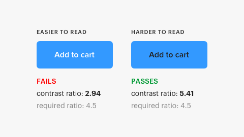
The contrast ratio for the black text is 5.41, which passes the requirement. However, the contrast ratio for the white text is 2.94, which fails it. According to the contrast requirements, the button with white text should be less readable, but it’s actually more readable.
A similar study comparing white and black button text confirms this finding. Not only did normal-visioned users find the white text easier to read, but color-blind users did as well (source).
This contrast inaccuracy seems to occur with white text on blue and orange backgrounds. The WCAG contrast ratios don’t always account for the high luminance contrast of white text. White is pure luminance with no hue or saturation, which is the strongest form for contrast. Because of this, it makes sense why the button with white text is easier to read (source).
The reason the contrast ratios failed with the white text is that it has high luminance and is on a background with high luminance. Light text on a light background is rendered low contrast computationally. Your design is supposed to satisfy what people see, not computational algorithms. It’s why the designer’s eye should always play a part in the equation.
The WCAG are intedned to help designers choose the right color contrasts. The adage “The map is not the territory,” applies here. Don’t confuse models of reality with reality itself.
Myth 2: Text must meet the AAA requirement, or it’s inaccessible
WCAG has different levels of conformity. Some believe that all text must conform to the highest level of requirements (AAA), or it’ll be inaccessible to a large portion of their users. This notion is false and is evident when you understand how the AAA requirement was made.
The AAA requirement constitutes a contrast ratio of 7:1 to compensate for contrast sensitivity loss by low-vision users with a vision loss of 20/80 or more. Many of these users employ assistive technologies that have contrast-enhancing features. They need this technology because they aren’t just viewing content on a single interface, but multiple when they use the web. The AAA requirement only applies to 20/80 vision loss users who don’t use assistive technologies, and represent a much smaller group (source).

A vision loss of 20/80 is rare among the general population and mostly affects the elderly suffering from age-related eye diseases. A study found that most low vision is related to aging (source). Visual acuity starts to decline among most users with healthy eyes at age 70 (source). If the majority of your user base is 70 or older, meeting some of the AAA requirements can benefit them. It’s not recommended by WCAG to meet all the AAA requirements because it’s not possible for certain content (source).
Meeting the AA requirement is sufficient for the majority of users. The AA requirement constitutes a contrast ratio of 4.5:1 to compensate for the loss of contrast sensitivity by users with a 20/40 vision loss. A study found the “majority of persons maintain at least fair acuity (20/40 or better) into their eighties” (source). This finding suggests that meeting the AA requirement will make your text accessible to the majority of users.
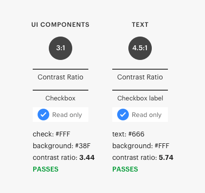
Myth 3: Interface components have the same contrast ratio standard as text
Many make the mistake of holding interface components to the same contrast ratio standard as text, when they are actually different. Interface components have a contrast ratio of 3:1, while text is 4.5:1. Text requires a higher contrast because users need to read it. Interface components don’t require reading and have a lower standard (source).
Many nuances affect text contrast, such as font size and weight. Large text sizes (18 pt) and text with heavier font weights (14 pt bold) require lower contrast ratios (source). Not only that, but certain interface components are exempt from the requirement. Before you hold an interface component or text to a contrast ratio standard, make sure you’re applying it correctly in the right situations.
Myth 4: Gray text and buttons are inaccessible and look disabled
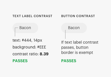
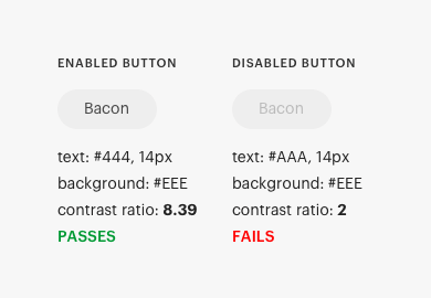
Another common myth is that gray text is inaccessible. Many assume users can’t read gray text because it looks low contrast. Sometimes this may be true, but other times it’s a false assumption. For example, the button below has gray text and some would assume it’s inaccessible. However, running it through a contrast checker shows that it’s not only AA compliant, but also that the ratio is well above the standard.
The other myth you might hear is that a gray button is inaccessible because it doesn’t meet the contrast ratio standard. It turns out the success criteria for buttons doesn’t require a visual boundary indicating the hit area. If a button with text has a border, there is no contrast requirement beyond the text contrast (source). Therefore, the gray button that most would assume is inaccessible passes the contrast requirement.
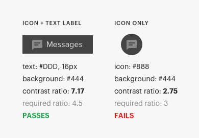
This success criteria also means that icons next to buttons don’t have a contrast requirement as long as the text label meets the 4.5:1 contrast ratio. However, if an icon is without a text label, the 3:1 contrast ratio requirement applies to the icon.
There’s also the myth that gray buttons look disabled, which is often parroted by biased observers who don’t understand the proper signifier for inactive components. Disabled buttons are signified by the lack of contrast to the text label. When a button is hard to read, users don’t bother with it, which is the intent of a disabled button. Not to mention, the contrast requirement does not apply to inactive components.
Myth 5: Color-blind users can’t tell the difference between contrasting colors
A common assumption is that if a design uses color contrast to convey information, color blind users won’t notice the difference. Color hue and color contrast are two different dimensions. Color-blind users have trouble distinguishing specific color hues. They don’t have difficulty perceiving differences in color contrasts (source).
For example, many would assume the buttons below aren’t accessible to the color-blind because it’s using color contrast to indicate different states. But the truth is that color-blind users can differentiate the contrasting colors quite clearly. The buttons only use one color hue with no others competing and have sufficient contrast disparity.
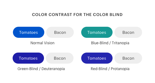
By using a color-blindness simulator, you can mimic what color-blind users see. Users with a red-green color deficiency and blue-yellow deficiency have no trouble seeing the difference in color contrast.
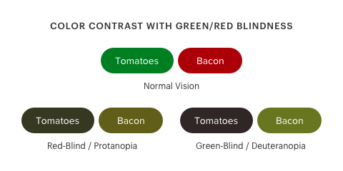
Color-blind users only have a hard time noticing color contrast when the colors are green and red, with nearly the same darkness (source). The example below shows what color-blind users would see if the buttons were red and green with similar darkness.
If you’re using competing color hues to differentiate states, you need another visual cue besides color. But if you’re only using color contrast to differentiate states, it’s likely accessible to color-blind users.
There are various types of color blindness, but the ones you should focus on the most are red-green deficiencies. Red-green color blindness affects more than 99% of all color-blind people (source). There are several color-blindness simulators you can choose from on Chrome extensions, such as Colorblindly.
Myth 6: Using a color cue alone isn’t sufficient in conveying information
This myth is probably the one that people get wrong the most. They’ll often cite the “use of color” requirement without recognizing when this standard applies. Keep in mind, there are nuances to these standards you need to understand before you start using them willy-nilly.
The accessibility requirement states that “color should not be used as the only visual means to convey information, indicate an action, or distinguish an element.” However, this standard only applies to cases where different colors are assigned specific meanings to inform the user (source). In other words, if you’re using color differences to convey information you need an extra cue. But if you’re using lightness and darkness to convey information, you don’t need an extra cue, as long as the contrast difference is high enough.
For example, the toggle tokens below use a blue color to indicate the active state, but there is no specific meaning assigned to blue. The active state is conveyed through the color contrast, not the color hue.

The color hue for the active state is arbitrary. You could use any other color hue, and it would suffice as long as it maintains a high contrast level to the inactive state. As such, the “use of color” requirement does not apply to this scenario.
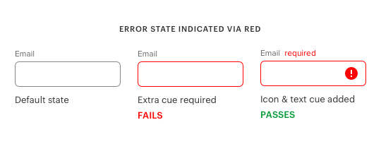
An example where color is assigned meaning is error states on form fields. Red is often used to indicate an error in a text field. In this case, red is not enough to indicate the error state because color blind users won’t see it. The red would appear black to them. Therefore, you need an extra cue, such as text or an icon, to indicate the error state.
Another example is using color to indicate system status on a page. The color hues green and red are often used to indicate the severity of system issues. In this case, the “use of color” requirement applies because specific meaning is assigned to the color hues. Icons are needed to help color-blind users distinguish each system status.

Color contrast isn’t always the only cue at play when it comes to states. Visual depth is also a cue that users experience. It occurs when objects contrasting with the background appear closer and dominant, while objects that lack contrast appear further away and subdued. The blue button in this example seems closest to users. As a result, the emphasis and prominence signify the active state.

It’s this play of contrast with the background that creates depth in the buttons and allows users to distinguish the active state. If both buttons had the same contrast level, users wouldn’t be able to perceive depth as a visual cue.
Myth 7: An accessible design meets the needs of every user on the planet
Every designer would love to meet the needs of every user on the planet. As much as designers strive for this, it’s impossible to achieve even if you followed every WCAG requirement. There are always some users who will find your design uneasy on their eyes.
Instead of striving for an ideal based on an unachievable fantasy, aim for one based on an achievable reality. The reality is that an accessible design can’t meet the needs of every user, but it can meet the needs of as many users as possible.
Understanding this truth means accepting the fact that a minority of users won’t have as good of an experience as the majority. But luckily for the minority, there are assistive technologies with high-contrast modes available to them. Designers who truly understand accessibility will strive to achieve the realistic ideal, not the fantasy one.
The Nuances of Color Contrast Accessibility
Accessibility should always be a priority when designing for users. The WCAG guidelines are an effective tool to help you achieve an accessible design of the highest standard. These myths are not caused by the WCAG guidelines. They are caused by people who misinterpret, misrepresent, and misuse the guidelines. It’s time to put these myths to rest.
Understanding the nuances of color contrast accessibility will help you meet the WCAG standards accurately. When others project color contrast accessibility myths onto your design, you can correct them. You’ll stay true to visual simplicity and aesthetics, while balancing them with accessibility at the same time. The result will be an inclusive interface that satisfies nearly everyone.
Book

Affiliate

Re number 1, a better question to ask would probably be, “Do you have trouble reading any of these buttons?” And then you would ignore the answers from the people who can read both buttons and only focus on the people who actually cannot read one of the buttons (or both).
It is possible that people who can read both buttons prefer the white text (e.g., because it’s more appealing) but that people with vision problems still can’t read the white version at a higher rate.
Read the study that tested with color blind users. 61% preferred the white text button.
Accessibility isn’t about what the majority prefer.
in this case its the majority of the minority though
Accessibility most certainly is about what the majority of people for whom accessibility is an issue prefer.
Color contrast is not just about people who are color blind. It is about people with low vision. Visually acuity <20/200. Many vision conditions have issues with contrast even when the person is not color blind. I am actually truly color blind, Achromatopsia only grey scale, all the others conditions are color deficient, and in Myth 1, the first example the black writing was absolutely easier to read than the white.
@antony Absolutely. I am (light) color blind myself and prefer white text. Besides, I see that the adsense ad on this site does the same, and the blue bg of its button is much less contrasted than that of the validation of the comment of this site.
Asking if you can read it yourself, and basing your judgment on that can be a big mistake, especially if you’re under 40 with normal vision.
I’m color blind with poor vision.
I can read it.
Clearly, opinions on point no. 1 are divided. Anyone any suggestions what a correct way to test this is?
Yes, opinions on #1 are divided. And with good arguments. Preference doesn’t equal performance. The best way to have a strict “test” for it, is to follow the standard. If you think your design decisions can incorporate the white-on-light-blue design and it won’t be a problem – then do some direct focus group testing. The author has a point that in general strict rules often sweep things that are otherwise acceptable into the “inacceptable” pile. But that’s what a strict rule does; it applies a generality to a subjective situation. I wouldn’t object to trying the non-compliant option, if users preferred it. But I would document how I tested it, and was able to validate that it still had appropriate contrast so that no one had difficulty with it.
White on light blue is horrible for people with vision impairments
Asking a direct question like that will lead to bias results. When you ask ‘do you have trouble reading any of these buttons’ – you are suggesting to the participant that there may be something wrong with some of them. Better way would be a preference test with a follow up question: tell me why you prefer this? Or asking participants to tell you about the website, indicating anything that comes to mind.
To also address Thomas’s comment about preference vs performance – I did preference tests, as stated above, by also asking participants to explain why they prefer what they chose, and often people focus on visibility immediately. Therefore you can’t separate preference from performance because often preference comes down to usability. When you have very similar buttons, for example, same colours but you are assessing if users prefer rounded of square corners – this is where a pure preference comes out but in such cases, the difference doesn’t impact function in any way.
Towards the end of this informative article our attention is drawn to an example where blue and depth play a role. Did that example graphic not get loaded properly?
Thanks. The many hiccups to publishing articles.
@anthony,
I think what Šime Vidas is (correctly) point out is that there is a difference between preference and performance.
I concur. I had cataract surgery by age 40 (very young) and since have noticed tremendous difficulty reading in certain color combinations, despite having excellent color perception (I ace every color test). I’ve been building accessible websites since 2005, and always found white text easier to read on buttons than black, but would always default to whatever my color contrast apps told me was “correct.”
Has anyone made a tool, that takes something like the blue button… and it computes for you what the best color text is to use with it?… possibly from a set of colors?
I agree that the white text is much easier to read (at least for me), but I’d like to get some insight as to where the threshold is. Backed with the scientific data. e.g. the contrast ratio is part of the picture, but what else is going on.
I think it is that the blue is 80% saturation of the color… vs. white being essentially 0% saturation… but I’m guessing at this point.
I have. The key is color luminance. Every color has a specific brightness perception. Blue has the lowest brightness perception and yellow the highest.
Tools like the HSL color picker calculate the luminance for each color. Good contrast is given for a luminance delta greater 30%.
http://www.workwithcolor.com/hsl-color-picker-01.htm
Hi, this is interesting. Why luminance delta greater 30%? From where you have this data?
I am currently playing with LCH color palette. Maybe calculating in that way is more proper method than WCAG method we know – but I need to know more about that you wrote 😉
Testing some of these examples with a vision simulator makes me question the author’s conclusions. A majority of users might have a preference but accessibility isn’t about preference its about access. Try testing some of these examples with a Deuteranopia or Protanopia simulator and you can see why the contrast is so important. Looking at the examples above I personally preferred the white text and found those buttons more easy to read (I have fairly decent eyesight) but I could still always read the black text. When I started running these examples through various vision filters the white text suddenly became a lot harder to discern, almost unreadable in a couple cases, while the black text always remained legible.
Good article and I agree with a few of the points. The WCAG is often misunderstood which leads to confusion about how to pass a particular criteria. The examples in the article show the weaknesses of relying on automated testing only. While automated testing is great and helps catch issues, it’s only part of the process. Each myth is debunked by manual testing which is why manual testing is a definite must because automation, as it is now, is no match for an actual user.
I greatly disagree with the dismissive view that only old people are blind. As if that were an excuse to not be working toward a11y spec, it’s just wrong. If you happen to be a young person with limited vision, you would be in conversation with people who have shared experience. Temporary loss of vision is shockingly common, to which I can personally list more than a handful of people under 40. I call asshole on this article.
Hi Anthony,
Interesting Article. I presented a number of these points as a bug/issue to WCAG on GitHub (#695) early this year, and am the WAI invited expert on Color Perception, presently developing the new web visual contrast standards to address several of the issues you mention here.
DISCLAIMER: My comments to you below are mine and do not necessarily represent the W3C or WAI — the new standards are far from final! Nevertheless, I’ll address just a couple of your comments to discuss some misconceptions and also how we are working to fix this situation to provide a more robust and accurate color vision model and standard.
1) Regarding point 1, “brightness” is not the “strongest contrast” because brightness isn’t a contrast — “brightness” is a relative perception of light.
As a coincidence, the white text on orange button is the weird error that caused me to begin investigating the issue. I am on record as pointing out that the WCAG math does not correctly adapt to the polarity of light text on dark, though not for the reasons you indicate.
1b) No Wait I said BUD LITE! …. — You said “Bright text on a bright background is rendered low contrast computationally.” I’m not sure what you mean there, but for a given sRGB color difference the light text on dark will have a perception of higher contrast vs the dark text on light BG due to the complicated psychophysics of the human vision system (HVS), factors may include light adaptation, local adaptation, contrast constancy, surround effects, etc. depending on the specific situation.
Think about it like this for a rough incomplete answer: if you have a white web page with black text, your eye mostly sees the bright white, your pupil contracts smaller. If it is a dark page with bright text, the majority of the page is the dark, and your eye adapts to the dark. If you are is dark adapted, then a given lighter stimulus will seem brighter. Think of being in a dark theater for a Saturday matinee, then stepping out into the noon sun for the extreme example of dark adaptation and bright light, LOL.
1c) MATH WOES: The method used for the WCAG 2.x contrast is, as I’ve discussed elsewhere, inconsistent with human perception models. When the background is white #FFF, then the math method is “most accurate” but as the brightest color of the pair gets darker, the contrast value reported becomes less accurate in relation to human perception. The reason is the current math is a simple ratio, it is not Weber nor Michelson, nor any other perception model, so it is essentially linear relative to light (with a tiny dark offset), it is not linear relative to perception.
Even if it was, it would still need an offset for positive or negative contrast polarity, because polarities are perceptually different for the same color distance when the stimuli is less than 50% of the total area. And therein lies the rub,. See my site for some live experiments and further explanation and links.
1d) IT’S NOT THE COLOR it’s how you use it… And the effect you describe is NOT limited to orange or blue — it is related to the luminance value. With the example you posted, the equivalent greyscale is #979797, and you can even try green with #12AF2A and get the same effect. Here’s an image I created for demonstration, with Y and L* values displayed:
https://www.myndex.com/WEB/images/Ycompare
2) ACUITY: As for the way the WCAG understanding — it was written in terms of acuity but also led to misunderstanding. Your comments regarding acuity and age are not accurate, It’s a common misconception. First of all , for all intents and purposes 100% of people will have impaired vision by age 45, and vision impairment is currently a problem for HALF the population in the US. Vision does not just fail at 70, and that’s a misinterpretation of the literature. Yes it is true there is an acceleration over age 60,
Further your assertion that 20/40 thru 20/80 is a miniscule portion of the population is also odd, as it is ~4 MILLION in the US, 1.5 million have LOW vision which is WORSE than 20/70, and 1 million are legally blind (20/200 and worse).
But more to the point, acuity does not even begin to account for the complexity of the HVS, and contrast sensitivity function (CSF) is becoming the more salient indicator, Expect to see more documentation on CSF, and levels based around CSF.
Moreover, acuity is not the level needed for efficient reading. Even if you are 20/20, the size text you can see at 20/20 needs to be at least twice as big for best reading, and this isn’t even considering contrast perception. More on contrast in a moment.
3) CONTEXT RELATIVE GUIDANCE I think you’re going to like the changes that are being developed here is all I can say at the moment. But part of the plan is improved flexibility for designers/authors.
4) SPATIAL CONTRAST and GREY TEXT … Actually, grey text relates much more to spatial frequency and is I think the single most misunderstood aspect of perceptual contrast.
In 1982 working in the layout room of a tiny local paper, before DTP and WYSIWYG, we had to send things out to be typeset, and we’d get them back in a day or two, cut them up with razor blades, put hot wax on the back, and stick the pieces onto a nonrepro blue grid paper on a light table…. … UPHILL BOTH WAYS!!
And did we ever use grey text? No, of course not. It would take a separate plate for grey ink since you can’t half-tone a column of body text to make it grey!!, If someone in the layout room suggested grey text, they’d have been laughed out onto the street.
Today all you have to do is flick a couple hex values into CSS and presto, INSTANT BAD DESIGN CHOICE.
PLEASE STOP USING LIGHT GREY ON SMALL THIN FONTS. !!!
Yes, “technically” it meets the current standard, but that standard was written before Google fonts and the new @Font-Face method which totally opened up the font cavalcade of bad design choices! Just because a really thin font exists does not mean it should be used at 16px in a column of body text!!!
Work is being done to address this. In the meantime, it is BAD ADVICE to claim that you can have light grey body text.
Expect changes here … In the meantime, blocks of body text, like the text in this message editor, are higher spatial freq. and need much more contrast than the current standard defines. We are currently working on new functionality to balance this and actually expand designer flexibility.
CONTRAST FUNCTION:
High spatial frequencies need more contrast, lower need less. A big fat bold headline with an 10px stroke width is low frequency and could actually work well at less than 3:1 (this will fail the current standard however). ON THE OTHER HAND, a column of body text Helvetica at 16px and a weight 200 needs more than 9:1 if antialiasing is turned OFF (use auto, subpixel only, but not smoothing or greyscale aa on thin fonts). If antialiasing is turned on for a small ultra thin font, then even #FFF and #000 is not enough because the webkit (greyscale) antialiasing blends so much that even 21:1 becomes less than 4.5:1, look for new guidance on this hopefully sooner than later.
UPSHOT: Never use font smoothing or webkit antialias on fonts less than normal weight that are set smaller than 24px. And even with AA off, 4.5:1 is not enough even for NORMAL 20/20 acuity. The RECOMMENDED WORLD STANDARD (ISO) for body text is 10:1 (oh yea, there are many more standards for this than just WCAG: ISO, IEC, ANSI, and they recommend even more). Even 7:1 is not enough for a website using thin body text like 200 weight and smaller than 24px. A reasonable target is as much as 10:1 or more, depending on several other factors. 4.5:1 is not even a useful minimum for normal eyesight.
5) Actual “Color Blind” is very rare (I am talking about achromatopsia) — the more common Protan, Deutan, etc are color vision deficient, but they still do see colors, just a radically reduced gamut, and trouble distinguishing between certain color pairs. Color “blind” is not really accurate.
So yes, for the web author, it is mainly important to ensure adequate luminance contrast for color vision — but also for ALL users. Classical design has the saying “make it right in black & white” meaning that a design should work when printed in B&W, with color only an “added garnish”.
Also, the CVD simulator you used doesn’t seem to model the protan condition, where red becomes darker. I have a simulator based on Brettel that is considered a very accurate model, you’re welcome to try it out (you can upload images and see all CVD types at once)
https://www.myndex.com/CVD/
I hope these comments improve understanding in these complicated areas of vision and perception. It is abstract and easily misunderstood. Please email me if you have any questions on the subject.
Best Regards,
Andrew Somers
Senior Color Science Researcher
Myndex Technologies
Wow! What a reasoned and thorough response! Thankyou
Hi Andrew — what an excellent, thorough response you gave! I would love to explore with you something that’s been nagging at me about color contrast guidelines, but your email address here is visible only to Anthony. I looked for you on Twitter and found about two dozen Andrew Somerses; couldn’t figure out whether any of them was you. Would you contact me, please? My Twitter handle is @ebuie.
Hey Andrew,
do I understand you right with 1b) that the color *around* the orange button (or rather the main color of the webpage/actual screen) matters?
That was at least my impression reading Myth 1 and a short test with MS Paint confirmed that concerning my personal perception 😉
Your explanation mentioning pupil contraction sounds appropriate to me…
Best,
Konstantin
Hi Andrew, thanks for all this awesome science. Question about the Myndex website you posted. The shadows/glows on the text are KILLING my eyes. Is this part of the lesson? Like it’s supposed to help users without visual impairments know what it is like to have one? Serious question. I can hardly see my screen after looking at this website for a few seconds. Is it something I can turn off? I’m just going to assume it’s an intentional part of the experience, otherwise it would (obviously) be the complete opposite of accessible.
https://www.myndex.com/WEB/Perception
@anthony – I’d strongly recommend updating your article to reference Andrew’s comment here, or pointing to it. His work is the basis for evolving WCAG standards that validate some of your points. Your article ranks highly in search results, so signal boosting this message is both useful and important. The official WCAG github workspace hosts the issue that he raised, which details the work that’s gone into this new standard. It can be found here: https://github.com/w3c/wcag/issues/695
Are we saying WCAG standards are theoretical garbage?
If I update a site with to reflect higher contrast ratios and then the majority of Stakeholders & Users complain that they prefer the old version, my butt is looking for a new job.
Part of user experience is understanding a Spring Salad has so many health benefits over a Double Bacon Cheeseburger but guess what my restaurant is going to be selling to make people happy (and make money)…
…except that taking the example of restaurants, some have been taken to court over inaccessibility. Although the cases I know of haven’t been colour contrast specifically, accessibility is a bottom line one way or another. Best to have the burger and the salad =].
As one person working with WCAG has replied, there is room to improve the testing. The real take away is to use WCAG as a guide. That to automate with a basic contrast checker may throw up false positives and for now must be navigated thoughtfully.
A good starting point for designing accessible websites would be to use black text on a white background or vice-versa. And not e.g. #33333 on F2F5F7.
Given the information provided, how would you suggest companies who have gone through WCAG accessibility audits and are held to their exact standards address situations like white text on lighter, more saturated colors like the button examples above?
Is there a way to justify those decisions while remaining compliant to the WCAG requirements?
Good question. First, you have to educate your company not to look at the guidelines as black and white. There are nuances to them, which is why they are referred to as “guidelines” (a general rule, principle, or piece of advice). Use them to guide you in the right direction, but exercise some discernment as well.
Second, you have to demonstrate the validity of your discernment by testing your buttons with users. When you present your data, you have to be specific about it, not general. Specificity leads to deeper insight and stronger arguments.
For example, the study on the button colors showed that the majority of color blind users found the white text button easier to read. The only color blind users who found the black text button easier to read were those with Monochromacy / Achromatopsia. You start asking more questions that inform your decisions. How common is Monochromacy? How many of our users have it?
You make some good points but, to me, you don’t really understand accessibility, and the fact that you seem to be very focused on colorblindness is odd. That’s just a part of accessibility, even one focused on vision. The goal of making a website or any other thing accessible is to make it working for the tiniest percentage if you can. If you start thinking about how many people have this and that and how rare it is, then you might as well design your website however you want because what you’re doing is not accessibility: it’s just gauging how many people you can afford to exclude because you or your employer don’t care. You gave a perfect example when you explained how using several types of cues like text, iconography and colors can be better. This is being creative instead of seeing accessibility as a constraint and that’s the key to making this work. This is taking into account that you’re trying to make it work for all kinds of brains from the ground up: people who don’t see the colors the way you do but also people who don’t have them mean the same thing in their cultures, people who don’t react to color cues, people who have issues with iconography, people who do not speak the language very well,… Of course, nothing will work for everyone. But it matters that you try because this is how you find creative solutions and reach users you never knew had issues with your design in the first place.
BTW I don’t fit into your percentages. I’m not colorblind but I usually don’t see teal-ish colors like most people, I have good vision because I have had laser eye surgery but not a perfect one. It has also increased my sensitivity to light (a common side-effect of Lasik with halos). I wear glasses with a light correction when I’m on a laptop because it’s a bad distance for reading and I need them. I hate white text on blue. It hurts my eyes and I do find it more difficult to read especially if it’s small or there are many words. I find your website font too small and the contrast in this text area I’m typing in too low because the grey is too light. It took me way too long to type this and check it over for mistakes and I wouldn’t do it again.
It’s categorically false, and not supported by your source, to claim that green vs red is the only color combination that’s difficult to differentiate for the most common forms of colorblindness. Blue vs purple and green vs gray are especially common difficulties as well. This is a reckless false claim.
Indeed. I think the problem derives from the somewhat known phrase “red-green colourblind”. It’s true to say that 99% of so-called colour blind people are red-green colour blind, ie. they are deutans or protans (like me), meaning we find it hard to distinguish between reds and greens. But the misunderstanding is that any colour with a red component eg. purple, pink, brown is also equally hard to determine – the problem is not just between red and green.
Don’t get me started on multi-colour LEDs that attempt to indicate status by glowing one of green, yellow or orange – all of which are indistinguishable to me.
I found this article useful in highlighting how important user research and user testing still is in the context of applying the WCAG guidelines. As an app developer, you have provided some good examples I can use with clients to explain to them why these aspects of the process remain critical to designing a product with an exceptional user experience for the targeted audience.
The points about the flaws in WCAG’s contrast guidelines seem thoughtful and well researched, but I’m afraid they’re rendered moot by the fact that organizational guidelines and legal precedent are increasingly requiring strict AA compliance. Compliance is likely to be measured by automated tests carried out outside of the control of the UX/UI team. The ability to back up the rationale behind not meeting full compliance is irrelevant to internal pencil pushers who need audit documents based on “industry standards,” or someone planning a lawsuit. I wish the most rational approach would be widely accepted and WCAG would update their guidelines, but for now I can’t recommend submitting non-compliant deliverables without potentially exposing clients to liability.
Let’s go throught each myth.
Myth 1 : Yes, you’re right. The contrast ratio isn’t optimal every time, but the requirements explicitly said to reach a contrast ratio of at least 4,5:1. The formula could be modified in the future. It may be a problem but is definitely not a myth.
Myth 2 : Nowhere in the world AAA requirements is required by regulations.
Myth 3 : You’re right.
Myth 4 : Gray text and buttons actually look disabled. If you’re using disabled buttons, add the attribute disabled. The result will be accessible.
Myth 5 : I don’t know enough about color perspection to have an opinion.
Myth 6 : I don’t like your first example, but the second and the third examples are correctly exposed your point. Your last example isn’t accessible: visual depth and prominence aren’t taken into account for accessibility.
Myth 7 : You’re right. A design which meets the needs of every user on the planet is a inclusive design. Inclusive design isn’t 100% compliant to WCAG.
You clearly do not understand what you are talking about. In the EU WCAG 2.0 AA compliance is required for a lot of sites. You can not ignore that because the “designers eye says it otherwise”. Not all people are color blind, some are blind. Believe me, they do not see colors. You have to convey the same information by other means.
A lot of hemming and hawing on here over the details – I think something that is easily ignored is (and I forget the official term here, but let’s call it) “Responsive Accessibility” – it’s a bit of a different paradigm from traditional design “rules”, but one that I think can greatly aid in making websites more accessible for a reflective majority of users.
If the one constant in this discussion is change/differences in human perception, why not let the users tell us what they prefer, and then let them do that?
Sitepoints accessibility navigator (bottom left of page) is the best example of this concept applied in practice that I’ve seen – I’d love to know if there are others. You can check it out here: https://www.sitepoint.com/
(disclaimer, I am not a UX expert, but felt inspired to chime in)
The article itself is excellent … only from myth 2 onwards, nothing is myth, but fact … (but I agree that the word myth causes more clicks … :)), already about myth 1, You are wrong to treat linked studies as key references and completely ignore the actual success criterion data, including mathematically explaining the effects and motivations of choosing contrast ratio (https://www.w3.org/WAI/WCAG21 /Understanding/contrast-minimum.html). But the article itself is good, as it brings a lot of information to the designers who are starting their studies in the field of accessibility … except that especially for myth 1, there is an issue not taken into consideration that it would be simply a change of background and not From the text … tools like Tanaguru (https://contrast-finder.tanaguru.com) can be very helpful in this regard.
Regarding number 4 part 2. I would disagree that the contrast requirement doesn’t/shouldn’t apply to disabled buttons. (Which I suppose is referring to the WCAG guidelines rather than the authors opinion)
The disabled state does not mean it doesn’t have to provide information and therefore doesn’t need to be read.
For example the elements could be links to other areas of the site to explore but are currently locked or a submit button for an invalid form.
Would you say that because those areas or actions are not accessible (pun intended) to the user they shouldn’t be able to see them?
A good test would be if the designer thinks that an element doesn’t need to be accessible, do you need to show them to fully-abled users?
If so, they need to meet guidelines as everyone should be given the best chance to read them.
If not, why are you showing them in the first place?
You are correct. There is no provision exempting active user interface component from compliance. It’s exempted only when the is ‘inactive’.
There’s disabled and then there’s inactive — similar but different. Understanding this is about seeing the NUANCE.
For example, the gray toggle tokens are inactive, but not disabled. The text label is readable because they are available for activation in the current context. The text label on a disabled button is not readable because it cannot be activated within the current context.
I’m glad you are writing (and, I assume, care) about web accessibility, so thank you for that. However, parts of this piece are problematic.
My big problem with this article can be summed up in the following excerpt:
“Instead of following them dogmatically, you should use the guidelines to guide your design decisions, not dictate them.”
It’s not good advice to say that this. WCAG AA has to be followed in many geographies because it is a legal requirement. Telling someone otherwise is very misleading and dangerous. WCAG AA should be followed as written in order to prevent any legal issues down the line.
You have a few good points in this article, but it is hampered by this and related flaws. I hope you will consider having someone who does accessibility audits for a living go over it to ensure all the information is 100% accurate and to minimize any legal risk to anyone reading it.
My $0.02
Maybe this is waxing philosophical a bit, but is it Anthony’s job in writing this article to protect his readers from legal harm? Is there actual legal risk for someone to read this?
I’m not saying that there aren’t legal repercussions for not following WCAG. I’d argue that very few humans on the planet are empathetic enough to undergo the cost of accessibility compliance out of sheer goodwill for differently abled people. Most of the time it’s because they don’t want to face legal issues. That backbone of legal compliance then gives some of us in the industry the space to be more empathetic, because we have to be. So that requirement definitely exists. And it can be very costly to ignore it.
I’m just not sure it has to rest on Anthony’s shoulders whether we choose to follow WCAG or not. The article takes an opinionated tone and approach to interpreting WCAG standards, but there’s nothing here that would hold Anthony liable to someone else choosing to take that risk themselves. I can see how people might THINK he’s liable, but at the end of the day, we’re adults and professionals. It’s up to you (and your employer) to balance the risk/reward of your design choices and the impact they have on legal risks.
So I guess all that to say to all the designers/developers reading this comment on a dated blog post: If you’re unsure about whether you HAVE to follow WCAG to a certain degree, now would be a good time to go research that. You might be legally required to follow those standards as rules. If not, understand the tradeoffs you make for some of your users if you break the standards. Decide for yourself if it’s a moral issue to leave those users with a lesser experience.
Anthony – Thanks for contributing to the discussion of accessibility. I don’t agree with everything you’ve said, but some stuff is really helpful and I appreciate the work to gather your thoughts and engage in the dialogue.
First of all, you broke the freaking rules about accessibility right here in your own article about it. Look at the “Required contrast” text in the first graphic for example.
I have to question your motives for writing this article if you yourself aren’t going to adhere to accessibility standards.
The reality is 99.99999% or more of the demographic for most web sites are not vision impaired and light colors encourage sales. When considering ROI and design choices, market forces take a priority over accessibility, and that has always been the case.
Perhaps future browsers could have accessibility features which recognize low contrast buttons for example, and “fixes” the colors to be more visible. This should be possible with existing technology today, tho it might not be as instant as a normal page load.
Perhaps what I’m about to say will be considered heresy against the ‘Gods of Accessibility’ and I should probably be burned at the stake for even thinking this.
No one has brought a lawsuit because they believed a font color was too light to comfortably read. Therefore, how far should we bend backwards (aesthetically speaking) to satisfy 4% of the population who have some degree of color blindness?
I’d argue, not that much.
I’m going to assume you just didn’t think to bother with a cursory Google search before writing this comment.
I don’t know why you’d feel comfortable denying access or causing pain to a portion of the population but the fact of the matter is that, without a means to process the internet, those who are vision impaired cannot access it. Delilah, above, wrote out a comment explaining this very thing with a concrete example.
Being incapable of easily accessing the multitude of services the Internet can provide – many of which can be crucial to easier maneuvering through life – seems like a steep thing to forego because, God forbid, something isn’t aesthetic.
I agree, Kevin probably didn’t google accessibility lawsuits and how expensive those legal cases can be. Dominos Pizza is a good place to start.
At the same time though, it’s not helpful to shame him into compliance either. If disability can fall into a spectrum of severity (some people have mildly poor vision… some people are completely blind), and users’ relative convenience/need to have accessible content can be on a spectrum (the black/white text on a button for a CTA on a consumer website… compared to the color contrast and labeling on medical equipment), then it’s also logical that designers are going to have a spectrum of urgency when complying to WCAG standards. That spectrum should simply be prioritized relative to the other spectrums at play. Accessibility isn’t lost in the equation when we acknowledge that sometimes designers make choices that aren’t 100% accessible to every human, there’s probably valid reasons why they feel like that’s the choice they should make.
It’s comments like these that make me think that while a11y work is extremely valuable, has net benefits on products, and can make the things we build reach more people, there’s an underlying moral superiority/elitism to those who place accessibility as the highest good. We’re all trying to figure out the push and pull of creativity and compliance here; if you’re framing someone else’s lack of concern as wanting to “deny access and cause pain” that kinda tells me more about your moral superiority and less about whether you think Kevin has a valid claim to sometimes prioritize aesthetics over other factors. And that’s fine. We need more a11y evangelists convincing people that it’s worth the extra effort. Just realize that if you can’t empathize with a group of people who have priorities different than yours (a designer focused on aesthetics), maybe you’re a bit more like Kevin than you realize.
This is incorrect. People have brought these suits and forced many organizations into settlements as a result. The WCAG AA is considered a minimum accessibility requirement and the ADA has been used to successfully file suit against organizations that have large bodies of text on their websites which fall below the AA standard.
So if we can’t or don’t wish to use the courts, our accessibility needs don’t matter? The legal system has its own cost and accessibility barriers.
The WCAG standards are a compromise between accessibility, sometimes diferent accessibility needs, and standard web design. For example, they don’t try to ban common seizure and migraine triggers, but for the AA and AAA standards, they limit some of the worst triggers. One concern is that if they do try to ban them, more people will ignore the standards or undermine the standards.
I find higher contrast is more likely to give me migraines, even if they’re less likely to give some other people eye strain.
There can be a legit conflict here, but if browsers can support user settings, and sites work with these settings that could help.
There can be similar conflicts over animated top bars/headers, like this site uses, blinking cursors, buttons zooming on mouseover, autoscroll, smooth scrolling, non-scrolling top bars/headers and side bars, zooming maps, differences between largest and smallest font sizes, font choices, modals, repurposing page up and page down for other nav functions, and so on.
There seems to be the idea that the same web site should look the same for all readers. And that browsers don’t need built-in accessibility fixes, and can periodically break user settings, user css, add-ons, and other fixes. But it seems to me that the best option is to design web sites and browsers to work with users’ accessibility preferences. And browsers to be as widely-accessible as possible while users set up those preferences.
Bizarre !.
The dark “Add to Cart” here is much easier to read than the white.
As for the “source” it turns out that the two blue buttons were on a dark background – so hardly surprising if the white version was more popular there.
So NOT a fair or objective comparison.
Color winnows humanity’s perception regarding the world and alters their relationships with their surroundings. The relationship between humans and colours has been around for eons and evolution has embedded it so deep into human subconscious that its dormant yet active hypnotic potential makes it a worthy asset for any visual communicator.
Worth reading your article and i would to know your feedback on for the same: https://www.hiddenbrains.com/blog/colour-psychology-how-to-pick-the-right-colours-for-your-app-design.html
Thanks for this wonderful article. Hope you don’t mind, i borrowed some bullet points from here for my seminar. Thanks.
Question: on some of these button examples, the text is at least 4.5:1 contrast with the button color, however, the button color is not 3:1 with the site’s background color it’s sitting on (in these cases, #ffffff). Does the button’s color need to have a 3:1 contrast ratio or does it only matter if the text has 4.5:1 with the button color?
Contrast on the text label takes priority over the button because it’s the element users read to identify the action. If your button label passes the 4.5:1 contrast, your button doesn’t need to pass the 3:1 contrast since the label acts as the primary cue. However, if your button doesn’t have a text label, it needs to pass the 3:1 contrast.
Text/background color has long been a requirement, but WCAG2.1 now specifies that non-text contrast, in this case the button’s shape, should be 3:1.
The takeaway from Myth 1 is that the button colors need to be adjusted, not that white text is better than black because it is more readable.
Hi Anthony, Thanks for this Interesting Article. Opinions on point no. 1 are divided. Any suggestions on what a correct way to test this is?
If Large Text Passes and Normal Text Fails, can this be Level AA compliant?
Shoutout to Jon Wojo. His comment on user experience are golden.
2.3 Is adding in a bit of exceptions if user controls are being added.
My advice is have a color key for your site and an option(s) to switch the color key to colors at the appropriate Contrast level, flip the white text to black. Target your user community.
You have to be careful with tracking or providing an alternative site because PII/PHI/disability regulations.
I know this thread is old, but thought my comment was relevant to an open discussion and given WCAG 2.3 is coming.
Great post Anthony! Today, I learned a lot from this post.
Hi Anthony,
Great post!!
Is there any automated test tool that actually corrects for the qualitative real world results for actual visually disabled users?
Your post is very important for any designer who cares about “real world” accessibility vs theoretical mathematical models that are too simplified to account for the way color blind & noncolor blind human eyes actually respond to light, as the cited source article explains.
My design work in the past for elderly users with various eyesight issues confirmed Myth 1. Just like our example, I tried to follow WCAG with dark text on colored buttons, and it completely FAILED with visually impaired users. When I switched to white text on Blue, WCAG failed, but my results clearly favored the white text on blue.
Cheers,
-Bill