Personas are a useful UX tool for summarizing research data. Designers create these character profiles to humanize their findings and insights for project stakeholders. This is to help guide their decision-making toward meeting user needs.
But there’s one major problem with personas nobody ever talks about. And it’s wasting your time, keeping you from designing for users, and preventing stakeholders from making correct design decisions. Failing to address this problem could cause your company to lose money.
The big problem with personas is… nobody uses them.
If you were to track how many people reference your personas after distributing them to your team, you’ll find very few do. Most will glance over it, mentally appreciate the information, and never pick it up again.
All that hard work—wasted. This isn’t how you want others to treat your personas.
Hard to Reference & Unusable
Your team members need to refer to your personas in discussions to ensure their decisions meet user needs. But most will rarely reference personas throughout the process.
The problem isn’t with other people or your research data, it’s with how your persona is presented. You were taught that personas are supposed to be a certain way.
It needs:
- A written bio
- Demographics
- Stock photo
- Personality attributes
- Motivations, Goals, Frustrations, etc.
But that way has made your personas hard to reference and unusable.

Say No to Wordy Bios
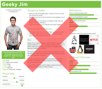
Here’s an example of a typical persona. It looks informative but the wordy bio overloads it with too much text.

If one were to reference it, they would have to wade through layers of text to pick out the essentials. This is overwhelming to do and time-consuming. Leave wordy bios out of your personas because they turn people off off from using them.
Fictional Users Cause Confusion
When project stakeholders see a persona for the first time, what questions pop up?
“Who is this user?”
“Is he or she real?”
“Why are we designing for this one user persona?”
“How can this one user represent a user group?”
“If the research data is real, why is this user made up?”
“Why do we need to make up a fictional user?”
“Huh? I’m so confused!”

Whether people verbalize their confusion or not, you still have to go through the trouble of answering these common questions. It’s easy for people to misconstrue the concept of using fictional users when what they’re being presented looks so real.
Their expectation when viewing fictional users is that the data is also fictional. But in this case, they’re told the data is real but the user is fictional. This confuses them and makes them wonder which bits of information are actually made up. If they have to wonder this, they won’t trust your persona. And if they don’t trust it, they won’t use it.
Stop with Demographic Minutia
Personas contain demographic data to get people to relate to the user. But by the time they’re ready to use a persona, they’re already past the point of learning about the user. Now it’s time for them to design for user goals—and that’s when personas come into play.

When your team members reference your personas, they’re not looking for demographic data because that doesn’t influence their design decisions. Instead, they’re looking for task-oriented details on how users accomplish their goals. Knowing the user’s age, sex, race, occupation, income, location, and hobbies is utter minutia.
Demographic data have a place, but they don’t belong on personas. Save the learning info for your slide deck. Personas are for quick and actionable referencing.
Skip the Chart Junk
If you have subjective bar graphs on your personas, it’s no wonder why people don’t use them. What do ambiguous graphs for personality, motivations and preferred channels say about specific user goals and priorities? Nothing, it’s useless chart junk that distracts from the essentials.

Again, they’re good on slide decks, but they don’t belong on personas.
Reinventing Personas
To make personas usable, we need to remove these defects and focus on the essentials. Your personas need to have these five essentials:
- Concise snippets of information
- Clarity on who the persona represents
- Insight into user goals and priorities
- Details about their tasks that frustrate them
- Details about their tasks that delight them

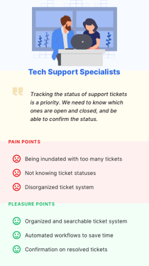
If we were to put these altogether, we would get something that looks like this. Notice the difference in information quantity and how much easier to reference the new persona is. Let’s look at how the new persona includes the five essentials.
1. Concise snippets of information
The more information you add to your personas, the less people will want to use them. The new persona eliminates the wordy bio, shows only the essentials, and keeps the noise out.

Think of personas like a cheatsheet. Cheatsheets are referenceable because all it contains are lists of bullet points organized by category. This makes the information actionable and quick to scan, which encourages people to refer to it.
2. Clarity on who the persona represents
Stock photos are out because they trick people into thinking the persona is of a real user when it’s not. Instead of using realistic photos, use contextual illustrations that depict users in their activity environment.

For example, when creating a persona for “tech support specialists,” an illustration of someone working with others on a computer provides visual context to make it more relatable. Labeling the archetype by user group instead of an individual’s name further clarifies who the persona represents.
3. Insight into user goals and priorities
Knowing what’s highest priority to users and what they’re trying to accomplish is important. A brief description of this in the form of a goal quote gives the feeling that users are voicing their needs in a candid way.

4. Details about their tasks that frustrate them
As users work to accomplish their goals, they’ll perform various tasks where they may experience frustration. Detail these frustrations in a bulleted list called “Pain Points.” These are the specific problems your team needs to solve.

5. Details about their tasks that satisfy them
Users may also experience satisfaction as they perform their tasks. Detail these experiences in a bulleted list called “Pleasure Points.” These are potential features that would help users accomplish their goals quicker and easier.

When you cut the fluff out and add the essentials together, you get a usable persona that’s referenceable in design discussions and decisions.

It’s important to remember that your personas should always:
- Be based on actual research, not made up info
- Represent user goals and problems, not biographic or demographic profiles
- Contain insights that are context-specific and task-oriented
Persona Patterns
If you like the reinvented personas in this article, you can get them as customizable templates called Persona Patterns.
Included are 40 custom persona templates for the most common user archetypes. The templates are divided into 20 primary and secondary personas for representing the pro and casual user of each archetype.
Primary Personas (click to enlarge)
Secondary Personas (click to enlarge)
Features:
- 40 custom persona templates
- 40 editable SVG illustrations
- 20 common user archetypes
- Includes an advanced guide
- Includes the designer font
- Optimized for mobile displays
- For Sketch and Illustrator CS6+
It also includes an advanced guide that shows you creative ways to customize them. The template sizes are optimized for mobile displays for quick and easy referencing.
Persona Patterns is available for Sketch and Adobe Illustrator CS6+ only. The download file will be emailed to you after purchase.


Great insight Anthony. This is something I’ve experienced first hand: designers thinking they were being creative and going the extra mile, when it was really just a distraction from the proper focus that had to be revisited during later audits.
hi,
Interesting POV.
what we had done with an agency some time ago is build personas based on actual user research and illustrate them through 2 templates. one classic with all the “gimmics” and dense information and another that was similar to yours, un extract of the more complete version.
to be franc, i was the only one using this deliverable in meetings.
thanks again for sharing
Interesting article and I agree with a lot of what you say.
For persona development, I focus more on the goals, pain & pleasure points and only include useful contextual demographic data (eg: being single/coupled/married if you are designing for a product about life insurance for example) as the key essential areas for personas.
But, while at times, having a role title & contextual illustration rather than a name and photo may be the way to go (eg: in the case designing improved experience for a user of a work related processing system). I am uncomfortable with the total scrapping in all cases based on the statement in case you ‘trick people into thinking the persona is of a real user when it’s not.’ As indeed, part of the intent when you use personas like this is to deliberately humanise and create an emotional link to the reality of real lived users experiences (that is based on real research) – although the names and faces are changed to maintain their privacy. I think you underestimate the skills of Designers to be able to sell the value of personas and how they are used to design better user experiences when it is appropriate to produce them.
But I also agree there is definitely no point creating them without real research, so in those cases focussing on more of a context similar to your suggested versions paired with key ‘jobs to be done’ (which are often applicable across multiple roles but might need a different representation pending their context) is a possibility.
As Designers, we have many tools in our toolkit & part of our skillset is identifying what tool may be best for the gig, having the creativity to adapt them to suit when needed and finally to take our clients on the journey with us so they see the value of using the chosen tools.