Many designers are using a hamburger menu in their navigation and wondering why users aren’t opening it. Before you use a hamburger menu, it’s important to understand how users navigate. Not only that, but it’s also important to distinguish the menu from the icon and refer to them with the proper names.
Proper Naming Convention
Most identify the three-barred icon in a navigation bar as a “hamburger menu.” However, this term is a technical misnomer. The icon and menu are two separate components. The icon looks like a hamburger, but the menu does not. Naming conventions for components should reflect their functionality in a familiar and memorable way.

For example, the accordion and carousel components function like their real-world objects. A real accordion can expand and contract, and an actual carousel can rotate bi-directionally. However, the hamburger menu slides out from the side of the screen like a drawer. As such, it should be referred to as the drawer menu, not the hamburger menu. The icon, though, can be referred to as the hamburger icon. This article will refer to the components in these terms.
The Problem with Drawer Menus
Drawer menus have a history of low engagement. Many studies have shown that users don’t click the hamburger icon when they’re navigating. The main reason for this is that it lacks predictability. It’s an abstract icon that has no information cue indicating what content lurks behind it. Therefore, there’s no incentive to click it. If users can’t predict the outcome of a button, they won’t engage with it. This scenario is happening to most apps that use drawer menus.

Some designers have proposed putting the label “menu” next to the hamburger icon as a solution. You may get a few more clicks, but this approach ultimately fails because it still doesn’t match what users are thinking about when they’re navigating.
Users are thinking about the information they want and are looking for a specific item label that matches that, not the word “menu.” When they see a matching item label, it is the information cue they need to get them to engage. This occurrence is known as pattern recognition.
Match the Item Label with Mental Object
For pattern recognition to occur, users need to match the information they see on the interface with the information already stored in their minds. When there’s an exact mental match between the item name in mind and what they see on the screen, navigation is the fastest. When there’s an approximate match, navigation slows to a moderate speed but is still satisfactory. When there’s a mismatch, navigation is the slowest, and user engagement is the lowest.

Ideally, you would place item labels that match the user’s mental object in the navigation bar to give users an exact match. However, it isn’t possible to list every item in the bar when you have so many of them and limited screen space.
In this case, you have to aim for an approximate match by grouping your items in a higher level category. Then place a link to that category in the navigation bar to trigger the drawer menu. When users click it, it’ll open that particular section of the drawer menu.

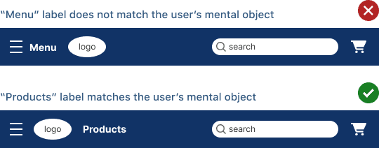
For example, if a menu contains the following items, the higher level category name would be “Products.” You would create a section named “Products” in your drawer menu. In the navigation bar, you would place a “Products” link there. Clicking that link opens the products section in the drawer.

As a result, the drawer menu will get more engagement because the navigation bar is displaying a recognizable item label that matches their mental object. A “Menu” label doesn’t match the user’s mental object and won’t get as much engagement. The “Products” label may not be an exact match to the user’s item, but it’s an approximate match that allows them to associate it as a product.
You can make room in your navigation bar and add other higher-level categories that open different drawer menu sections. All you have to do is come up with proper category labels that encompass the items.

Several studies confirm that placing item labels in the navigation bar leads to higher engagement resulting in more pageviews and transactions. They also demonstrate that users are more likely to click on text links that match their mental object over a hamburger icon.
For Mobile
It’s easy to apply this approach to a desktop navigation bar, but it’s more challenging on a mobile bar because it has even less screen space. A typical mobile bar contains a logo, utility icons, and a search field, which doesn’t offer much room for item labels. You can make it work by extending your navigation bar to a secondary level. This would provide enough space to place high-level categories below the primary level.

You can even encapsulate your item labels in tokens to not only make them easier to notice and tap. If your item list bleeds past the screen edge, you can incorporate a carousel or horizontal swipe interaction. Bear in mind that items hidden behind the horizontal swipe will get lower engagement than the ones exposed. Therefore, it’s best to limit your high-level categories to the necessary minimum.
Subscribe to access the full article
Read the full article to get more secrets to engagement, including drawer item and hamburger icon optimization. It also shows you website examples that practice this approach.
Book

Affiliate

Brilliant article… mental object is one I find frustrating when stakeholders insist on using cute (or internal) terms instead of what users will be able to understand. Navigation for mobile is one that seems to be progressively getting worse with the new push for clean design. Designing buttons or links to look like something one can click (tokens) makes things easier for the user.
But… the “products” label/link that opens the drawer… it doesn’t has the same problem?
You put “Products” without any indicative of the result of the action of this link. Ok, you will see products, but I don’t know if is the best solution.
As user, if I see a label or link in the top bar, the last thing I expect is that, that link opens the menu ¿?. I’ve never saw this behaviour in a website, for me is a little bit confusing.
Great article! I would, however, also add that before you start improving everything you mentioned, it’s crutial to run some usability tests, Card Sorting for example. That will help you with choosing right labels for your categories and help in making navigation more intuitive. I give more info on that on my website https://www.card-sorting.com/ I even made a list of the best online Card Sorting tools out there, check it out. I’d love some feedback!