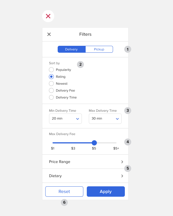
Below is a screen of filters with many interface elements. At first glance, it seems like it has a good user experience, but it doesn’t. It has many issues that you can only realize by deconstructing and analyzing each component.
The first overall issue with the interface is that there’s too much blue everywhere, calling for the user’s attention. As a result, it drowns out the primary call-to-action button. Not only that, but the white background brightens all the elements. This brightness isn’t good because it makes the entire screen look overwhelming.

1: The toggle buttons aren’t clear to all users. Some may interpret the white ‘Pickup’ option as the active one, while others may interpret the ‘Delivery’ as active. This confusion occurs because they both have similar color contrast ratios.
2: The ‘Sort by’ list options are hard to tap with accuracy. Since they’re so close together and the hit targets are so small, it’s easy for users to mistap them. Also, the list format uses a lot of vertical space. Notice how much whitespace there is to the right of the options.
3: The dropdown menus for ‘Delivery Time’ take time and effort to use because users have to click to open them and then scroll through the options. This is especially hard to do on mobile devices.
4: The slider for ‘Max Delivery Fee’ is hard to use. The thumb on the slider is small for a finger to hit. Not only that, but when the user’s finger is sliding between options, it covers up the input values. They have to lift their finger to confirm that they selected the right option.
5: The Price Range and Dietary sections are hidden on another screen. The user has to tap to see them, but they’ll lose their context if they do this. Not only that, but that they have to navigate back to the filters screen.
6: The Reset button is placed next to the Apply button, which can lead to accidental resets. Resetting filters is a destructive action because the user loses their settings. Therefore, it’s not ideal to place it next to the primary call-to-action button to run the risk of errors.
Subscribe to read the full article
Subscribe to see how the good filters redesign fixes every issue. For just $9/mo, you’ll get unlimited access to our entire archive of premium articles.


Hi there! Really smooth analysis. I have seen a lot of filter bars like that one. In fact, dare I say it looks like a design pattern indeed. Can you show us how to do it in a better way?