What interface element should you use to provide the user with helpful information about a form field?
If you were thinking a tooltip, you are correct. Tooltips are necessary for form fields that need more clarification than its field label can give.
For example, when the field label has an obscure term the user isn’t familiar with. Or, when you’re asking for information that’s more personal than normal and need to explain why it’s needed.
On desktop, tooltips are easy to display because the user has a mouse hover and ample screen space. This allows the user to trigger and read the tooltip with ease.
But on mobile, it’s more of a challenge because screen space is limited and there is no mouse hover. This begs the question of what the best way to display tooltips on a mobile form is.
Easy to Spot, Tap, and Read
A mobile tooltip must always be easy to spot, tap, and read. This will be determined by the appearance of the icon and how you position your tooltip.
Spotting and Tapping the Icon
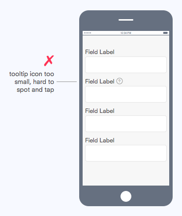
Larger icons are easier to tap than smaller icons. Not only that, but they’re also easier to spot. This means the tooltip icon must be as large as it can be without breaking the form layout. An icon that’s too small will be harder for users to spot and tap.
The example below shows how placing the icon next to the label is not a good idea because it makes the icon too small. You could increase its size but that would break the form layout and its alignment with the label.
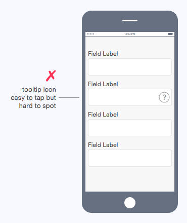
The best option is to place the icon inside the text field on the right. This allows the icon to span the height of the field, which is much taller than the field label. It’s also in a position where it won’t interfere with user input. The icon is now large enough to tap, but it’s still hard to spot due to its low contrast style.
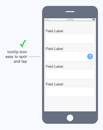
Instead of using an outline icon, you should use a solid icon that looks and feels like a button. To strengthen its affordance more, give it a blue color that distinguishes it from all the other neutral colored form elements.
Now the tooltip icon is both easy to spot and tap. The next thing we have to determine is how the tooltip text will be displayed once it’s activated.
Reading the Tooltip Text
The tooltip text not only needs to be easy to read, but it should visually correlate with the field and its label.
To do this, use a tooltip balloon that spans the width of the text field. If you allow the tooltip to appear directly above the icon it could get cut off by the screen edge. It’s important the tooltip balloon matches the field width and is aligned with it so this doesn’t happen.

The tooltip balloon should be placed right above the field and label for a strong visual correlation. Users should be able to read the tooltip text and view the correlating field and label at the same time. The balloon tip should point to the icon to indicate what triggered the tooltip.
Once users are done reading the tooltip, they’ll tap the text field to type their input. Make the tooltip disappear when the user taps an area outside the balloon, allowing them to resume their task.
Use this tool called Balloon.css to add tooltips to your form in only a few lines of CSS without Javascript.
The Form Element Is the Visual Anchor
Notice that we used the height and width of the text field to determine the size and placement of the tooltip icon and balloon. This is because the text field is the largest and most important element that serves as the visual anchor for the tooltip.
Instead of picking the size and placement of the tooltip arbitrarily, we allow the text field to dictate it for us. This will create a strong visual correlation and uniformity between the tooltip and the text field.
Other Form Elements
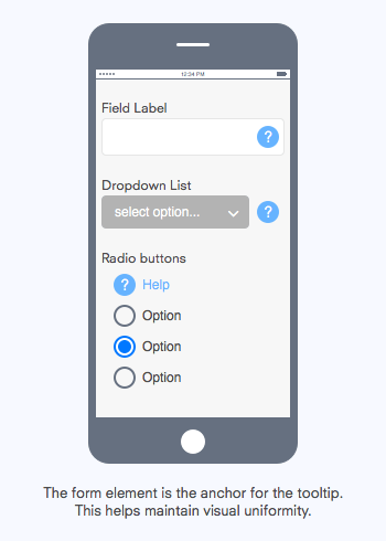
You may be wondering how to display tooltips on other form elements such as dropdown lists, checkboxes and radio buttons. You would follow the same principle used for text fields and let the form element be the anchor for size and placement.
In the example above, you can see the tooltip icon is placed to the right of the dropdown list and is the same size as its height. This is so that it does not interfere with the option label but is still visible to users. The visual form of the dropdown list is dictating the size and placement of the tooltip icon.
The tooltip icon placement for radio buttons will be different than text fields and dropdown lists because they expand in different directions. Text fields and dropdown lists expand horizontally, but radio buttons expand vertically.
Therefore, we can’t place the tooltip icon at the bottom of the radio buttons because this would make it less visible to users. It needs to be placed at the top for high visibility.
We also can’t place the tooltip icon to the right of the radio buttons because it would interfere with the option labels. Placing the tooltip icon to the right of the text field and dropdown list was possible because it didn’t interfere with the user input or option label.
The tooltip icon conforms to the shape of the radio button for visual correlation and uniformity. At the same time, users can distinguish it from a radio button because of the question mark icon, help label, and unsaturated blue.
Even if users tapped the tooltip icon on accident, there would be no negative consequence to their action. They would only receive helpful information that helps them fill out the form.
The Purpose of Tooltips
Tooltips provide helpful information that can ease form field friction for users. But not all users need that information to fill out the form. The ones that do should be able to access it immediately when they need it. The ones that don’t should not have to read it.
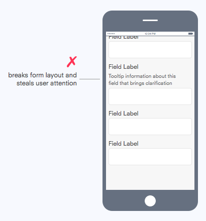
Some designers may suggest an alternative to tooltips is to display the information below the field label. The problem with this is that it not only breaks the form layout, but it also steals user attention when it doesn’t need to.
When performing tasks, user attention is a finite resource. Stealing it can frustrate users and slow down their task performance. Tooltips should be displayed with deference and not invade screen space unless called upon by the user.
The lack of mouse hover and limitation in screen space is not a problem when we understand the purpose of tooltips. Tooltips are help. As such, they should be accessible and deferential to users. Don’t let it get in the user’s way, but don’t let it be out of arm’s reach either.
Book

Affiliate

Interesting, but where would you place the tooltip icon for checkboxes, radio buttons, dropdown lists?
Good question. You would follow the same principle and let the form element be the visual anchor for the tooltip. I’ve updated the article to answer this.
You talk about “following the same principle” for each element, but I am seeing the *opposite* of consistency here – in two ways…
In both the Field and the Dropdown elements, you have the tooltip-icon at the *end* of the input/selection, but on the Radio buttons, you have it at the *beginning*. Also, for the Field and the Dropdown elements, the tooltip-icon is on the *right* side, but for the Radio buttons, you have it on the *left* side.
I could almost forgive this if it wasn’t for what I perceive to be one other huge massive major UX-error, that being the tooltip-icon you have for the Radio-buttons actually looks like a radio-button itself, in a selected state!
Brett,
“Place all icons on the same side” is not the principle. Placement depends on the visual appearance of the form element. The principle is using the form element as the visual anchor, meaning the visual form of a form element dictates the size and location of the tooltip icon.
Notice that the tooltip icon is the same height on all form elements they are with. The tooltip is sized to match the height of the form element, not the other way around.
The tooltip icon is on the right of text fields and dropdowns because these elements expand horizontally, so when users view them they will see both the input and tooltip icon at the same time. This can’t be done for radio buttons because radio buttons expand vertically and the option labels expand horizontally.
Placing the tooltip icon at the end of all the options would make the tooltip icon less visible because the options expand vertically, so it must be placed at the top for better visibility. The tooltip icon conforms to the shape of a radio button for visual uniformity and correlation, but it is still distinct. The question mark icon, help label, and unsaturated blue all make it distinguishable from a radio button.
There’s no negative consequence from accidentally tapping the tooltip icon, only a positive outcome of helpful info. So even if users weren’t able to distinguish the tooltip icon from the radio button, it would not be a cause for concern.
Hey, first of all thank you for this nice and clear article. For me the “blue” or the look as a button is too much for a hint/support function. Nowadays people should’ve learned that they might find help on the right side of an input/form already.
Thanks for the help to understand more thoroughly the ins and outs of tooltipping on touchscreen devices
Question about tooltips: Say that I’m designing a process to add locations. If the addition of the location happens in a pop-up on desktop, can I still use a tooltip to explain additional information? Are there successful examples of tooltips in a pop-up?
And how you do deal with tooltips inside a tabs container? Cuz the thing, the tooltip have no viewport awereness, so they get out of it. For me the solution is quite simple: stop styling tooltips for mobile like you do in web – check Uber Eats tooltips for example – they simply stile a bottom div with a transform animation that wont mess with everything wlse on your screen and it works great. Mobile is not Web, the UI has to change accordingly.
Hi Anthony,
where would you place the tooltip icon when the input must contain square meters units on the right side (m2) and where you would place the validation checkmark when the tooltip icon is in the field?
Thanks a lot,
T.
This all sounds lovely, but this article does not tell you how to accomplish this. Sample code would be super helpful. I’m having problems finding any. I followed the link to Balloon.css, and all the examples there use buttons and talk about hovering. Am I supposed to put an image button inside the textbox? I can’t find a way to do that that actually works.
Hi
Nice post. Just a little confused about 1 area, the placement of the tooltip after the textbox. This seems to me to be in the wrong place both from a semantic and accessibility point of view. You need to tab past the control to get further information about it.
This is excellent article. Do you have an working example we can try and see the code underneath?