Text fields have evolved stylistically over the years. Designers are getting more creative with them, but sometimes a little too creative. One particular style that’s caught the eye of many is the underlined text field. Its novel and minimalist appearance may attract you in using it, but when you understand how it affects user behavior, you’ll think again.
Underlined text fields are hard for users to recognize and tap. If they have trouble recognizing and tapping your fields, they won’t be able to start your form nor finish it. These issues lead to user frustration, form abandonment, and lower conversion rates.

Not every user has trouble with underlined text fields. Tech-savvy and normal-visioned users can often figure them out, but many elderly and visually impaired users have a hard time. They’ll usually land on a form and wonder where the text fields are to begin their task. When all they see on the page are text headings and content dividers, they get confused and leave.
Text Field or Content Divider?
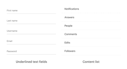
Users are most familiar with horizontal lines used to divide content. When you use underlined text fields, it’s easy to mistake them for content dividers. The underline looks like a content divider, and the field label looks like a heading. Sometimes the placeholder text inside the field can even look like body text.
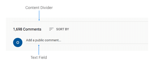
Users can also mistake them for content lists. A content list isn’t what they expect to see when they land on a form, which can make them think they’re on the wrong page and leave.
Not only that, but underlined text fields are also hard to tap because the edges of the tap target are missing. When the top and side borders are open and invisible, the target becomes a thin and faint one-pixel line. A smaller and less visible target to aim at decreases the user’s tap accuracy and causes mistapping.
In some cases, they may accidentally trigger an adjacent text field when aiming for their target. Without clear target boundaries, it’s easy for the finger to land in the wrong area.

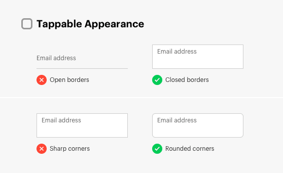
Tappable Appearance
Text fields should appear tappable so users can start the form right away and tap through each field quicker. Instead of opening the borders, keep them closed on all sides. Doing this will make your text fields look like tappable objects with larger targets.
It’s also beneficial to round the corners of your text fields to enhance its tappable appearance. Research has discovered that humans innately perceive rounded, contoured objects as friendly, and sharp, angled objects as threatening (source). This finding suggests that users have a positive bias toward rounded corners, which draws them to interact with those objects.
Text Field or Disabled Element?
Along with a tappable appearance, your text fields should look fillable, not filled. Many designers make the mistake of filling the inside with a solid gray. Solid text fields are an improvement from underlined ones, but they’re still not the best practice.

The solid gray fill makes text fields look like they’re in a disabled or inactive state. It causes users to wonder whether they should interact with them or not. Sending these mixed signals confuses them before they start the form.
When text fields look like disabled elements, users are less likely to interact with them right away. They’ll first scan the page for regular text fields. When they realize those are the only elements that resemble a text field, they may interact with them then. This cognitive effort is taxing and slows down their form completion time.
On top of that, solid text fields make input and placeholder text harder to read. When you have gray text on a gray background, the color contrast isn’t strong. Many low vision users will have a tough time reading the text and could abandon the form as a result.

Overlooking and reading solid text fields isn’t the only problem. Users could also have trouble distinguishing any text fields that are in an actual disabled state. If your form has a mix of regular and disabled fields, low vision users will have difficulty noticing the difference. Usually, the only difference with disabled fields is a fainter text label.

Fillable Appearance
The ideal experience is when users recognize your text fields and begin filling them out immediately. This immediate reaction only comes when they contain white space for a fillable appearance. The white space is a clear cue of emptiness that prompts users to fill the space with their input.
To achieve a fillable appearance, keep the inside of your text fields white and empty with closed borders. Darken the borders just enough for users to liken the outline to an empty box. Outline text fields may look plain, but they attract attention and are easy to recognize, which is what users need.

To enhance the fillable appearance of your text fields, place them on an off-white background. An off-white background color makes the white space more prominent and provides the clearest cue for a text field. Not only that, but it makes any disabled fields on the form easier to distinguish.
With this approach, it’s quicker for users to notice filled and unfilled fields when they’re checking the form. The brightness of the white space gives the input and placeholder text higher contrast for better readability. Any text placed on the off-white background remains readable, and won’t visually clash with the input or placeholder text.
Google Got It Wrong
The popularity of solid and underlined text fields originated from Google’s Material Design system. It’s novel approach to text fields garnered the attention of many. However, this led designers to sacrifice usability for trendiness—a move that doesn’t pay off in the long run.
Even Google realized their mistake when they changed the underlined text fields on their Gmail login form to outline text fields. From the enormous amount of Gmail users, they got feedback that many were having trouble logging in.

They’ve further addressed the issue of underlined text fields in a study that found “enclosed text fields with a rectangular shape performed better than those with a line affordance” (source). Although they still promote the use of solid text fields, they’ll soon realize that this is also a mistake.
Usability First
A novel and minimalistic style for text fields has no use if it’s not easy to use. Before you consider changing the style of your text fields, make usability the requisite. Ensure your text field style is easy to recognize and tap for normal-visioned and visually impaired users.
It’s okay to make your form components attractive and fashionable, but not at the expense of usability and accessibility. Don’t follow trends because everyone else is. Question whether they meet user needs first. Not doing so won’t just hurt the user experience, but also your conversion rate and bottom line.
Book

Affiliate

All I can say about updated Google login form on the last picture — everything is misaligned. On the underline-version, all were perfectly left-aligned. But then the UX came into and ruined everything 🙂
Great to find this article and site. I’ve been in UX a long time and care a lot about usability. I’m continually frustrated by the novel, unusable things that many designers come up with these days, even (especially?) at the largest companies, which should know better. Google’s continued “innovations“ are particularly maddening. Thanks for writing about these flaws.
I am not quite convinced by the arguments. Mistaking underlined inputs with lists can perhaps happen if they are styled simliarly and sit next to each other. Both can be avoided.
The context in which forms appear make it usually clear for the user that something needs to be filled out. One can also add a headline above the form and use appropriate wording in the fields to inform users what to do.
Incorrect tapping is a problem which could be solved by placing the fields further apart.
I was debating with someone on why I preferred my filled inputs over outlined.
They made the same argument about disabled fields, however, I was able to offset this situation by using a much lighter background on my input fields. That way, my tappable area was still visible, and nothing looked disabled.
While I agree, the example you’ve provided would be difficult to tell, but I’ve not seen anyone implement a filled input and make it that dark.
Aside from lighter backgrounds (35% opacity or lower) for filled inputs, you can also provide colored (or high contrasting) prefix/suffix icons and text. Another implementation would be to use lightly-colored input fields. Because there are ways to enforce good UX techniques surrounding the use of filled inputs, I don’t necessarily agree that they cannot be used at all, but with caution and correctness. I appreciate you for sharing your opinion on it nonetheless.
“Angled objects are threatening”, it’s taking a slight bias that could be valid for a certain circumstances due to evolutive reasons and stretching it to the ridiculous.