Radio buttons and checkboxes have long caused confusion for users. They’re often used in the same context, but look completely different. Designers and developers know the difference, but that’s because they learned it through their work. What about non-technical users who never learned the difference?
The fact that users need to be taught the difference shows that these two components are not intuitive. Their appearance alone does not convey their slight differences in functionality. The visual cues themselves—a dot and checkmark—carry no specific meaning to users other than an option selection. Therefore, the existence of both radio buttons and checkboxes violates the UX principle of Consistency.
Designers and developers have never questioned their co-existence because it’s the way it’s always been. However, if their co-existence causes users confusion and violates a UX principle, it merits a logical analysis and rethinking.
A Violation of Consistency
The UX principle of Consistency states that components with similar functionality and same usage should have a uniform appearance. Radio buttons and checkboxes have a similar function and are used in the same context, but there’s nothing uniform about their appearance.

Radio buttons represent mutually exclusive selections, while checkboxes represent mutually inclusive ones. Both are commonly used together on forms to select options from a list. However, a radio button is a circle with a dot inside, while a checkbox is a square with a checkmark inside—two different visual cues.
Some might say that their functions are different, so they should look different. But to be precise, their functions are only slightly different, and they both have the same usage, which is not enough to justify a different appearance. Doing so presents an inconsistency that can perplex users.
Mutual Exclusivity/Inclusivity Is Not a User Concern
If you ask the typical user what a mutually exclusive or inclusive option is, they probably wouldn’t be able to tell you. That’s because they don’t think about mutual exclusivity or inclusivity when they use an interface. Only designers and developers think about this because they have to design the interface.
Users merely read the labels and select the options they want. They’re focused on what the labels say, not component functionality. Therefore, mutual exclusivity and inclusivity should be indicated in the labels they read, not the components themselves. Designers and developers are imposing their way of thinking onto the user.
How Users Know They Can Select One or Multiple
The label on the components often indicates whether users can select multiple options or just one. When users can select multiple options, the label is worded in plural form. When users can only select one option, the label is worded in the singular form. Make sure you use the correct noun form when you label mutually exclusive and inclusive components. It’s easy to forget about the labels, but they’re what matters most.
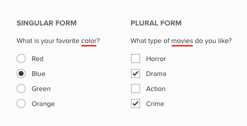
Label noun forms are a clearer cue for mutual exclusivity/inclusivity than a checkmark and a dot. A checkmark and a dot do not signify mutual exclusivity/inclusivity other than by convention that’s familiar to only designers, developers, and tech-savvy users. Regular users who see the different components used in the same context will wonder what the visual differences mean. The inconsistency isn’t severe enough to derail their task, but it certainly diverts their attention.

Use Check Circles Instead
Users need a component for selecting from a list of options that’s uniform and consistent. Instead of using radio buttons and checkboxes, use check circles for both instead. A check circle combines both the outer shape of a radio button with the checkmark cue of a checkbox.
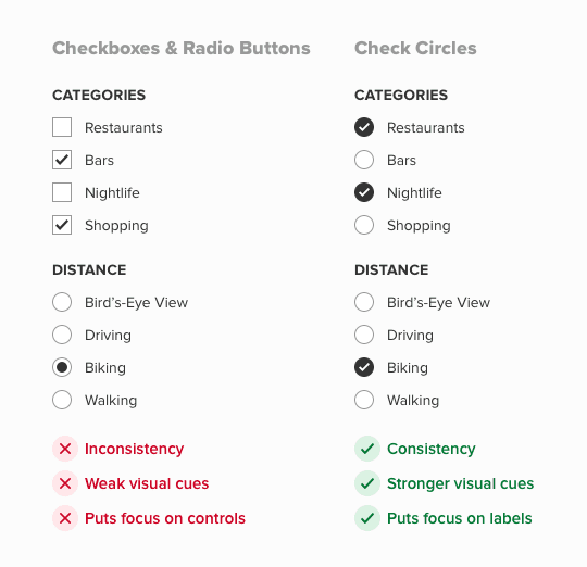
The checkmark is used because it’s a much stronger cue for selection than a dot. It’s universally known as the symbol for affirmation or “yes.” A dot is a weak visual cue that could hold any arbitrary meaning.
A circular outline helps distinguish itself from a checkbox. It also has the added benefit of being more appealing and easier to recognize, since most icons with a background are inside a circle.
When there’s a single component for selecting option lists, users are no longer distracted by the differences between radio buttons and checkboxes. They can focus more on the labels and choose options that fit them best. It doesn’t matter whether users can select only one or multiple options. They’re going to make selections based on what the label dictates, not the type of component.
Old Design Practices Evolve
Radio buttons and checkboxes have co-existed for a long time. Some may use their longevity to justify their co-existence. However, many old design practices of the past have since evolved due to a better understanding of UX. For example, reset buttons that clear forms, red asterisks on required fields, and password confirmation fields have nearly all faded away today. Radio buttons and checkboxes may soon do the same because, like most things in life, interface design continues to evolve.
Book

Affiliate

This is dead wrong. If I saw ‘check circles’ in a portfolio that would be an instant fail.
Conflating different types of controls for personal aesthetic preference over common usage is navel gazing design for design’s sake. User test any form flow with this suggestion for verification. Bad advice.
Did the article say the purpose of check circles is for aesthetic preference? You didn’t disprove any of the reasons given. All you did was make an emotionally biased claim.
Read the article again and address the specific reasons if you want your criticism to have merit.
Even though I agree with the considerations in this article, it would be good to have some empirical data here to validate what has been said. An A/B test with hundreds of users would certainly provide more clarity here.
I would argue about using the checkcircles instead of checkboxes.
You say “components with similar functionality and same usage should have a uniform appearance”, and then you design the SAME appearance for slightly DIFFERENT controls — radiobuttons and checkcircles. I guess it can lead to a misunderstanding for a user. Like a user just put several checkcircles on one form and next form doesn’t allow him to put several “controls” because a designer decides it’s a radio now, not check.
I understand that checkboxes and radio buttons may not need to co-exist. But as a conclusion you could also just use checkboxes for everything just like we do on traditional paper forms like tax returns. I’m not sure a new element is necessary except for purely stylistic reasons. I also doubt that people read labels precisely and rather try to find cues from the shape of the elements, thus, round radio buttons do serve a purpose as they communicate functionality/feature by means of their shape to users.
Radio Buttons and Checkboxes confuse same people that cannot make a difference between questions with one or multiple correct answers.
Sorry, but this article doesn’t make any sense. Nobody, absolutely nobody, confuses checkboxes with radio buttons.
If you want to re-invent the wheel and fight 30 years of the convention because you consider it an inconsistency that two form elements (with two different functionalities btw) have different visual cues – why stopping here? Let’s re-invent also the input text or the buttons.
The focus required by the scanning of check vs. radio it’s nothing compared to the effort that users should put into finding S’s in supportive text.
I disagree with the assumptions at the base of this theory.
So you’re proposing using the same visual elements for two different functions? People don’t read labels, they look for familiar visual clues…sorry, but you’re wrong.
I agree with you that the radio button and check box cannot exist at the same time, but the Check Circles will increase the focus of the list of options and reduce the user’s attention to the label, so it is recommended to use the check box instead of the radio button. And provide label for both single selection and multiple selection. Personally feel that this is better.
In my opinion it is not OK to merge the two different choice tools into one. With the check circle the user doesn’t know without trying whether you can choose more than one of the options. (Form designers can make mistakes with singular/plural forms too.)
BTW, the checkmark is not “universally known as the symbol for affirmation”. Where I live (Finland) it used to mean “wrong”: teachers marked wrong answers in exams with that mark. People using computers and smartphones have learned the new meaning, but I guess it may still cause confusion in some old folks.
PS. you said that red asterisks for required fields have faded away nearly everywhere… well, I see that not here at least.
I just came for research and good advice aka best practice but your writings about using circular checkboxes is dead wrong. For one basic reason and please for the ux sake do not use it. It is more confusing for user than clear differentiation of shapes. Thanks
You say that red asterisks on required fields is outdated UX, yet the form I am filling in now on this site uses them. I find this whole article is just wishing for evolution when there isn’t a need for it. Checkboxes and radio buttons are understood, and there is no need to force users to read labels carefully to figure out how to fill in a form. There is no user research to validate your claims, the only evidence I see is all the comments on this page who disagree with your points.
Hello,
I share a video showing the interactions from a sample article: https://1drv.ms/u/s!Aj16T_Ds0bkvwB5jYTpjoG8jditc
But the use of circles for checkboxes and radio buttons creates “weird” behavior. But that’s my opinion (of Designer ). And it is true that in this example, the content is fictitious (?) and this can bias perception. I don’t know if this article relies on quantitative and qualitative studies to support this statement. If there are, I would like to read them.
Bests,
Thierry
That’s cool how you made the article image clickable. How did you do that?
You’re entitled to your opinion, however, “that’s weird” is not a logical counter argument, it’s an emotional one. Designers can’t make objective decisions based on what feels weird to them. If you read the article, you’ll see that it cites logical reasons and the Consistency principle as the basis for its argument. It’s not quantitative research, but it’s more credible than an emotional argument.
A check mark is not only a visual cue for “selected” but also for “correct”.
Your “new” check-circle might also be perceived as “Oh I got this answer right, off to the next question”. Thereby achieving the opposite of what is aimed for: We won’t know if a single answer was the only one that applied or whether the respondent didn’t understand it’s an MC question. Some form of usability testing seems in place.
Radio buttons and checkboxes are indeed a convention that is familiar to everyone but the most remote from society. If someone uses a form for the first time, I doubt they we thrown off track more by these than your check circles.
Let’s go back to the roots of our UX training and ask “Are we solving the right problem” before discussing solutions. And let’s discuss based on data, not opinion.
My 2 cents.
I don’t know why you would take two things that do in fact behave differently, and make them look the same. This seems like a fundamentally flawed approach.
While users most likely do not think of the terms like “mutual exclusivity” when filling out a form, it is not a far stretch to expect them to realize that some things can have multiple choices (checkboxes) while others can only have one (radio).
1. in my opinion, it’s far easier to scan the shape of the controls. it’s also more consistent to use radio & checkboxes:
• circles means pick only one
• boxes means pick one or more
2. how about nouns that have same singular/plural forms?
in your examples, you only use english which clearly differentiate singular vs plural nouns.
in bahasa indonesia for example, to indicate plurals formally the noun is repeated, separated with dash, eg: “kategori” vs “kategori-kategori”.
however, colloquially, the same word is used. so, from your example, label for both “pick category” & “pick categories” would simply be: “pilih kategori”.
fyi, there are 98 languages that don’t have plural forms _at all_, see: https://wals.info/feature/33A#2/26.1/152.9
3. “A checkmark and a dot do not signify mutual exclusivity/inclusivity other than by convention that’s familiar to only designers, developers, and tech-savvy users. Regular users who see the different components used in the same context will wonder what the visual differences mean. The inconsistency isn’t severe enough to derail their task, but it certainly diverts their attention.”
thing is, users will only have to learn ONCE that “circles means pick one, boxes pick one or more”. whereas, they have to read the label every single time. additional cognitive load to determine singular vs plural is probably unnecessary.
oh yes, determining singular vs plural can be an additional cognitive load for people who natively speaking one language, filling forms in other language.
besides, “… following design standards enhances users’ ability to predict what a control will do and how they’ll operate it. When they see a list of checkboxes, users know that they can select multiple options. When they see a list of radio buttons, they know that they can only select one. (Of course, not every user knows this, but many do, especially since this has been a design standard since 1984.)”
— jacob nielsen, 2004
I think much of the disagreement in the comments is related to the axiom “if it’s not broken, don’t fix it.”
I WANT TO agree with many of your suppositions (that people don’t distinguish between mutually inclusive or exclusive options; that a checkmark is a better signifier for “selected”). They seem logical, but many users don’t behave logically.
Can you reference any usability research to back up these ideas?
Underlining “movies” for its plural is wrong. “Movies” here is a subordinate noun, “type” is the main noun and is the one that matters when understanding whether the choice can be plural. The question is “What type”, not “What movies”, and “What type” is not plural, so the use of singular here is inappropriate for a list of non-exclusive choices
Yes, anthony—the question in that image should be “What types of movies do you like?” Also, I found out another reasons why the labels are important; specifically, it helps blind users who are using screen readers to read the labels because they can’t see the visual differences between radio buttons and checkboxes anyway.
Obviously, the designer can ensure the labels are grammatically correct regardless of the UX. However, assuming the individual options (whether mutually exclusive or mutually inclusive) don’t take up more than one line, I would prefer using your article on toggle tokens as a substitute for check circles (maybe also putting a checkmark icon within the token if it’s selected, not just the dark contrast and color?).
Anonymous wrote:
“the question in that image should be ‘What types of movies do you like?’”
That’s right. In fact, to convey that it’s OK to select only one type, the question should read, “What type(s) of movies do you like?” Otherwise, users could rightly–but falsely–conclude that they must select at least two choices.
I’m annoyed this article is at the top of the search results for my UX pet peeve. This check-circles thing and the way designers nowadays often make checkboxes and radio buttons look the same is downright dumb, and makes me fill out forms either wrongly or slowly with a constant worry that I misinterpreted it.
I’m attuned to spot the visual difference between checkboxes and radio buttons. If I see a circle, I expect to give just 1 answer, and if I see boxes, I expect to give multiple. Conversely, when I want to give more than 1 answer, I expect to see boxes, not circles. They behave differently, so it’s just logical and intuitive that they look considerably different too. I learned this from experience in my first days of using the internet, it’s not a steep learning curve.
Read the text and analyze its grammar to figure out how many answers you should give? First of all, many forms are sloppy with such details or lack the space to have full sentences, even with the best intentions/efforts. Second, nobody reads the standard boilerplate text “please fill out bla bla bla bla bla”. You gloss over all that filler because you already know from context and seeing the listed answers what the form is asking. Nobody is going to attentively read the same old standard headings every time, let alone analyze the spelling. “Putting the focus on labels” but to the detriment of the visual nuances is just breaking one thing to fix another. Keep the visual difference for people who think fast and visually, AND make the labels grammatically correct for text-driven people. Just do both instead of deliberately sabotaging one or the other group of people.
Is the difference arbitrary? Yes. Is it a clearly recognizable, dead-simple, good ol’ reliable convention that anyone learns after encountering these two components just once in their life? Yes! It just works. I have never filled out a form using checkboxes or radio buttons the wrong way, but I sure have filled out forms using checkcircles wrongly almost every time I’ve encountered them, or had to waste time playing around with the form’s controls to discover their poorly expressed behavior and satisfy my nagging suspicions/worries.
Visually different checkboxes and radio buttons aren’t just “don’t fix what isn’t broken”, they’re “don’t break what works”.
In the company I currently work for, previous designer was primarily a graphically oriented guy.
And from him I inherited the Quizz formed questionnaire UI with the toggle tokens you mention in another article.
The problem arises with answers with more than 2 words.. and worse with question path designers combining inclusive and exclusive options within the same question (“none of the above” as the last option). And ALL of the buttons look and behave the same.
Now, all the software users are power users that use the tool repeatedly, and inevitably learn the pattern. After looking at people working with this, I came to a conclusion that in general you might be right, and that the toggle token can be used BUT – it needs few more states – besides SELECTED, we need to add INCLUDEABLE and EXCLUDED (states) – that apply to some or all of the rest of the buttons.
So, even though this thing is giving me nightmares and the usage of the checkboxes and radio buttons would be the “sane” option, I agree that in some cases the unfortunately named “toggle tokens” or check circle could be useful, given that each button is “situation aware” and conforming to the current situation.
Because, in the end, we are working in digital realm, where input elements CAN conform to the situation – unlike their printed predecessors.
Hi, I found this article interesting. Here is some data on the circle checkboxes: we have 100k users using a Search component that asks the user to select search locations. Search locations have circle checks instead of square checkboxes, and the biggest complaint from our customers is that they are unclear whether the ‘selector’ is a radio button or a checkbox. The funny story behind the component is that it was designed this way (before I joined the company) because the team didn’t know which would be a better choice. I learned that breaking pre-learned design patterns, even something as simple as changing the shape of the component, leads to very confused users (good classic to read on this topic is: ‘Don’t make me think’ by Steve Krug).