It’s no secret that fewer form fields lead to higher conversion rates. Reducing them not only makes a friendlier first impression, but it decreases error rates and completion time. Therefore, you should remove as many unnecessary optional fields as you can.
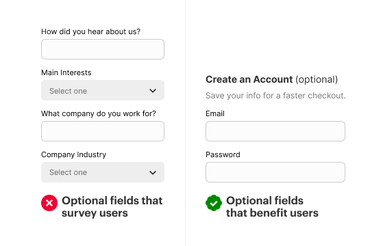
Many apps use optional fields as an opportunity to gain knowledge about the user for research purposes. They treat it like a survey form and ask them a lot of prying questions. Users don’t get any benefit, and it causes them to skip those fields.
A sign-up or registration form isn’t the place to survey your users. Save those questions for after the initial form. Users are in a hurry and only need the data fields necessary to create an account. Don’t bog them down with optional survey fields that clutter the form and their mind.

If you want to gain knowledge about your users, present those questions after they’ve signed up as an onboarding step. The more fields you have on your form, the more you’ll overwhelm users on the first impression.
There are times when optional fields can be helpful. The only time you should keep an optional field is if it’s an opportunity to enhance the user’s experience. For example, at the end of most checkout forms, an app will offer the option to create an account to save their data for future purchases. The optional fields for this save them time and are useful to have.
Don’t burden users with optional fields that survey them. Keep them off your forms if you want users to fill out your form with ease.
Access Full Article
Access the full article to continue learning more about optimizing optional fields. In addition, you’ll get exclusive access to our archive of premium UX articles.

