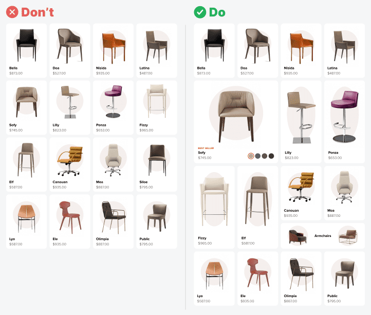
Your product catalog page is frustrating users, and you don’t even know it. Chances are you’re using cards to display your products, but the cards all look the same. Having only one card type isn’t good because it creates a limited, one-dimensional browsing experience.
A one-dimensional catalog page causes users to sift through each card individually to find what they want. Since the images and text are the only perceivable differences, they have to scan each card more closely.
Adding more depth to your cards enhances the user’s perception of your content. They’ll be able to recognize product qualities by card size and shape. Above all, your catalog page will look more interesting to browse.

Subscribe to read the full article
Become a paying subscriber of UX Movement Newsletter to get exclusive access to this article and other subscriber-only content.


It depends. This assumption is probably wrong.
Why make certain cards larger? Are they more relevant to the user? Are they based on the user’s previous interactions?
If they’re just random, then it’s distracting. Why does the user want to see some random junk. It feels like an advertisement.
Most importantly, this breaks the entire visual flow. As an e-commerce store shopper, as a website visitor, as an app user, I am there to find information. I’m not there to look at your pretty design. I want to scan the page quickly, and click on whatever I want more info about.
The user will have an easier time browsing the products if they’re all the same size. Less distracting, more cohesive. Less frustrating.
A more pleasant experience makes the user much more likely to come back next time they’re looking for something.
I agree with everything Paul Shorey said. I would be frustrated and not use a site like the “Do”. It’s not just that it’s not helpful, it gets in the way of using the site.