Many websites use black text on a light background to display their content because it’s easy to read. However, using white text on a dark background also has its advantages. Knowing when to use one over the other will allow you to design your website without hurting user readability.
Reading vs. Scanning
When it comes to text on websites, users either read or scan. Reading involves focusing on words for a thorough comprehension of the subject. Scanning involves skimming the words for a broader comprehension of the subject. When you should use white text on a dark background depends on whether users are scanning or reading text.
Paragraph Text
The kind of text that users read is paragraph text. You should avoid using white text on a dark background when displaying paragraph text to make it easier for them to read. Forcing users to fixate on the white text for a long time can strain the user’s eyes. This is because white stimulates all three types of color sensitive visual receptors in the human eye in nearly equal amounts [source]. This makes reading white paragraph text on dark backgrounds stressful on the eyes.
White also reflects all wavelengths of light. Because the words and letters in paragraph text are compact and close together, when white text reflects light, the reflected light scatters and runs into neighboring words and letters. This makes the shape of the words and letters harder to perceive, which affects readability. Compare that with black text, where the black absorbs the light around each word and letter, making them easy to distinguish.
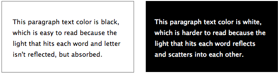
That’s why a better choice for displaying paragraph text is black text on a light background with a tint of gray. With a gray tint background, less light reflects behind the words, making it easier on the eyes. The black text works better because black is also a color that doesn’t reflect light in any part of the visible spectrum [source]. Therefore, fixating on black text while reading won’t put as much stress on the user’s eyes because it absorbs the light that hits each word.
If your site uses a dark background, you should display your paragraph text in gray tint. This won’t put as much stress on the user’s eyes because gray text isn’t as bright as white text. It’ll reflect less light, making it easier to read. Keep in mind that if you’re reading text in a dark room where no light is present, white text on a black background isn’t as hard to read. This is because no light is reflecting off it in a dark room.

Headings, Titles and Labels
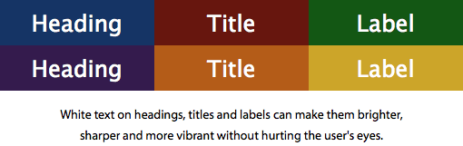
There are times when white text on a dark background works well. This is when users are scanning text. Users typically scan headings, titles and labels. Using white text on a dark background for these types of text is an effective way to highlight them to grab user attention.
White reflects all the colors of the visible light spectrum into the eyes [source]. This makes the text bright and distinct. You won’t have to worry about putting stress on the user’s eyes because scanning doesn’t take long visual fixations. All it takes is a quick sweep of the eyes to scan a heading, title or label.
Using white text on a dark background as a highlighting tool is a smart way to call out text that users scan. But black text on a light background is better suited for paragraph text that users read. Apply dark and light colors correctly so that users can enjoy your content without getting an eye ache.
Book

Affiliate

@Anthony: I don’t follow your reasoning where you stated that:
“A better choice for displaying paragraph text is black text on a light background. This is because black is a color that doesn’t reflect light in any part of the visible spectrum. It’s experienced when no visible light reaches the eye [source].”
In the case above, there is a lot more white on the page (i.e. background colour) causing a lot more light to reach the eye [source] than it would be with a dark background with light text.
Additionally, many programmers who have to spend all day looking at text on a screen opt for light text on a dark background because it gives lower eye strain.
That’s a common misconception. I have updated the article so that it explains the reasoning clearer. Let me know if you have any questions.
I am highly dubious of claims about reflected light where it is implied that reflected vs. absorbed light make up the bulk of the light experience in the context of a computer monitor, rather than e-ink.
Paper and e-ink use reflected light for white. Lit computer monitors convey white with transmitted light from the screen.
Computer monitors do emit light, but they also reflect it when it’s in a lit room. Just because it’s a computer monitor does not mean the laws of nature do not apply to it.
Stating that text readability is affected by reflection of light off a computer monitor can only hurt your argument. When a pixel is white, it is completely translucent, letting the bright, white back-lighting from the monitor shine through. When a pixel is black it effectively blocks that back-lighting, appearing black. The photons emitted from a white pixel will not reflect a photon from the lights in the room back into a user’s eye. The black pixels WILL reflect light emitted in the room. Most of the reflection from your monitor comes from the outer layer of material (glass, plastic, etc). In this case only the angle of incidence and the index of refraction of the material really matter – that kind of reflection is called glare, which hurts all readability regardless of color scheme. I think it really does come down to contrast and how long you plan to stare at the text in question, as well as the lighting in the room.
A light source cannot reflect light. The white/bright pixels on your monitor do not reflect light. As Schell mentions, you will get reflected light on the screen — in other words, glare — but everything you’ve stated about white lettering reflecting and scattering light applies only to non-black text, ie. text that relies on the reflection of light to be visible.
You have it backwords. White text on black is easier to read because ther is less interference from the back ground. IE if you use white on black text only the letters themselves are emitting light. Black on white text leaves a bunch of white lighted screaming at your eyes. People with bad vision will be the ones straining as all the white light surrounding the black text will bleed into your black text which making it hearder to focus your eyes on the text. This extra focusing effort is the real source of eye strain. Think of how strenious it would be if movie credits were done with black text on a white background. You woulden’t be ablew to read it. Also Notices that people with visual disabilities will need to use an inverted high contrast color scheme on their monitos when to make the text turn white on black when ther stuck with those curse word processors people use these days. Too bad theres no survey on what writers prefer to use.
I’m a software developer myself and always use an IDE that supports light on dark text.
People instinctivly think they like black on white text cause it matches what they normally see in print writing. But print is done that way because paper is light by default and it would be impracticle and messy to use ink all over the page except for white cutout letters. Although I have read an occasional time article that did just that.
Also using grey text on a white background is harder to read since you’ve reduced the luminence contrast.
Fully agree. I personally always use Dark Room or a dark theme in Atlantis Word Processor (white-on-black, or yellow-on_navy).
I don’t understand these comments about white on black is easier. I have to skip right over those pages or comments. It blurs my vision, literally makes my eyes hurt, and makes me see flashes of light. Not only on this post, but a lot of people I know find it easier to read the white on black. Why is that impossible for me?
The original post is more or less correct but for the wrong reasons.
Black text on white is the most readable scheme to most humans. The reason for this is that corneal aberrations are minimized when the pupil is at its smallest. The opposite occurs when, for example, you are dilated at the optometrists’ office (acuity goes down).
Black text on white is transmitting the most light to the eye and will look sharpest, especially for people with under-corrected vision.
However, in terms of eye strain, the best is a LOW contrast scheme. White text on black is the worst for eye strain (speaking grayscale). Black text on white is better but still not the best. Dark gray text on light gray would cause the least strain.
That’s true somehow. When programing, 99.9% of programers use black background and light texts of several color to difference properties, values, statements and so on. However, the font is light, usually courier type which is not practical for formatted web text.
I have to disagree that it’s a common misconception. John Beckett was correct that having a light background causes more light to reach the eye, which causes eye strain. It can even cause pain for users with Photophobia.
I understand your reasoning for why dark text on a light background might be clearer, but it still causes more eye strain.
Yes, you are right that a light background brings more light to the eyes. However, that’s not the point I was making. My focus is READABILITY, not how much light goes into your eye.
The fact is when you’re reading white text on a dark background in a WELL-LIT ROOM, as opposed to a dark room, the shape of the words and letters won’t come out as clear as black text on a light background for the reasons mentioned in the article.
Is a pure, white background the ideal background for reading paragraph text? Probably not for the reasons you mentioned. But a LIGHT background with a tint of grayness in it? Yes.
“My focus is READABILITY, not how much light goes into your eye.”
Well, speaking for those of us with overactive photoreceptors, I can’t read when my eyes hurt because of staring at bright, white websites all the time.
And screw people with astigmatism. At least my mutation is an advantage during blackouts.
“Screw people with astigmatism”? That’s about HALF the species. SCREW YOU, MORON.
Meh, regarding your comment, “And screw people with astigmatism. At least my mutation is an advantage during blackouts,” are you a cat?
You can just lowering brightness of the monitor, adjust it to be like e-paper.
When we read the focus is primarily on the text but not on the background. This probably causes the eye strain.
You have it backwards.
First of all, light off a monitor is not based upon reflection. It’s based upon transmission.
Secondly, most vision is based upon contrast, which is the DIFFERENCE between two areas. Grey on black (or white for that matter) is harder to discern. This is why eye examinations are conducted with black on white, for the contrast.
And Third, aside from color-confusion/blindness issues, the actual color of text/background does not matter. What does matter is that it is a color that would register sufficiently differently to the eyes (generally referred to as a contrasting color). Color, in this case, referring to hue, saturation, and luminosity.
That being said, even if we hold the supporting statements to your theory to be true, reason and science tell us that the bright thing in the middle of the dark is going to be easier to discern than the dark thing in the middle of the bright, if for no other reason than light spreads, and dark, being the lack of light, does not.
You are right that monitors emit light. But when you’re viewing your monitor in a well-lit room, your screen also reflects light. That’s why when you read white text on a dark background in a dark room, it’s easier to read than in a well-lit room. Developers often work in dark, dim rooms. That’s why coding apps use white text on a dark background to make it easy on theirs eyes.
How can you say color doesn’t matter, but then say contrast, hue, saturation and brightness matter? These are all apart of color. Different colors have different degrees of contrast, hue, etc. So color does matter.
You’re looking at this article wrong. This article is not talking about how many people can point out the bright thing in a dark room vs. a dark thing in a light room. That’s a totally different context. This article is specifically talking about the readability of text.
If you are talking about readability of white text vs black text, then why do most code editors come in a dark theme. Why is terminal window on mac defautl to black. If what you are saying is true. We need to shift the defaults for developers.
How about White on Black on mobile phones? In my experience it can be nicer. Like when it’s dark, it’s much calmer for your eyes because you don’t have the light of the bright screen in your face.
That’s some advice to keep in mind 🙂
I was amazed that grey text on black background is actually easier to read than white text on black bg, but it’s true 🙂
Good to know, and thx for the article 😉
Thanks again for this great article, over the 5000+ designs that I have created, having solid white on black is painful compared to having the text slightly gray on black (even if it is just a little bit less white, it helps.) Keep up the great articles!
It all depends on your audience..There are a few options you can use when deciding what colours to use when designing your games menus and screens Either dark text on a light background light text on a light background light text on a dark background or dark text on a dark background..Black text on a White background.
Black text on a white background is the most common way that text either printed or on web pages is presented. This dates back to the times before computers and type writers when the majority of printed text was found in books and in newspapers.
An example of a game that uses a dark coloured text on a light background is Assassins Creed shown below ..The amount of light reflected from a white background can actually cause tiredness or slight pain in some peoples eyes but because presenting information in this way is how many are used to the best way to make sure that the viewer is most comfortable when reading your piece of information is by using an off-white shade.
In contrast to many comments here, I have to agree with you simply because the grey text on black is far easier to read than full white text on black. This, I believe, is the core idea regardless of the science behind it and anyone arguing over the science is pretty much arguing semantics at the end of it all.
It’s not actually an argument against light text on a dark background but rather an argument against true white on dark backgrounds. White is light but light doesn’t necessarily mean white – it’s simple logic.
Also, if anyone’s noticed, programmers are not exactly known for their astonishing eyesight. I’ve tried working with a similar screen style but it just hurt too much and slowed me down massively.
Finally, I also believe that dark text on a white background isn’t exactly ideal either and that it’s often beneficial to reduce the brightness of the background.
I get an increase in readability from a light grey background rather than a white one as well.
After having looked at the alternatives, my preferred color schemes are always going to involve light grey instead of white, and a dark grey instead of black. It’s amazing how much difference it makes.
But when the science cited is wrong, I’m still going to quibble. 😉
Another example of this is in the website for Two Black Sheep Coffee.
Black background, Grey text, White (or red) highlights.
It is easy on eyes, to read.
Do I see it right that you placed the light-on-black in BOLD type and the dark-on-light type in NORMAL?
If so – how can you compare both?
They are both in normal type. Read the article and you will know why the light on black looks more bold. Everything in the article is absolutely correct.
The reason why that happens is because of the way Mac OS X renders bright text on a dark background, it has nothing to do with ambient light interacting with the LCD device. There have been attempts at duplicating this behaviour on different font rendering engines as evidenced here: http://www.infinality.net/forum/viewtopic.php?f=2&t=135&hilit=mac+os&start=20#p970
To further my point, here is what the inverse (that is inverting the colour values of every pixel in an image) of your screenshot looks like: http://imgur.com/Zy1vOvL
Hi,
An interesting read, but I’m afraid this article hasn’t taken in to account a critical component; there is a massive difference between how we perceive, and what affects, transmissive and reflective light.
As azurelunatic has already mentioned, reflective light, which is discussed within this article, is how we perceive printed words and colours, such as text in a book or in a newspaper, and is not relevant when discussing how to use colour displayed on a computer monitor.
Computer monitors are based almost entirely on transmissive light, which is not the same as reflective light, and the issues that affect how we should approach type for online are therefore not covered at all within this article. Transmissive light comes with its own issues and considerations.
e-ink is the exception to this rule, which uses technology to create text that is viewed through reflective light.
I would suggest further research is required here if you wish to include type displayed on a computer monitor. As it stands, this is a well written article when discussing printed text only.
Andy
To me this is an accessibility issue the same way many people with impaired.vision prefer light-on-dark text and may have problems similar to or worse.than mine when reading dark-on-light text. I still struggle with high-contrast light-on-dark designs.So if you want to use light text on a dark background please provide an.alternate stylesheet that turns the whole design not just the content area .back to dark on light. You should also consider what Mark Boulton has to say.in Five simple steps to better typography When reversing colour out eg white text on black make sure you increase.the leading tracking and decrease your font-weight.
Hi Anthony, thank you for such nice ‘observations’ regarding white-on-black, black-on-white text.
The results are right there, making me realize that one set is super easy to read while the other set is not….
but still, i think you MUST get a little more into physics and try to understand how stuff works.
But at the same time, let me point out it again that your ‘observations’ are really valid!… thank you.
This is a confused and poorly researched article. Quite apart from the confusion surrounding transmitted vs reflected light, the author makes claims and attempts to back them up with ill-sourced references. Example: yes white light is a mixture of all visible light frequencies and may stimulate all light receptors in the human eye equally, but why does this make it more stressful on the eye? No source is provided to substantiate this claim.
The optical effect of light scattering is then provided as a reason for the light from white on dark text being harder to read than the reverse. Really? Explain this and provide some evidence please.
If there is evidence and research from the world of physics or biology to substantiate the thrust of this article, it could make an interesting and useful piece, instead of this jumble of half-baked pseudo science.
For me, lots of white bodycopy on a black background is a no no, they often do it on the Sky 1 site and it feels like its vibrating, it gives me headache. Then when I go back to regular site, it takes ages for my eyes to readjust. A light grey text on the same background and I don’t have the same problem.
I find light (not white, or florescent green) text on a dark background less stressful to read, and i also like text in a variety of colors (as my site has them). But after reading this i am going to experiment with a off black background. And i thank God for eyes to see, and for color.
To put it simply, white text on a black background hurts my eyes and keeps me from being able to read anything else clearly and without a headache for at least 20 minutes. I see ghost or phantom text when I try to read another lighter page. I like gray on black much better.
I have to disagree.
White on a darker background (e.g. dark blue) is much easier for people esp dyslexics to read.
Since the advent of white boards and the increased use of work sheets and the demise of chalk boards in schools diagnosis of dyslexia has increased significantly and has a much wider impact on all subjects.
Previously the only thing dyslexics had to cope with was the reading of books (black on white) and now the problem with reading black on white affects all their classes!
Chalk boards were and still are miserable to read from because the contrast was terrible. I saw very few that were washed regularly, so it as usually white on murky gray. That said, white on gray or white on blue etc are not the same as white on black.
I’d say the diagnosis of dyslexia going up has a lot more to do with improved understanding and methods for diagnosing dyslexia over the last 20 years than the absence of chalkboards.
The whole range of conditions which can cause someone to have difficulty reading is generally better understood and in most cases more commonly diagnosed today than it was 20 years ago.
Enjoyed the educated posts, but would like to hear more about white vs black background on smartphone design. I am trying to make the decision right now as I type this, and finding it a difficult decision. Thanks All… 🙂
When to use white text on a dark background? I don’t even need to read the article.
The answer is easy: When you’re not maliciously trying to cause headaches and blindness in people.
It’s violent to make your background white.
I use light text on dark background on my blog. So I can save energy. Unlike dark text on light background, it’s easier to read. I recommended this reading method, or writing method because it’s easy to read, and it won’t effect your vision.
I still think White on Black is more readable. The only reason I can seeing Black on white is when there is a large amount of glare. With a white background, the amount of glare is less apparent, but in general, I prefer white on black as the words seem sharper to sort of stick out of the background rather than just the absence of light. I think the human eyes naturally pick up on brighter colors than dark.
White light from your screen isn’t reflected, it’s projected.
Also the light from one character, either on paper or on the screen, doesn’t touch the light coming from another.
I’ve been using computers since 1988, using the internet since 1993.
Websites text/fonts are getting extremely too light. No matter how I adjust the monitor and Windows display settings, it’s lousy. I have to choose within the browsers to display system colors in order to read or I just leave the site. With or without my glasses, it’s lousy. I can see without my glasses. I don’t have legally blind lenses and I’m not elderly.
The text is like, if they were talking vocally, they would be whispering so softly that you have to tell them “SPEAK LOUDER PLEASE!”
I wonder is the eyeglass industry behind this, so people have to strain their eyes in turn needing to buy glasses.
I read books I don’t find the text getting lighter & lighter with newer books like websites are.
The human eye has 2 kinds of receptors, rods and cones. Rods determine luminance (brightness) and cones determine chrominance (color). The eye can sense more fine shades in the middle of the visible light spectrum, right at green, which is why old computer monitors and new night vision goggles use green as their main display color.
High contrast is required for easy readability, and you should always convert your design to grayscale to see if it is still readable.
If you’ve ever used bright red (#FF0000) text on a bright blue (#0000FF) background, you’re an idiot. Convert it to grayscale and you will notice the text completely disappears.
This lack of contrast is why you get a headache when viewing such a horrid combination. The brain is trying to use cones vs rods to determine edges, and one says there’s an edge while the other says there isn’t.
Black on white, or white on black work well, although white on blue is better.
Microsoft spent a bunch of money to determine the most readable combination of colors, and it turned out to be white text on a blue background. That’s why it’s the “blue screen of death” instead of the “orange screen of death”.
this has nothing to do w/ the website info but, thx for having this out on the internets because for school I had to do a bibliography and this is almost exactly what I was looking for! #reallyHAPPY
I can’t read website with white text on black backgrounds – my vision goes haywire – I have to do a select all and usually when it does that – it reverses the colors when highlighted. It is still a pain though because there are black lines highlighted text.
The American Federation of the Blind says white text on a dark background is easier to make out for those with low vision. Why would that not be true for the rest of us?
For me, I enjoy reading white text on a black background because it allows my eyes a chance to rest. Computer monitors do not reflect light as a general rule, and when light is reflected (like on glass MacBooks), it’s not what you’re trying to read.
I appreciate articles like this that try to elevate the user experience, but it’s based on a very faulty premise.
i am reading this in reverse video, which makes it quite clear that white text on a black background (the left-hand option in the first two display boxes) is far easier (for me) to read in a computer monitor (not the same with paper or e-ink, since that is all by reflected light)
i suspect from the comments that different people have very different physiological effects and psychological responses to this issue (which is why i argue for letting me make the choice, not the web site), so that any answer or approach that says that (any particular) one way is best is simply wrong
I am curious if this goes for print as well as web. I’m designing an ad for a playbill which will be read by older people in a poorly lit room. Any ideas?
White backgrounds always look crisp and clean.
Why is it that reading through all the comments here has given me a headache? (It’s the white not the comments).
Grey on black is soothing while white backgrounds quickly feel like a bright light turned on in the dark (confusing and disorienting).
I have seen studies that show increased comprehension for yellow on black (which we probably all agree is just bumble bee scary).
Preference rules. Even if preferences can be exact opposites.
Thankfully we have CSS.
White text on a black background hurt eyes, period. But please, do not take my word for it, ask any optometrist. If you’re in a goth metal band and you want a dark master of the world website, great. If you’re trying to convey a message or subject matter that involves detailed and complete comprehension, grow up. I had to stop reading your view point at the end of “Reading vs Scanning”. Scanning literature is the very reason a double digit percentage of college students cannot read at graduation. End of story…
When? Never.
Billy, stop being a troll. It has been verified numerous times that light text on dark background causes less eye strain. My optometrist actually recommended that I use darker backgrounds during my long hours of programming for that very reason.
I’ve been a computer user for 50 (!) years and remember when all we had was black type on white background. I personally think the current crop of web designers are in an endless (mindless?) race to outdo each other in creating “glizzy” type fonts, and then blithely printing light letterings with small fonts on dark backgrounds to the detriment of us poor readers. We need to convey our messages without creating artificial subliminal distractions that slow readability, i.e. the speed of reaction and comprehension.
“To read or to scan, that is the question!”
P.S. Try reading a book printed all in white lettering on black background and assess your attention span and time to completion.
“Try reading a book printed all in white lettering on black background and assess your attention span and time to completion.”
I think the point many have made in these comments is that comparing projected light (like from a monitor) with reflected light (like in a printed book) are not equal comparisons.
What about white on dark brown? I find this comment section hard on my eyes but I like the white on dk brown.
I have to use plugins to change black backgrounds to white and white text to black text. Otherwise, it messes with my eyes and causes some kind of blurry vision.
I think it is because of astigmatism.
http://blog.tatham.oddie.com.au/2008/10/13/why-light-text-on-dark-background-is-a-bad-idea/
I vote for light text in dark background.
I agree with the reasoning of some in here that it is easier to spot something light in the dark and by so i guess it is effortless for the eyes too. Additionally, too much light emitted from a screen, it overwhelms sight. But i would like to mention some other ideas;
Printing is more efficient with dark text in white background, because of less toner/ink usage. So they do it like this since Ghutenburg… On the other hand light emitting sources like monitors, work better with dark backgrounds, mainly for 2 reasons. 1)You usually need less energy to transmit a dark screen (excluding older lcds where there wasn’t any deference) and 2) light screens could decay/burn pixels mostly on old crt monitors, but to tft’s also (at least leaving ghosts). I believe that the main reason for using dark text on light backgrounds at the computer industry, is for compatibility with…printing. And since we read books with white paper, we should do the same with computers-they say. Of course we could convert a text to fit printing needs, but that would need more expert users. And that would be a problem, so they prefer black text on whitish background. I think things should be deferent.
All these comments make sense. They’re simply logical. But what I cannot understand nor fathom is why in blazes would any writer use light grey (or very light blue) on a WHITE background? What’s with the GREY ON WHITE that you see on so many sites? Yahoo is especially guilty of this ridiculousness. Can anyone explain why it’s done?
I have the opposite problem. On screens, white on black looks sharper to me, black on white is blurry for me and causes pain and fatigue in my eyes.
I use plugins to convert pages to white on black, I use dark themes in mobile apps if available and I prefer sunglasses when reading printed paper in even light sunlight.
And light grey on white? That is just pure evil.
This is an argument for the opposite of what the author intends. It is evidence IN FAVOR of black or blackish backgrounds.
“White stimulates all three types of color sensitive visual receptors in the human eye in nearly equal amounts [source]. This makes reading white paragraph text on dark backgrounds stressful on the user’s eyes”
IMHO, the blocks of white on black above stand out better and are easier for me to jump in and read than the black on white.
Also, as someone with light irises who gets weary eyes by constantly gazing into bright, white light (Duh!) I strongly appreciate the sentiments for using off-white, like the background on this page, when using dark text
Please people he is making a point about readability, not trying to advance a physical theory of his!
When the paper is printed, the light that reaches the eye is reflected off the white areas.
When its from a monitor, the majority of the light is sent out from the monitor from the white pixels.
The same reasoning for color choice still applies.
The best for the main text body is gray background with darker text, and a good way of having eye-grabbing headers is white on colors.
I didnt know this because most of my programming was made with light grey or colors on dark grey. Its neither black or white so it was hard for me to have a good understanding of the subject of white/black/font because Ive used neither!
I’m one of the programmers who has to look at text all day.
Someone named Ethan Schnoonover claims to have developed the ultimate color schemes for clarity and eye strain. I don’t know how accurate his research really is, (he claims a great deal of testing):
http://ethanschoonover.com/solarized
His “solarized” color themes are very popular – especially among Linux programmers. Once I used the solarized light color scheme, I put it on every text tool that I use. I can’t go back to looking at anything else all day, (I try now and then).
I have had cataract surgery and detached retinas on both eyes. The new fad of low contrast very light gray on bright white is horrible and unreadable. I much prefer darker text. Or better, a dark theme. Light grey text on a dark background looks nice and readable.
Thanks for the good read Anthony. I wish more designers would use simple black text on a grey background. The opposite gives me a headache.
I think there’s a reason sites like Google, Microsoft, Amazon, Youtue, Ebay, Reddit, BBC and pretty much every news or even ever major website today use black text on a white or grey background. Not to mention every eReader I’ve seen.
One can only assume all of these companies have done their own extensive research and came to the same conclusion as the writer.
I’ve been using computers for the past 30+ years and I attribute the switch from light text on dark backgrounds to black text on white background back in the late 80s with the happening of the GUI as the number one cause for my complete loss of light sensitivity in dim conditions.
It is a proven, medical fact that bright backgrounds hurt the retina. Imagine 30 years working under those conditions!
Those who claim black text on white background is better base their opinions on a short sighted study that determined, quite justly otherwise, that because white backgrounds forces the pupil to close down, it improves focus. They just forgot to take the long term effects into consideration and the loss of dark sensitivity and night vision it produces.
I compose most of my writings in a notepad replacement that not only never crashes like word processors do, but allows me to write with grey text on black background. (under really bright conditions I switch to white on black). There just is no comparison with the blinding white most mainstream applications force users into in terms of productivity.
I am having a hard time reading these comments and it is beginning to bother my eyes. With the light gray font and white background almost like looking into a flashlight. I think using f.lux app would help by dimming the screen, but that would actually make the gray font harder to read even more. I think. I am no pro, but I know what bothers my eyes. I kind of prefer a darker background with a darker gray, blue or off white font. I really don’t know what I am talking about, but just what I like.
Here are my thoughts when it comes to designing sites that offer comfortable reading :
1. Screen brightness is what makes reading very straining. Take note that most users in the offices have their screen brightness set to very high because the area is well lit. Knowing this, take note that a shade of white (gray) or black for the background, will give some relief to the user’s eyes.
I wish CSS and HTML would have something that auto adjusts the brightness of the screen based on the website background 🙂 .
2. Font size: Anything bigger than 12px or 1em, is welcome.
3. Font Family. Using fonts that are San Serif ( Arial or Helvetica ) are good choices in my opinion. Serif Fonts (i.e. Times New Roman) was invented for printed news papers to save on Ink for mass production of reading materials. 😉
All opinions and creative preferences aside, what matters is what the reader does with your work. Studies have shown for decades that readers see but soon abandon light text on dark backgrounds. They just don’t read white fonts on a black background through, period – it’s subconscious – they move on to the next message and that’s probably going to be the competitor. (Who’ communicating to them in black on white) Stick with what works, not what you think looks better. It isn’t about you, it’s about the reader (potential customer) and the client. ( The guy who needs the customers so he can pay you for the wonderful work you do on his website)
Even after all those years this still is a great post. We’ve linked to it as reference in one of our articles. Keep up the good work!
I think I can agree with black text on white background being more readable. However, what if I use big letters? (For example 26 font size in notepad. I just tried, I can read it easily from 4 meters.) From my experiences dark background feels relaxing compare to white background. If I read for several hours (with breaks) my eyes start to burn from the light. But anytime if I switch to dark background my eyes feel relieved. It’s just my experience. I always use big letters to easily read the text, and for continuous reading I prefer dark background. Lighting is also a factor, I don’t really have reflections on my monitor, but my room is bright enough.
What is the scientific source for the claim that reading white text on a dark background strains the eyes?
Programmers/designers can benefit from using dark UI because they don’t actually focus on the same, small area, for a long time, but their gaze move around more than what you usually do while reading a block of text.
Interesting subject for sure…
My problem with this article is its voiced as though its fact, when actually it’s really a hypothesis.
It needs validating one way or the other with some decent testing/research.
I for one enjoyed this article, it made sense to me as I can see for myself that it’s harder for me to read the white on black. And the explanation also makes sense. So thank you 🙂
There have been several studies that seem to indicate that for those with full vision, black on white is preferred but that white on black is a little better for those with vision problems. But the key element is the contrast between the two colors.
-Michael Norman
What about white text on an e-ink device? how does this change? because the entire part of “Paragraph Text” change in that situation, there is no light stimulating the eyes …
The answer to this article is that “it depends.” For those who mentioned how programmers tend to use dark backgrounds, the actual reason for it is that it is easier to pick out colored text on a black background. IDEs color syntax so that the programmer can scan and find parts of code quickly and efficiently. To be honest, I don’t really know of any programmers that read code the same way that a person reads prose. When reading code and coding, I don’t really spend much time “reading.” The time is spent scanning for errors or matching variables, classes, operators, etc. When I read an article on the web, I prefer dark type on light background. When watching video, I prefer dark backgrounds. When coding, I often have my IDE set with a dark background and whatever resources open in windows with white background.
As for the science of all this, the poster who wrote about the irises is correct. In the end, the REAL solution to eye fatigue is not to stare at a computer screen for hours on end. Take regular breaks.
Thanks for reminding designers to make it easy for people to read the copy in their designs! Too often designers create web pages, for example, that look “funky” but make readers’ lives miserable. Among the other common problems I see (I’m a content writer) are an obsession with centred text (which changes the starting place of each line, forcing users to work harder to find where each line begins to continue reading), and font sizes and line heights that are too small (no prizes for guessing why that’s bad). If designers spent just a day learning about typography, the world would be a better place!
On an e-ink display, what about white text? What changes with this? There is no light stimulating the eyes in that case because the entire “Paragraph Text” changes.
Making the claim that the reflection of light off a computer monitor affects text reading would only undermine your case. A white pixel is fully translucent, allowing the monitor’s brilliant, white backlighting to shine through.
White text on an e-ink display—what about that? What does this alter? In that situation, there is no light to stimulate the eyes because the entire “Paragraph Text” has changed.
Your eyes are Made to detect light, which implies they are designed to look at white text (which emits light) and not black text (which is shadow or the absence of light). Furthermore, think of placing a fully white screen on your phone (it can be used as a torch and is strainfull for your eyes to look at), whereas a fully black screen on your phone is very relaxing (ie, phone turned off). So, in theory darker backgrounds with lighter text should be less strainfull on the eyes because you do not want to be staring into a torch (so to speak).
However, what I have said above is not 100% correct when you start to consider ambient light conditions. For example, if you are in a very brightly lit room, then white text on a black background will become more difficult to read, while black text on white background becomes easier to read.
In conclusion, is white text on a black background better than black text on a white background? The situation is murky. A lot will depend on your ambient light conditions. In a dark room, I prefer lighter text on darker backgrounds and in brightly lit rooms I prefer the opposite.
It’s ridiculous to have a black background. It’s easier to read black on white. Some folks are trying to force us to use something the majority don’t want. Some documents, power pt. slides and are going to white on black. You have to figure out each time how to print any of this. If you forget you get a pile of back paper that is hard to read and you’re out of black ink. We been using black on white paper for more that 3 thousand years. Ive been using it for over 70 years. Why would you want to wreck a good thing.