Tables are one of the most popular ways to display data. They’re effective at providing structure and organization to data, but they’re difficult to scan. Users often have trouble differentiating various data types at a glance. They have to read each column header title to do so, but this requires extra cognitive effort.

Here’s a data table of six records with eight different fields in the header. When looking up a specific data value, users will scan the record identity by going down the first column. Then their eyes have to scan across the row to find that value. As they do, they have to fixate on each value to determine if it’s the one. If a particular data type isn’t clear, their eyes have to scan upwards to the column header title to verify it.
This is a lot of work and a slow process for looking up a single value. It requires users to make many fixations and saccades as they scan. The cognitive effort magnifies for tables that contain a large number of records and fields.
From Data Tables to Data Cards
A more efficient way to scan tables is differentiation through visual recognition. Instead of reading text, users only need to look at the data’s appearance. From appearance alone, they can identify the data type. Not only that, but they can also differentiate primary and secondary values for quicker recognition. All this is achieved by transforming data tables into data cards.

Data cards can cut the number of saccades and fixations down. All the data values will remain the same, but they’ll take a different appearance. There’s now a hierarchy based on data type.
The eyes don’t need to travel long saccades to get to their target. They also don’t need to fixate on irrelevant data as they scan. Nor do they have to scan upward to the column header to verify a field. Once users find the record ID, they’ll spot the value they’re looking for at a glance. This differentiation utilizes human visual recognition capabilities instead of information processing.
Salient Record IDs
Data cards make finding record identities easier with salient visual cues. They’re always placed in the top left corner of the card header for high visibility. This visibility is persistent and will keep you from getting lost. It’s easy to lose track of record IDs on tables when there are too many fields to scroll through.
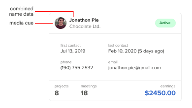
All fields that contain ID data are combined for a more robust data field. For example, the data card combines the client name with the company name as one field. On tables, they’re often separated into different fields.
Record identities also contain a media cue. A photo of the client or image of the company logo helps users spot the record ID easier. Their number of fixations will decrease if they can recognize their target by the media cue alone.
Quick Card Sorter
The addition of a card sorter can help users find a record faster. It allows users to sort the cards by any field with a dropdown select menu placed next to the table title. The cards are ordered by column, not by row, to line up the values vertically. This alignment allows users to scan in a vertical direction to compare values quickly like a table.

Column scanning on cards might not be as clean as on a table, but it’s no issue if all values are in the same positional pattern. Users only need to look in the same position across each card.
The example shows the cards sorted by earnings and the values in descending order by column. The color and font contrast as well as positional pattern help users focus on the values they’re comparing.
Contextual Status
Images and graphics are harder to display on a table due to row constraints. It’s also harder to view them in context of all the other data. Data cards are less constraining on images and graphics. They also allow you to view them in context, which is useful for analysis.
For example, the client status is displayed in a badge. While looking at an active status, it’s helpful to examine it with last contact, projects, and meetings to gauge the current activity. Doing this on a table is harder because the data are further apart and out of reach.
Focused Record Analysis
Tables make it difficult to analyze records. It’s hard to focus on a row when assessing values because the data in adjacent rows will interfere visually. When they do, you have to track your eyes back to the record ID to ensure you didn’t jump a row up or below.
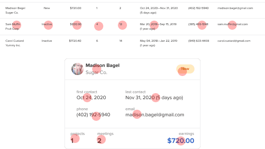
Data cards allow you to focus on a record without adjacent distractions. All data are inside the card and in the proximity of each other for easier analysis. You don’t have to restrict your eyes to a single row to avoid errors. Nor do you have to backtrack to verify you’re in the correct row.
Clear Stat Numbers
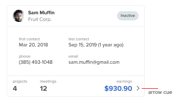
Assessing different stats is a common task. Data cards allow you to arrange stat numbers together for easier comparison. The card’s footer is dedicated to stats.
The primary stat number goes in the bottom-right corner and is highlighted with blue. Secondary stat numbers are arranged on the left. Since stat numbers are essential to analysis, they have higher color contrast to distinguish them.
No Horizontal Scrolling
When a table has too many columns, users have to scroll horizontally to view latter fields. This can cause them to overlook fields that are out of view. It also requires more work, which slows them down.
Data cards don’t have this problem because they eliminate horizontal scrolling. Adding more fields to the card only increases the height, not the width.
Longer Text Values
Long text values are harder to read on tables. They not only increase column width but row width too. When the text gets too long, it’ll either wrap to the next line or stretch the column out.
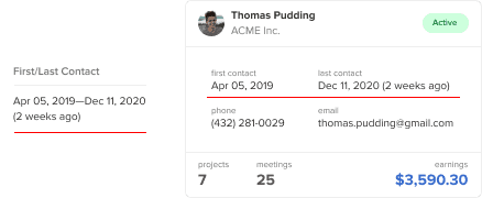
Data cards can display longer text values in a more readable format. There’s more room for text to grow, preventing text wrapping and layout breaking. You’re able to place multiple values side-by-side in the card’s body. This allows for an easier comparison of corresponding values. In the example, contact time and contact details are juxtaposed.
The field titles are also displayed with each value. This means you no longer have to travel back up to column headers to read the titles. There’s more text, but this isn’t an issue if you make the data values more prominent. To do this, use an all lowercase and lower contrast style on the field titles.
Drag to Reorder
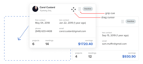
Another feature that aids comparison is the ability to drag cards to reorder them. You can apply this to the header of the data card and indicate it with a grip cue. When users hover over the header, a drag cursor appears. They can drag and place them around like real cards.
Detailed Disclosure
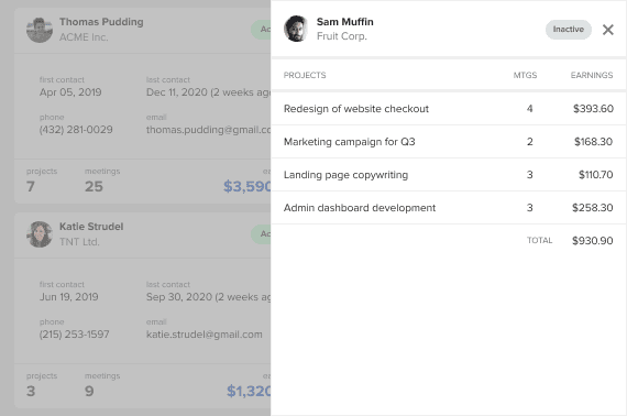
Certain fields include more details that users need to see. Tables will expand each row to display them. However, this creates clutter and distractions while viewing. A data card discloses details in a table sheet expanded from the side when you click it. The sheet is overlaid on the current screen to maintain context. It uses an arrow cue to signify its affordance.
The sheet allows more space for displaying the details of each field. This is especially useful for stat numbers. Stat numbers only provide an overview. This detailed view breaks the numbers down in context for in-depth analysis.
This sheet allows for long data lists. As it grows, users would vertically scroll as needed. You can even add another layer of disclosure to each table row if your data requires it.
Access Full Article
Get access to the full article to read the insights for designing edit/delete actions, pagination features, and data card anatomy. Your subscription gets you access to this article and all future articles.


My thoughts:
I felt the data table has its own strength. Because there are two types of users in the web application, one is regular and another is non-regular. For non-regular users, I think the data card will be the best solution but for regular users, the data table will work best because, for regular users they don’t need to know the header everytime, they already used to it and it will be easy for them to scan and compare between data.
Sounds great, unless I need to display > 6 items in a list.
Even when the table you put as example is a bad appproach for information presentation (earnings, projects, meetings and contact information, all mixed) I understand why cards are better than tables.
– Easier to progam
– Fully responsive
– Visually more atractive
But probably you need to understand why tables are better than cards when dealing with real information.
– Sorting by any criteria: just click in a header, or in the right control if the table allows multisorting
– Visually Searching: it is like searching in an index instead of reading the whole book
– Visually Comparing: you have one value right below the other.
So, tables are designed to allow users to manage information in high volumes.
In 2 pasts projects, UX people tried to put cards instead of tables, and they were dismissed from the project, by the clients. It was not usable for them.
So, whenever you do these sentences, try to put a context to say when and where this would be better, just in case a newbie is reading.
Great blog, thanks!
The title is somehow misleading: you’re talking about a particular way to display data; not data “tables”. Anyway, it’s a very interesting article, worth reading; including the 3 comments below.
@Cerebrado @David @Sc @NirajShakya Fully agree.