How should disabled buttons appear when they’re inactive? The way most designers indicate an inactive state is by graying out the button. However, this approach often catches users off-guard because the button’s enabled state looks nothing like the disabled one. Going from gray to fully colored is an unpredictable change that can affect user expectations.
For a smooth and seamless experience, it’s best to avoid graying out your disabled buttons. Instead, you should decrease the opacity to make it transparent.
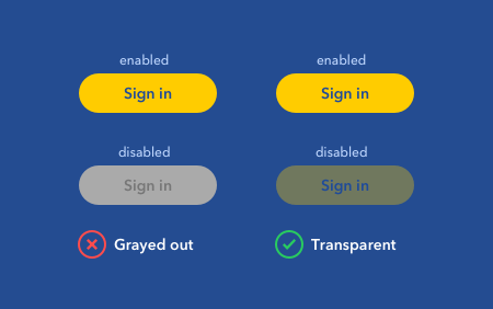
When the disabled button is transparent, users can see some semblance of the button in its enabled state. Although the button is faded out, some color still bleeds through for recognition. As the disabled button transitions to an enabled state, its new appearance is what they expect.
A transparent button also blends into the background more, while a gray one stands out in the foreground (unless the background is gray). Foreground elements are more noticeable, which means users are more likely to click a gray disabled button. When they do, they’ll wonder why it’s not doing anything.
Another issue with gray buttons is that it’s easy for users to mistake them for secondary actions. Gray is often used to communicate a low priority button (e.g., cancel buttons). When they see a gray button, they won’t know for sure if it’s disabled unless they click it. This uncertainty and unpredictability is not an optimal user experience.
When making your button transparent, adjust the opacity, not the color. The optimal opacity level will vary based on your background color. A rule of thumb to aim for is an opacity of less than 40%, or until the text label is unreadable. It’s important to make the opacity level low enough, or users may perceive the button as active.
By making your disabled buttons transparent, you’ll indicate an inactive state without confusing users. Instead, they’ll get a seamless and predictable experience as interface contexts change.
Book

Affiliate

You have som good points. But if users haven’t seen the enabled btn before they see the disabled btn, they may not know that’s it disabled? Maybe they’ll just think that this is the color for enabled btn?
Users often see grey btn as a universal diabled btn (in my experince).
Screen readers will often skip disabled elements, so I wonder if there’s something to be said for either replacing or augmenting the disabled element with text that explains why the current state prohibits the function.
What do you think?
But your example images demonstrate a clear issue with transparency. If the button’s active color is not clearly being used for other interactive elements then it’s not obvious it’s actually transparent. In the context of your sample image it just looks as if you chosen a muddy yellow-ish color. This makes it just as bad as the greying it out.
I’m not sure that this is good advice. For some people with low vision, the button may already appear blurry and with low contrast even in its enabled state. How are these people supposed to know that the button is less visible because the website made it semi-transparent to indicate that it’s disabled?
I agree.
By lowering the opacity enough so that it looks disabled rather than low contrast. An opacity of 40% or less is ideal based on my experience.
You could say the same thing about gray buttons that look like secondary actions.
It’s absolutely terrible advice.
Seriously?! What kind of ridiculous comment is that?
Why is it absolutely terrible advice. If you can’t state at least one reason, then you are adding absolutely nothing of value to the conversation!
The reason this advice is ridiculous is simple. For at least 3 decades gray has meant disabled. Now, some who has confusion with this idea wants to change it. Users have to learn how to use computers and disabled buttons are one of those elements they have to learn.
Another point. It is ABSOLUTELY STUPID to color an active control gray.
Please, if you’re going to post claims, please also provide supporting research or tests to back it up. I’m sure it exists and you have it from personal projects and experience, but without, it just comes across as your subjective opinion.
If you’re going to cast doubt on my claims, please refute the rationale in the article to legitimize your doubt. Without it, it just comes across as your refusal to understand and examine the claim.
It doesn’t work that way. You are the one boldly proposing a rather different approach that you claim is much better than the one which is a well established industry standard.
If I claim the world is round while everyone else says it’s flat, it’s not up to everyone else to provide proof I’m wrong. And if they fail to do so, I am not automatically right either.
There is merit to what you say, but there are also some questions. Make a case with support based on measurements or at least some observations as a starting point.
Where is there merit and what are the questions? Make a case by examining and addressing the rationale that supports the claim.
The above are quite legitimate comments. There’s no need to act defensively when provided with what I thought as a reasonable challenge and critique.
There’s no need to accuse anyone of acting defensively when what’s provided in return is a reasonable challenge and critique as well.
Hi, interesting article. Just like the posters of the replies, as fellow UX practitioner, we’re very interested in the research and the data (what type of scenarios is tested, type users, numbers etc. etc.) It would really help to illustrate your point, provide us more insight into this issue and makes duscussions more interesting.
Hi Anthony, I appreciate it takes a lot of effort to write an article but you’ve made some pretty bold statements here that I think it would be useful for you to expound on to the HCI community
Specifically here are my questions around some of the statements made in this article:
– “Users are less likely to confuse a transparent button with other buttons” – I’m presuming you have data to prove or disprove this hypothesis? And that you ran a proper experimental research process and can publish this? Or at least provide some solid user research data, qual/quant, whatever.
– “But a rule of thumb is to aim for an opacity level of 40% or below.” By saying “a rule of thumb”, you are again implying that research has been done, either yours or a reference to quality studies already done. Could you please point me in the direction of some data around this?
As we all know, working in practice with interaction design and trying to include cog-psych principles (which appear here to be around perception and action) is really hard and there are years of published research around the micro-usability of states with buttons, etc (NN Group et al.) It’s useful to challenge and be challenged around new ideas and I personally welcome this but I would be grateful as a fellow practitioner if you could provide some real-world data other than your own opinions so that I have a basis to consider, adapt and share this information. Credibility here is really important 🙂
I’d appreciate a response other than “Make a case by examining and addressing the rationale that supports the claim” to me personally that’s not enough to end a discussion, especially with all the exceptionally intelligent people that read your advice.
Thanks once again.
My claim comes from years of experience working with users and clients. If you need research to verify a claim you have doubts about, you should go do research on it and get experience working with users to understand how they behave. Since you’re a HCI practitioner who wants research so badly, I’m sure conducting one on your own wouldn’t be hard to do.
A perfectly reasonable request, I thought.
The articles on this website occasionally raise some interesting ideas, but it always bothers me that so much of the content seems to be based entirely on unsupported opinion. In an industry which depends so heavily upon supporting evidence, uxmovement.com’s prescriptive approach seems bizarre. It would be immensely more useful if the author included sufficient rationale behind his assertions.
However, the site seems intended more as a casual resource for those with a passing interest in UX—and I guess that’s the author’s prerogative.
Disabled states using gray have been in use for decades. Who do you suppose is being surprised by that?
As an alternative to disabled buttons, we have chosen to leave them enabled at all times and if the user chooses to click the button before everything has been satisfied to perform the action, we use the opportunity to provide guidance to users when they click the button that something must be done before the action can go through. This eliminates ambiguity caused by disable buttons which give the idea of “click me, but actually don’t”.
We have also chosen this path. A grayed out button is easier for development but the cognitive load is substantial. I get it has been common practice but our team has decided to move away from it. JMHO
It looks to me like the goal here was to make it clear that the button won’t work when you click on it (as well as making the transition to enabled from disabled more logical).
In certain colour schemes (oddly enough, like this one), decreasing opacity just ends up making the button look unreadable, muddy and ugly. On the other hand, a grey colour can be part of a colour scheme, depending on the app (for years, grey was the colour of nearly all things in desktop UIs).
Rather than go tactical, telling designers to decrease opacity for disabled items, I’d instead suggest that designers look at both states of buttons (and other items) and ask the following questions:
1) Do items you can’t click on look truly unclickable? If you test your app, do users stumble over the UI item or even give it a second look? If so, look at some other variation of a less-saturated/darker/less opaque treatment.
2) Are there any other cases where your disabled colour is actually something else in your UI? If so, avoid this and choose another disabled colour.
3) Do the enable and disabled versions of an item look similar enough that one can see one relating to the other? Try flipping the layer/treatment on and off. Does it make sense, or is it an arbitrary swap.
Thoughtful designers understand the semiotics (meaning) of disabled is different than simply choosing a grey colour or a lower level of opacity.
While I understand these points and mostly agree, user testing showed that on our app specifically user were confused by the lower opacity button. We use colors to drive forward progress through the software so when the buttons were the same color only lower opacity users still thought they were active. Many of our users seldom if ever use technology much less software, I would assume this plays a major role in the way these colors are perceived which is why I can only mostly agree with these points.
What was the opacity value of the button? What color was it and the background? If you don’t have a low enough opacity, users are going to mistake it for enabled.
Where are the tests to validate any of the assumptions?
This method has many issues that have already been pointed out. Disabled buttons do not need to meet contrast requirements, but that doesn’t mean that we shouldn’t aim to ensure they do. A pattern that I push for is to keep the state enabled, and upon actioning shift the focus to the first field that has been missed (and is required), showing the error. I’ve seen this perform much better than the aforementioned suggestion and works well for screen reader users.
I understand your point here.. But I would even disagree with your approach here.. Have an opacity with with the element being active color will some way around think as if it’s an active button rather an disabled one. We have been used by that pattern of disabled button over a period of time if you’re proposing a different approach you need to have an solid research or case study to substantiate it.
I would rather say why do we even need to disable the button allow the user to click on it and validate with the data provide necessary information. We have tried this approach and it worked..
How did you find that greyed out buttons are “surprising users”? It is actually industry standard and if you claim the other way around then better have some solid proof, which I haven’t found in the article. Also, sweating to reinvent the disabled button? Aren’t there bigger problems in usability than improving the experience of unavailable features?
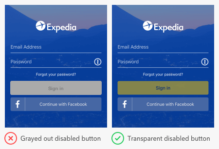
The second image in this story inadvertently helps disprove this idea. In the example on the right, both the “Sign In” and “Continue with Facebook” buttons are low contrast. If this were the first screen the user sees, they aren’t aware of the differing reasons behind why they are low contrast (Sign In because it’s disabled, Facebook because of brand colors), they just see what they see. A gray button would at least be using information they have acquired from other experiences.
No app/website exists in a vacuum. Using widely held conventions has merit.
Rather than disabling a button, provide a clear error/validation messages, why the form cannot be submitted. Don’t force the user figure what’s wrong, but just tell them what to do in order to continue.
I would like to see the research and numbers around how the classic, greyed-out button style is confusing.
From my experience, both confuses users. We’ve tested a disabled button on our submit pages, and consistently users:
a) Tried to click a disabled/opacity button.
b) Were not sure how to make the button enabled.
We resolved this by keeping the button fully enabled, and if they were missing form fields just pop a little old error up there.
It communicates to the user how to fix something, doesn’t confuse folks, and gets rid of the whole argument.
YES! THIS! Communication wins. Hopefully a screen reader would also pick up on the error messages and read them, making this more accessible than a color or opacity change.
“A transparent button blends into the background more, while a gray one remains in the foreground (unless the background is gray)”
It’s all depends on the theme, I think. There’s no exact rules whether to use transparent or gray. Also, there’s a lot of factors to think about – the theme, the mood, the concept, the audience, the device, etc. If you have designed plenty enough of projects, I don’t think you can easily say “Why You Shouldn’t Gray Out Disabled Buttons”
“Users are less likely to confuse a transparent button with other buttons.”
How did you know that? What kind of interface you tested them with?
This is the exact article I needed to dunk on my co-workers. Thanks Anthony.
“Greyed out” is often mistakenly used as the term for “Disabled” and can therefore lead to mis-interoperation by designers or developers as to how the button is physically rendered.
Why do you claim that lowering the opacity works better than lowering the saturation, which is the “graying out” effect?
I think we may be getting into a philosophical thing here… Is a designing an art or a craft? Do we need to test our assumptions? “I’ve done it a hundred times before!” Has tumbled out of my mouth a lot in the last 25 years in design. I would argue that since we can state hypothetical design solutions all day without understanding their actual impact. We would need actual data to understand how far ahead or behind we may be with a design.
I understand where your head is at when something feels just right. It’s hard when the wisdom of the herd may give you a hard pass on a concept. Experience has taught me the most trite sounding truisms can be more right than I wanted to hear.
Best practice for buttons in general is to enable and display an error message if a user tries to continue without completing a form correctly or leaving required fields blank. I always discourage the use of disabled states for any web component, especially buttons. This post also does not cover web accessibility in which the exception here is that screen-readers do not announce anything with a disabled state so it’s not a WCAG violation to meet color contrast ratio for components that are disabled. It really doesn’t matter what visual style you apply to a disabled button, it will confuse users who are, or who are not visually impaired. I personally think it makes more sense to discuss the visual differences designers and developers should focus on when a component is either enabled or read-only, but I’ll leave it at that for now.
When in doubt, don’t disable.
I don’t think users tend to view gray buttons as interactive, rather grey is a well-known convention that means disabled.
I don’t see much visual difference between graying out a disabled button versus setting the transparency. As others have said, the gray for the button is a long established UI convention (more than 20 years now) for indicating disabled buttons. It’s the convention that sets the meaning for “disabled,” not the fact that the button blends into the background. I think this is an example of someone proposing a “new rule” based on his own preferences. As others commented, where is the user research data to support the claim? UX designers need to demand the evidence before they condemn a convention to death.
I agree with the other commentators that this transparency solution will not produce the desired effect to the button. But I agree the orginal idea that there should be resemblance between active and disabled buttons.
How about if you do not lower the opacity but the color saturation? Maybe not to fully gray (0%), but to yellowish grey.
e.g.: hsl(59, 100%, 50%) –> hsl(59, 30%, 85%)
It’s translucent, not transparent. Users wouldn’t see a transparent button at all.
Also, this is bad. You can’t tell that a translucent button is in a disabled state at all. And in certain colour palettes, making it translucent enough to be different from the enabled state would make it difficult to even find.
Don’t do this. The Expedia example even shows why it’s a bad idea: it doesn’t look like it’s disabled at all.
I dare to say that we should avoid disabled elements at all cost, from an usability and, above all, accessibility point view.
Chris got the point here: https://uxdesign.cc/why-you-shouldnt-include-disabled-interaction-elements-in-your-design-system-76a2d4307faf
How many here mistook the grey reply button in the comment section for being disabled?
Yes, at first I did. I was confused whether or not I could click it, at first. This is an interesting article, but I don’t think there’s a lot of evidence to support the idea. I do think it is worth exploring and I enjoy the discussion, but wish it was a little more civil. I think @anthony’s idea is worth exploring and testing.
Translucency is effectively the same as as muting the colours and is not accessible for people with RGB blindness – this is why grey is the industry standard, and what users expect in most cases.
While the article is written convincingly, the entire article should have been written as an idea/discussion piece… not written as fact. The comments here are more useful than the article itself which does not provide evidence, and the author doesn’t seem to respond terribly well to user feedback. I find the most useful thing to remember as a UX is no single person always knows best, you have to be open to discussion, back up your opinions and listen more than dictate.
Off-topic:
Why is this field, so out of reach? (I had to scroll a lot to tell my opinion). I expected to be above all other comments.
As a user / consumer I expect to tell my opinion, not to my statistics about other comments, anyway.
On-topic:
Did anyway tried to lower opacity and add blur to disabled buttons? (instead of greying out)
Honestly, this is pathetic. You’re all squabbling on about the transparency or colour of a button.
The contrast is much better is the disabled button then the greyed out button. so i am all for it based on that alone.
Hello
I have a question about floating action button (FAB), does this apply to that as well?
In my organization I have created a design system with extensive color use documented. Color in my system means ‘interactive’ and clickable, like links, buttons, etc are all shades of blue. Yellow could work as well if that was out theme. Gray, a neutral color means disabled in my system, and any elements that used to have color is redrawn with a very purposeful, less contrast that the required 4.5:1 (on purpose). Gray is disabled, but the meaning of the lack-of-color communicates that it is not an interactive element. This is also a common pattern I see out in the world as well, probably for this reason.
That’s good point. But I think the users seem to recognize wrong buttons that low image quality. So I feel like correct design is grayed out disabled buttons more than transparent disabled button.
Both apple and google use gray to indicate a disabled state. Pretty sure they’ve done the actual research. I recommend following their example and the decades long established convention. It ain’t even broke.
https://m2.material.io/design/interaction/states.html#disabled
I don’t think that’s entirely right, in the new m3 Google Material design guidelines they are speaking of an opacity reduction to 38%, but they also desaturate the element’s color and switch text color to black, you can discern this in their example.
https://m3.material.io/foundations/interaction/states/applying-states#4aff9c51-d20f-4580-a510-862d2e25e931
You need to be very careful with either the greyed-out version and the transparent option, as these examples currently do not pass WCAG for color contrast. With many countries beginning to legally enforce web accessibility, this needs to be considered.