All clickable user interface elements need visual cues. Without them, users won’t know they’re clickable. Buttons and links have size, color, placement, and shape. But the only visual cue a text field has is its border.
A thin, faint 1-pixel line is not a strong visual cue because users can easily miss it. Text fields need a stronger visual cue to signify clickability, so that users can spot them quicker and easier.
Horror Vacui
A text field is an element that contains user input. Its border is not a strong visual cue, but the empty whitespace inside the text field is. The empty whitespace is a visual cue based on the principle of horror vacui.
Horror vacui is a latin expression that means “fear of emptiness”. It describes the tendency to fill empty spaces with information over leaving them blank. By giving your text fields an “empty” appearance, you can trigger horror vacui in users and give it a strong visual cue.
Signal of Emptiness
What makes a text field look empty is the inner whitespace. But the whitespace isn’t distinct when the text field is placed on a white background. To make horror vacui work, you have to place your text fields on an off-white background. This makes the emptiness in the text field more apparent to users.

Light gray is a practical color to use if the rest of your site is on white background. But you can use other off-white colors as long as the text field’s emptiness is noticeable.
Some designers may want to put labels inside their text fields. But this will lessen the strength of the text field’s visual cue. Instead, opt for top aligned or infield top aligned labels so that the label is visible without concealing the inner whitespace.
Text Field Hover Effect
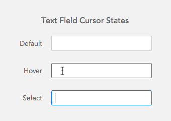
Hover effects often give buttons and links a stronger visual cue, but they can also work on text fields. You can give them a hover effect by changing the color and brightness of the border. You should display a different border color for when the user hovers over and selects the field to make each cursor state clear.

Text Field Size
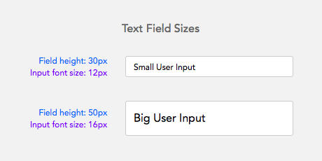
Most text fields are a modest size where the font size of user input is the same as the site’s body text. This is far too small for user input because it makes it harder to check for character accuracy. Making user input bigger will allow users to clearly see what they’re typing to prevent any mistakes.
Increasing the height of the text field also strengthens its visual cue because it creates more empty whitespace for users to spot. The average height of a text field is 30 pixels. Increasing it to 50 pixels gives it a stronger visual cue and allows for larger user input.

Combine the Cues
A 1-pixel border is not a strong enough visual cue to signify clickability. Make use of other visual cues such as empty white space, hover states, and sizing. When you use all these cues together, your form won’t just look easy to fill out, it’ll actually be easy to fill out.


Accessibility wise a Colour change on focus is hardly a “strong visual cue”. The default “blur” effect on OS X on focus is much better for example.
The grey background is a good tip for making the empty text field stand out. But you also have to make sure the text has adequate contrast. The medium grey text may work against white, but it’s lost when placed on a light grey background.
I’m fine with typical 1px or 2px border input field on white background. Just please remember about hover, on focus effect and of course add placeholder text even if you have labels for your input fields.
Btw. this website uses 1px border fields on a white background 🙂
That’s a great point @ seb…
Makes me wonder how one *should* handle text fields on white backgrounds?
I’ve used a light-grey background for inputs before, but I worry that can render a field ‘disabled’ in the user’s eye
You can also put a box shadow in addition to a border. Bootstrap does this. We also have a lot of forms/inputs appear in a modal so you could say the modal itself is the visual cue to do something.
What do you think about one line input fields (android) versus regular form fields? Do the users understand them? Is it easier or not? Even old people? Which one would you recommend? Do you have any research about it?
I think users do understand them because the underline has been used on paper forms for a long time. The only trouble with them is that they’re a smaller click target than a rectangular field. This means users will tend to move their mouse to the beginning of the underline to activate the field which can take more effort as opposed to anywhere inside a rectangle.
I think Material’s single-line input works better when accomplishing smaller tasks on mobile devices than it does in a full-blown application used on a larger device. When used on a website with data entry fields, I’ve seen people struggle to figure out what to do. They do not readily recognize the line as a place to click and start typing. Once they do manage to figure it out, they still move through the form more slowly since focusing on the next input takes them longer. I love Material Design, but I think the single-line input is a fail in the usability department.
I like this article. Thanks Anthony.