
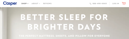
What do you notice about the website above? It doesn’t have a navigation bar. The text links are floating in space and obscured by the background image. Navigation is there for users to find what they want. That’s hard for them to do without the navigation bar.
The navigation bar is an affordance. Users rely on it like a safety net. When they see it, they know to go there if they get lost. When they can’t see it, they resort to page scrolling and link hunting. What’s the point of having a navigation if you’re not going to make it easy for users to see?
Background Image Is Not More Important Than Navigation
Many sites are removing the navigation bar in favor of an expansive background image. While this might have aesthetic appeal, you’re sacrificing an important usability function. Navigation are the legs of a site. Users will have trouble moving from page to page without it. They can’t use what they can’t see.

Sometimes the background image can lower the text contrast in the navigation. This makes the button labels hard to read. Users won’t click what they can’t read.
Stop removing the affordance that users need to navigate your site. Your background image is not more important than your navigation bar. Leave it in so that users can use it to find what they want quicker.
Links Blend in With Page Text Without the Bar
A navigation that isn’t obscured by a background image is better, but still not ideal. It’s easy for users to mistake the navigation links for page text without the bar.

The function of page text and navigation links are different. Separating them avoids confusion. The bar is what separates links and text, so that users know what they can click versus what they can only read. Without the bar, the links get lost in the page text.

The Bar
There’s no clearer affordance for navigation than the bar. When they can see it, they’ll use it. When they can’t, they won’t. Getting lost without a map makes you feel helpless. Users feel the same way getting lost on your site without a navigation bar. A thin, modest bar is all it takes to make that feeling go away.
Book

Affiliate

Along with the navigation bar don’t forget to implement a skip to main content link for keyboard-only.
An affordance is the property that allows action, so a graphical element that acts as a differentiator is not an affordance.
You’re presenting a matter of taste here as if it’s a hard and fast rule. The Airbnb example has its accessibility issues with legibility. Outside of that there is no direct demonstration of a problem, but just some wild guessing about the emotional state and action of users.
A navigation bar is an affordance because it’s a “graphical element” that tells users that there are links in this area for you to click, therefore “allowing action” as you described.
I didn’t know making navigation links easier to find and click was a matter of taste. I think most UX designers would disagree with you on that.
Good article. I am sick and tired of having to explain to designers why removing the nav bar in favour of the hamburger menu icon, on desktop websites, is bad for users and generally lazy design. I will use this article instead. Thank you.
Actually, Lucas is right.
Affordance is something you can do with something. And clearly, you can use navigation links in sites that have no actual “bar” for navigation.
Signifiers is word you should use, as “bar” signifies there is menu.
I agree with the rest. We, designers, should implement signifiers that are ready and fast to read, just as navigation bar.
“Background Image Is Not More Important Than Navigation”
Depends on the site’s objectives. Some sites have pages (and thus, nav) as a courtesy, but does not add to the achievement of objectives.
If your objective is to brand build, or present a hero product/service – then the background image could be much more important than the nav.
There’s so many possible outcomes here, it’s a very long bow to draw to just wrap every UX opinion up in a single statement like that.
“Background Image Is Not More Important Than Navigation”
Well said.
I have never found a screen-filling picture helpful.
It just signifies “work” – that this site is going to take a lot of scrolling – for very little pay-off.
Compounded by hidden/unclear navigation (e.g. plain text floating in the clouds…..), such sites are an instant turn-off – time better spent on another site with clear, easy navigation.
Pictures rarely “tell a thousand words”.
Mostly they get in the way.
Upon landing, I want maximum info in one view – and that means Content, Contents list and full Menu bar navigation.
I agree with author and Jules. Even if the objective of a site is to brand build, the win of dropping the navbar is less than the win of making it easier to find where one can click. These two goals can easily live side by side. Dropping the navbar on websites does not deteriorate the objective to showcase your brand. Here is an interesting article about this theme: https://www.nngroup.com/articles/content-chrome-ratio/