Contact forms are more than a passive method for communication. Great ones inspire user engagement. But what are the key features of a contact form that do just that? Here are 5 tips based on research to help you get more from your contact form.
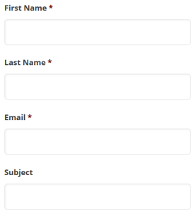
1. Use the right form layout
A recent eye tracking study conducted by researchers from Switzerland and backed by Google proposed a set of 20 guidelines for improving form usability.
Here are 3 key takeaways from the form layout section of the study:
- To help users fill out the form as quick as possible, you should place field labels above the corresponding input fields
- You should never split a form into more than one column – it’s best to ask just one question per row.
- Match the size of your input fields to the expected length of the answer.

2. Focus on three fields
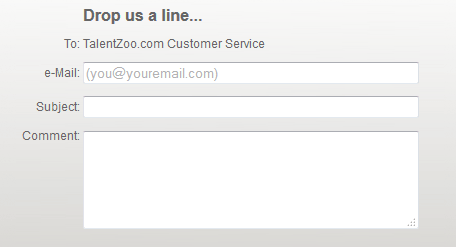
Quicksprout’s infographic shows that limiting the number of fields in a contact form can improve conversion rate. Including only 3 fields guarantees at least a 25% conversion rate. Adding even one more field can significantly bring this figure down.
Another study by HubSpot confirms this. They analyzed 40,000 forms and found that reducing the number of fields from 4 to 3 would bring an almost 50% improvement to the conversion rate.

3. Kill the captcha
Captchas are one of the most popular anti-spam measures applied to contact forms. A research study makes it clear that captchas have a negative impact on conversion rates. Companies that use captchas might be losing out on 3.2% of all conversions from their forms.

When building your form, you’ll come across the problem of balancing security and usability. Most captchas are annoying because its images are sometimes impossible to decipher.
If you want to avoid spam, but also want to maximize your conversion rate, you need a spam protected captcha-free form. You can do this by dipping into a bit of HTML and JavaScript code.
4. Don’t ask users to ‘Submit’
Research from HubSpot has made it clear that labeling the submit button ‘Submit’ has a negative impact on conversion rate. Going for the obvious will cost businesses at least 3% of their conversion rate.

Writing ‘Submit’ on a button is unoriginal, generic and doesn’t inspire anyone to reach out. Your contact form button should remind users what they’re doing when they contact you.
The message will depend on the goal of your contact form. For example, ‘Get a free demo’ or ‘Get your free quote’ will make sense in certain contexts to motivate users to reach out.
5. Don’t ask for phone numbers
Asking for a phone number is one of the cardinal mistakes on a contact forms. HubSpot’s research found that phone number fields lead to a high form abandonment rate.
Not only is it an extra field, but it’s based on a wrong presumption that users are ready to share their phone numbers. Nobody wants to get their day interrupted by a persistent salesperson. Instead, ask for their email address and allow them to respond at their convenience.
If you need to ask for their phone number, you can add the field, but only if you mark it as optional. A study from ClickTale found that marking the phone number field as optional decreased form abandonment rate from 39% to 4%.

Contact forms are mission critical to building a successful online company. Investing resources into reducing friction on your contact form is worth every penny.


Forwarded to sales, who insisted on *takes-a-deep-breath* first and last name, email, company, company URL, company size and work telephone number. *pfiew* (We brought it down to just name, company, email, non-obligatory telephone number, and of course – the contact message.)
Excellent tips Tess! Thank you – especially useful is the link to the JavaScript… I find clients are always super hesitant to drop the captcha, I’m hopeful this will help!