Every interface has users that make up the majority and minority. The majority usually have normal vision, while the minority have some form of visual impairment. There’s a big difference between what normal-visioned users see versus what color blind and low vision users see. These users tend to experience blurry text and faint elements when text sizes and color contrasts are too low.
The goal of accessibility is to meet the needs of the minority because they’re often forgotten. But what happens when meeting the needs of the minority ends up failing the needs of the majority? This issue occurs when the interface is made too accessible and isn’t balanced with aesthetics.
Aesthetic vs. Accessible
In general, the more accessible an interface is, the less aesthetic appeal it will have. Highly accessible interfaces are easier on the eyes of the visually impaired, but harsher on the eyes of the normal-visioned. On the flip side, highly aesthetic interfaces are easier on the eyes of the normal-visioned, but harsher on the eyes of the visually impaired.
This aesthetic-accessibility paradox is what designers struggle with when they design interfaces. The challenge is to meet the needs of both the majority and the minority. However, if you veer too far into one extreme, you’ll alienate a subset of your users. Most people don’t want to alienate the minority. But alienating the majority of your users is just as bad as alienating the minority.
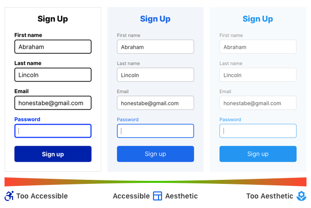
Below are two forms that illustrate this concept. One form is AAA compliant and accessible to all visually impaired users. The other is not accessible at all but appeals to normal-visioned users.
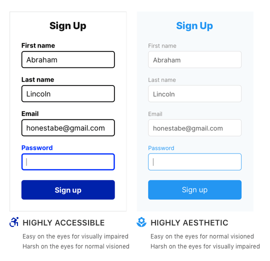
For the normal-visioned, the aesthetic form is easy on the eyes, while the accessible form is harsh. However, for the visually impaired, the accessible form is easier on the eyes, while the aesthetic form is harsher. Which form should you use?
The correct answer is neither because neither form respects the aesthetic-accessibility paradox. They are designed toward opposite ends of the continuum, which will either alienate the majority or minority.
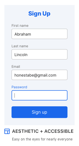
A truly accessible and aesthetic interface falls somewhere in the middle. Below is the form that respects the aesthetic-accessibility paradox. The color hues, contrasts, font sizes, and weights are balanced with AA compliance and meet the needs of both the majority and minority. The result is an interface that’s easy on the eyes for the maximum number of users. On top of that, complying with AA also follows the legalities of Section 508.
The Majority of the Minority
An interface that’s balanced with aesthetics and accessibility isn’t necessarily easy on the eyes for every user. Within the subset of the minority, there’s another majority and minority. The majority of the minority are users who don’t have extreme visual impairments and will be able to use a balanced design. But the minority of the minority who have extreme visual impairments will still have issues.

Designing for the smallest minority will make your design accessible to users with extreme visual impairments. However, your design will alienate normal-visioned users who make up the majority of your base. For this reason, the best design is a balanced one that satisfies the largest minority.
What about the needs of the smallest minority? Most users with extreme visual impairments use assistive technologies that provide high contrast modes. These modes allow them to read low contrast interfaces by inverting the screen colors.
Local High Contrast Mode
Sometimes a highly aesthetic or highly accessible interface is required based on the nature of a project. There’s a way you can provide users with these presentations without alienating any of your audience.
If you want to maintain a highly aesthetic design, provide a local high contrast mode on your interface. A local high contrast mode is a toggle button on the page that allows users to enhance the contrast of text and elements to AA compliance. On the other hand, if you want to offer users a highly accessible design, your high contrast mode would display an AAA version.
The challenge is getting users to notice and use the high contrast mode. Make sure it’s visually prominent, or they’ll overlook it. The example below shows a button for high contrast mode, but it’s in an obscure location and hard to notice. If you decide to implement a local high contrast mode, follow these guidelines.

The Importance of Aesthetics
There are accessibility extremists who tend to discount aesthetics. They believe an interface should be as accessible as possible for the minority without considering how it hurts the average user. These extremists need to understand the aesthetic-accessibility paradox before demanding the highest degree of accessibility.
Aesthetics isn’t a subjective and trivial attribute used for ornamentation. It serves an important purpose in the user experience. It determines whether users trust your app, perceive it as valuable, and are satisfied using it. In other words, aesthetics affects user engagement and conversion rate. Discounting it is not only bad for users, but bad for business.
Striking a Balance
Balancing aesthetics and accessibility isn’t easy, but it’s necessary for a great user experience. The cross-section of the aesthetic-accessibility paradox is the balance point for designing interfaces that satisfy the most users. Avoid designing at the extreme ends of the continuum and respect both aesthetics and accessibility.
Being mindful of this paradox will help you make design choices that include the visually impaired, without excluding the normal-visioned. When you’re designing for a wide range of people, extremism toward either an aesthetic or accessible direction is not the best approach. Finding the middle ground is the best way to reach and satisfy as many users as possible.
Book

Affiliate

Hmm… I think low-contrast, soft-color designs are only labeled “aesthetic” because they are the preferred “safe” designs that corporate decision makers can easily agree on. There are many aesthetics and they shift over time. You’re false-dichotomy of aesthetic vs accessible is not quite right and oversimplifies the choices a designer can make in regards to something they’re building.
Beauty is in the eye of the beholder. I’m a UX designer with normal vision (when I have my glasses on!), and I happen to like the “Too accessible” version more than the “Too aesthetic” version.
Just saying.
I have a hard time thinking that this author knows anything about accessibility when the term “normal” is used over and over to describe people without disabilities or accessibility needs. This article perpetuates the myth that designs that are accessible don’t “look good.” What an ableist point of view.
Accessibility extremists often get offended over the term “normal-visioned.” But this is an innocent term used to describe those who have normal vision. If you’re offended by it you have to grow up and be a more mature adult. There are more serious and consequential things in this world to get offended by. This is not one of them, so put down your accessibility pitchfork.
I did not state accessible designs “don’t look good.” I stated that extremely accessible designs on the far end of the aesthetic-accessibility spectrum lack aesthetic appeal. This is because they’re not designed for aesthetic appeal, but rather for functional purposes. To get a better understanding, go to the accessibility settings on your phone and put it in high contrast mode. Do you find it aesthetically appealing? A balanced design that follows the aesthetic-accessibility paradox can certainly appeal to the majority. That’s what this article advocates for.
If you think that was an extreme point of view, you have lived a sheltered life. And it’s perfectly reasonable to take umbrage with the misapplication of the term “normal”. Disability is a complex, broad, and imbricated area/issue, affecting most people in one way or another. If you do not have, never have had, and never acquire some form of disability at some time, _you_ are abnormal/unusual/rare.
If you’re offended by a word used in the literal sense, I would say you have lived a sheltered life. People with normal vision are “normal-visioned.” It’s calling it what it is as it is. To insinuate that this is a derogatory or judgmental term is absurd and immature.
It seems like you’re injecting your own personal feelings into the term because it points out the real differences in people, which maybe makes you feel insecure. Offending anyone who is disabled is not my intention. However, you should not be projecting your insecurities into a literal term or onto me for that matter. Doing so exhibits the actions of a holier than thou rabble-rouser.
“Normal” is hurtful because it frames some people as desirable and some people as undesirable. It establishes a hierarchy of human beings ranked by how similar they are to each other. My family told me I was not normal when I came out of the closet.
You are right that there is a difference in how people perceive the world and we need to have language that accurately reflects that. But this particular word has been used as a weapon against a lot of people and comes with a lot of baggage.
You might consider using the work ‘typical’ rather than ‘normal’. A lot of people see “normal” as a synonym of “good” or “correct”, which make non-normal “bad” or “wrong”. Using the term “typical” puts the emphasis on quantitative distribution of instances rather than qualitative judgement of the situation.
There’s an enormous difference between calling someone “normal-visioned” and simply calling them “normal”. Anthony only used the term “normal-visioned” and its meaning is perfectly clear, and it’s not derogatory in any way, simply meaning the vision capabilities of the vast majority of people. On the other hand, the broad brush term “normal” has no clear meaning, and depending on context, could be considered insulting or demeaning. It’s quite clear to me that Anthony, by his use only of the term “normal-visioned” and the general content of his text, never gave the impression, either explicitly or implicitly, that in any way he considers some humans inferior to others.
This sounds like a more specific case of something everyone has seen before, a moral extremist.
They take something with widespread moral support, animal welfare, gender equality, etc. and take it to extremes (e.g. kill all humans to save the rainforests) because who would disagree with saving the rainforest?
Gosh what a bunch of sensitive easily offended millennials! The term normal is not derogatory, the eyes’ vision has a scale which determines the “normality”. Research the phrase 20/20 vision and you will find that it refers to as being the NORMAL vision in the world of ophthalmology. It’s not the author who determined this, it is the medicine!
Relax and take a grip.
Despite what others above have said, I think your approach is valid! It’s important to recognize, and accept, the differences between the types of users that we are designing for. If you cater too much for any single group of people, your product / site will likely fail.
Every design has trade offs and decisions that have to be made. Balance in all things is a worthy aim…not just in design! I have worked on many a11y websites in my 20+ years in the industry. It is true that designing and coding for a11y has an impact on the code and visual aspects of your site / product. In order to make a site pass accessibility tests, you sometimes do have to adjust your design in ways that you might not want to otherwise.
It’s impossible to please everyone…knowing your audience and finding a healthy balance for all your users is a worthy goal!
I think the article would better be framed as an example of finding a compromise between accessibility requirements and certain engrained notions harboured by corporations, patrons, and also many graphic designers who believe that soft and subdued is ‘pleasing’, ‘aesthetic’, ‘easy on the eyes’. There is no such thing as some objective ‘aesthetic’ that would justify soft design as superior to the high-vis design. It is just design conventions creating expectations creating (unfounded) opinions. The only sound design approach would be testing (not only, but also with users with disabilities) what best supports the interaction for as many users as possible. So in terms of a strategy for reaching a compromise between conflicting powers impacting design, the article has merit. The author’s hurt pushback against supposedly immoral / phony / righteous “accessibility extremists” does not add anything of value.
“Designing for the smallest minority will make your design accessible to users with extreme visual impairments. However, your design will alienate normal visioned users who make up the majority of your base”?—what evidence do you have of this?
I’m curious about this as well.
The article itself shows “there is a balance – you can be aesthetic and accessible” but moves on to act like “it’s impossible, screw disabled users, focus on the majority.”
That mentality is what has lead to a slew of lawsuits because designers didn’t want to “compromise” and felt their “aesthetics” mattered more than federally mandated requirements for accessibility.
The design examples in the article that are recommended ARE accessible according to federally mandated requirements for accessibility.
Design is not merely aesthetics, but also usability. Accessibility is usability for everyone. If you want to create something based purely on aesthetics, then create a personal art project.
It was a mistake coming into the comments section…
I mean…I design things so they are legally compliant in the place that we do business, but there’s LOTS of “discrepancy” in those legal specs… and can be interpreted and mitigated differently.
I do also see that many are “extremists” as some people note…
Personally. I would like to see a browser based setting with some AI and ML to make any/every site/application hyper accessible. This way, we don’t really need to worry as much aside from good taste, and those who are hyper critical are satisfied.
For iOS apps, I believe devs have access to if the user is asking for higher contrast.
For web, “@media (prefers-contrast: high)” is in draft form so hopefully we can take advantage of it some day.
Nowhere in the WCAG AA or even AAA guidelines is a designer forced to use pure black on pure white, but this article makes it seem otherwise with its examples and absurd statements like “the more accessible an interface is, the less aesthetic appeal it has.”
The proposed “aesthetic-accessibility paradox” does not exist and suggesting that designs and products can be “too accessible” is honestly a pipe dream rather than a thing we actually have to guard against at this point in the web.
“The goal of accessibility is to meet the needs of the minority because they’re often forgotten.” At risk of being labelled an “accessibility extremist” and dismissed by this author, I really want to challenge this outlook. In my experience, this is not at all why we create accessible web sites. We do so to empower our users and make our products available to the widest possible audience. Just as we test prototypes to assure users understand a feature or A/B test a call to action to have the greatest effect, we test color contrast and make sure form fields have focus effects to have the greatest usability — for those who have impairments that may be permanent, temporary or situational. I’m not looking to do my potential users a favor by deigning to remember they exist, I’m doing it because they are potential users and I want to make good on that potential.
This seems like a false dichotomy. Can’t something be AAA-accessible _and_ look good? I’d probably fall into what the author calls normal-visioned and I prefer the designs labeled “Too Accessible”, they still look pretty good and are bold/hard-to-miss while the “Too Aesthetic” ones seem milquetoast and easily ignored/passed-over.
I have impaired vision. A type of colour blindness.
UX designers can either choose to help me or hinder me with that. If I am hindered then I am unable to participate. That might mean me not reading a blog post or skipping a page here and there. It often means I don’t even know a lead capture form exists when I get to the end of some content. If I don’t even know the form is there I can’t put my email into it.
This article makes me feel like I am the problem for being colour blind….
Hi there, I am curious to know if, as a colourblind user, there is not a browser plugin that can adjust colours accordingly to make them clearer to you?
Thanks for your input! I often fixing styles to make them more AA compliant but wonder if I’m wasting my time as it would be VERY easy to make a browser plugin which detects low contrast text and ups it . Therefore every site would be high contrast.
Automatic colour conversions aren’t normally fit for purpose. The best way to go about this is either to design with colour blindness ahead of time or to give users fully customizable colours on their end.
Run your design through a daltonising filter (colour blindness filter) to preview what it looks like for colourblind users, run that daltonised version of the site through a contrast checker. If those come up fine then you’re probably okay.
This article is clearly written from a designer’s point of view. I think it’s nuance and intention can be lost on a lot of developers who don’t completely understand design ~aesthetic~, and why it is just as important as an AAA WCAG score. Furthermore this issue isn’t a black and white case of designing for abled or disabled users. It’s finding that middle ground that surely most designers and devs do in their day to day work.
I think what anthony brings up is interesting and it is valid to think about and question these constraints. Designing for the largest minority doesn’t mean outright excluding the smallest minority. It means accepting trade offs and knowing that there will likely be a use case that you haven’t even thought of. Ideally I think it would be awesome if browsers could run high contrast modes natively (so it would still be up to the designer to design with good contrast but colours can be filtered automatically if needed by the user). My point is, a WCAG score isn’t going to fix all your a11y and usability issues because no amount of testing or thoughtfulness can cater to everyone without some sort of compromise or toggle.
I also wanted to say I don’t believe the dog piling in the comments is very helpful and I’m sorry to see it get this way without some sort of meaningful, un-defensive discussion. It is literally impossible to please everyone without making a compromise and if you look at AAA rated sites, usability and aesthetic is often affected. Personally, I have low quality vision and often have to zoom in on websites to read text. When I visit AAA or even some AA websites I can often see where the trade offs are and how navigation and usability is affected (sometimes negatively despite the score and intention).
It is still valuable to question current constraints, find a middle ground that is usable for your audience and learn from past mistakes. I don’t think anyone can claim to have made or designed a perfect website that suits everyone because with the current tech and standards that is highly unlikely ( but if you have an example you want to share I’d love to see it).
Aesthetic beauty has less to do with overall color contrast and more to do with visual hierarchy and attention to detail, in the same way both soft and loud music can be beautiful and appealing.
It’s definitely not easy to make a great experience that’s usable by everyone, but it’s our job as product designers in the same way it’s a road worker’s job to make sure the roads they’re building are safe for more than just expert drivers.
If you’re not up for that challenge you’re going to get left behind as our industry continues to be more inclusive and responsible.
Any designer worth their salt can design within constraints. Saying that an accessible interface is not aesthetic is unimaginative and exclusionary. Poorly-thought out rationale like this leads to unreadable 13px #767676 font on light grey backgrounds.
Would you suggest that we don’t need to build accessible buildings because doors at ground level are “too ugly”? Or that we should remove street signs for drivers because they make our cities “too unaesthetic”? We are all edges cases to someone. I would suggest building your knowledge on accessible design before publishing something so ill-informed.
Once you get to your late 40s mate, you’ll be glad of those high contrast designs. Age related long sightedness comes to us all, if we’re lucky enough to live into our 40s – “normal’ vision isn’t really so normal and by improving your design for people with the worst vision you make it so much better for us with more mundane, and inevitable, sight problems
This article was great, keep up the great work! I think some of the others who have more negative comments didn’t fully read the article and are misinterpreting the message. At least from what I read it’s a well balanced argument he’s arguing.
For those interested in optimizing for accessibility — if there’s room to get a higher AAA score, do you always find color contrasts that maximizes the amount of AAA score you can get?
Instead of bashing the author, could you please write your own piece that can help educate the rest of us how it’s supposed to be done? This is an important issue, and instead of taking down other authors, please help support / nurture / educate so everyone can learn from your experience.
For example, how are you designing for every type of accessibility user? It goes beyond color contrast of course, so how do you do it, and how do you convince the rest of the team to spend more time on it (it probably needs to ladder up to developers understanding and implementing ARIA correctly, to project managers understanding how taking time to put in accessibility takes precious time and resources away from other projects, etc.) — how do those decisions get made at your organizations? Very few articles and viewpoints are written about this, please share your own!
Thanks!
well explained. balance is needed and i think you satisfied both accessibility and aesthetics.
Simple solution – make another version of a website for the visually impaired people and don’t forget to include a switch to an aesthetic site.
A separate version of a website for users with certain disabilities is not a recommended web practice, for a few reasons:
1. Developers would have to maintain two versions of the website, which doubles their workload. If you’re going to put in the work to build a website, you should save yourself the time and factor/style semantic HTML into the final product so you don’t have to build a second version for accessibility. Historically, the primary and more aesthetic site would be actively maintained, while the secondary accessible site would fall more out of date. This leads to two different experiences for users that need an accessible site and those who don’t.
2. Separate “assistive” sites are a digital backdoor, similar to the physical backdoor that wheelchair users would have to use if the front entrance isn’t designed accessibly. It can be hurtful to not be able to enjoy the same content their friends and family can enjoy because the site wasn’t developed to work optimally with their assistive technology.
3. A separate assistive site does not mean you have met your obligation for accessibility. A settlement between Scandinavian Airline Systems (SAS) and the Department of Transportation forced SAS to refrain from using a separate accessibility version of the site and make their primary site accessible. Level Access goes into more detail about this settlement: https://www.levelaccess.com/settlement-shows-limits-separate-equal-approach-digital-accessibility/
TL;DR: there is less work, les cost, and more benefit in baking accessibility into your main website.
This issue is not only one that impacts visual designers, I very often hear developers debate whether a particular technology should be used if it isn’t widely accessible. But there are also some interesting edge cases where a specific visual presentation must be used for valid legal-compliance reasons. In any case it is not particularly original to point out that there will be competing concerns in any design decision, and it is helpful to discuss ways of weighing and balancing those concerns. But any company that thinks they can just dismiss an entire side of that argument will almost certainly find themselves on the losing end of a very public court case, regardless of how much they may whine about “extremism”. This article would be more interesting if it explained how to weigh those competing concerns in more informed terms: there are legal, moral, and commercial concerns that all need to be considered to varying degrees by different kinds of organisations. And nearly every decision involves compromise. WCAG themselves acknowledge this, and while literally saying, “it is not recommended that Level AAA conformance be required as a general policy…”, go on to explain many ways to solve this so-called paradox of competing concerns. One of those ways is actually illustrated by this article’s author: providing an alternative compliant version. It’s well worth a read if you are interested in going to the source: https://www.w3.org/TR/UNDERSTANDING-WCAG20/conformance.html#uc-conforming-alt-versions-head
Finally, I do think that using language that offends people is a poor way to win them over, so listening to them when they point out they don’t appreciate being called—by implication—abnormal would be, uh… useful. The fact is, I very often find I can’t read low-contrast designs when I’m using my mobile phone in bright light, and that has nothing at all to do with my own eyesight. Improving options for accessibility has lots of positive side effects for everyone.
There are no laws/regulations worldwide that require Level AAA color contrast for websites. If you’re running a website geared toward persons with visual disabilities it would make sense to work toward Level AAA color contrast, but that doesn’t require black text on a white background to meet it.
Indicating that the “majority” of persons do not have some form of visual impairment – especially for reading, may be true, but very close to half of the world population is age 40 or over, with varying degrees of vision loss – from those simply needing reading glasses to those developing cataracts and other age-related vision issues that reduce visual acuity. Many don’t have the right eyeglass prescription to fully correct their vision, and many have vision issues that are not fully correctable by glasses. These factors reduce their ability to read text that is too small with the reduced contrast of the “aesthetic” example given.
With the aging population the numbers of people with visual acuity issues is increasing and a good number of them are still working. Don’t alienate them by not considering their need for usable, easily readable text.
I side with the author.
It’s important to distinguish between an “inconvenient” use flow and an “impossible” one. Convenience is qualitative, there’s no universal measurement. Possibility is binary and that’s where lawsuits happen.
The cases in the private sector (which are extremely few and far between) were won because it was impossible for an impaired user to complete a business critical use flow, usually a credit card transaction, even with assistive technology. (This is why the majority of transaction forms rely on default input styles.) Moreover, the businesses that were sued have PHYSICAL locations for public accommodation, hence they were subject to the same portion of the ADA that requires public businesses to be handicap accessible. (Think restaurants, retailers that offer in-store pickup, etc.) This law prevents exclusion of the disabled and impaired from a sizable portion of the economy, many websites are not under this umbrella.
I loved this article; it shed light on a subtlety that I feel the accessibility movement often misses: it will never be perfect for everyone. Everything beyond the baseline from a legal standpoint is optional. It might be more constructive to think of the accessibility spectrum as market share rather than a spectrum. Users who find your site easier to use are far more likely to return, the trick is determining how best to appeal to the widest portion of that market.
As an aside, I’m a severely nearsighted (over 20/900) front-end dev with a bachelor’s degree in new media design; nothing in this article offended me. I agree with the author here as well, there’s a lot of virtue signaling in these comments which I find (ironically) more insulting. I know my eyesight isn’t normal. Please don’t insult my intellect by sweeping the word under the rug.
the proof that there is not a relationship between estetics and visual accessibility. https://moodle-arquivo.ciencias.ulisboa.pt/1516/pluginfile.php/118217/mod_page/content/35/p640.pdf
1. On iOS phones, accessibility is taken care of as system settings and iOS has detailed color design that is also integrated in Flutter as “Cupertino” colors. The idea is that an app supports both inverted and high-contrast colours. If one uses what Flutter calls as “dynamic” colours, the colour changes happen automatically. Is it worth then going with that, at least when it comes to choosing colors?
2. Is it not worth creating themes/profiles and let a user pick them, rather than creating a mid point that does not work at 100% for any of the target design goals?
With all due respect, I think what is “aesthetically pleasing” is determined by research that does not include a plurality of perspectives. I agree that something should meet the needs of the greatest number of people possible, but we lose by thinking of this in terms of “majority” and “minority” rather than inclusively. UX and UI research is not diverse. The tools to conduct it are often not accessible, people do not know how to source or interview people with disabilities, and people with disabilities are underrepresented in the field in general. You can’t reliably say that one thing is objectively visually pleasing over another unless you’re really talking to everyone who is impacted, and we’re not right now. Visuals matter. It doesn’t matter if something just works for a screen reader user because of a bunch oof hacky solutions but leaves out people with cognitive impairments, TBI’s, and low-vision users. You can’t please all the people all of the time, but until we’re really talking to everyone, there’s not an accurate picture of what people need.
Hello, I would love to know how you have measured this form sample is complying with AA. I did the contrast color check and it didn’t pass so I’m curious about what and how this has been measured. Thanks