Filters are a valuable tool for exploring new content. They allow you to remove undesirable content from your screen so you can focus only on what you’re interested in.
Unfortunately, most filters aren’t easy to use because they’re bulky and overwhelming. A typical filter contains many items users can choose from. Not only that but there are usually multiple filters on a screen. That makes the number of items users have to scan through astronomical.
Another negative to displaying so many filter items at once is that it takes up a lot of screen space. As a result, you have to compromise on the amount of space for content. Content is what users are interested in, so it deserves more screen space.
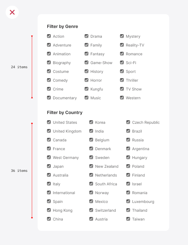
As an example, here are a couple of filters. One has 24 items, and the other has 36. When displayed together, they occupy a lot of space, look overwhelming, and distract from the content. You shouldn’t display your filters like this.
A far better way to display filters is to use multiselect menus. Not only do they conserve screen space, but they allow you to group and display multiple filters without overwhelming users.
Subscribe to read the full article
Learn more about how multiselect menus work and the benefits of using them by subscribing to the UX Movement newsletter. For just $9/mo, you’ll get unlimited access to our entire archive of premium articles.
Book

Affiliate
