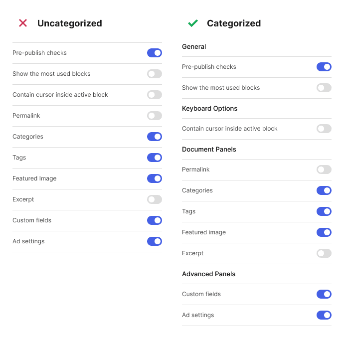
One of the most complicated screens to design is the settings screen. It’s hard to figure out the optimal page layout to use when you’re working with so many settings.
You should aim to design an experience that allows users to find the setting they want as fast as possible with the least amount of effort. Achieving this means organizing them into categories, making the headings, and optimizing the navigation for desktop and mobile.
Organize into Categories
Listing all your settings on one page without categories will overwhelm users. It requires them to read each setting label line by line to find the one they want.
Instead, you should organize your settings into categories so users can scan them group by group. Use headings and line dividers to differentiate between each category.

Make Headings Scannable
Using category headings is a start, but you still have to enhance them to make them scannable. To do this, increase the font size, bold the text, and add extra spacing to your headings.
Don’t shy away from using large text because it’s the key to making your settings easy to scan. For instance, if your settings labels are a 16px font, make your headings at least four font sizes larger. A 22px font for headings is ideal in this case.

Subscribe to read the full article
Subscribe to learn which navigation layout is optimal for mobile and desktop screens. You’ll also learn what to do if you have too many or only a few settings to manage.

