Did you know that your website navigation can affect your conversion rate? Several studies have found that minimizing navigation on sign up pages increases conversion rates.
One explanation for this is that less navigation means fewer distractions when users sign up. Visible text links can tempt users to click away from the page. Minimizing your navigation focuses the user’s attention on completing the form.
Instead of minimizing, you could remove the navigation, but that would harm the user experience. Users may need the navigation to refer to other pages for more information. If they feel like you’re forcing them to sign up, they’ll feel uncomfortable and change their minds.
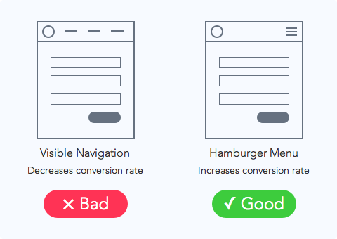
The way to maintain a high conversion rate and user experience is to replace your navigation with a hamburger menu. The icon doesn’t distract users from their task, and still gives them the freedom to go back to other pages. Text links draw a lot of attention, but when they’re inside the hamburger menu, users will only use them when they want to.
When users land on your sign up page they shouldn’t feel trapped or overwhelmed. A hamburger menu can give your sign up page a higher conversion rate without sacrificing user experience. The hamburger menu is more than a design trend. It’s a user interface technique to minimize navigation where you need it the most.
Book

Affiliate

“Minimizing your navigation focuses the user’s attention on completing the form.”
True.
“…you could remove the navigation, but that would harm the user experience. Users may need the navigation to refer to other pages for more information.”
Maybe. After the user’s made a conscious decision to sign up, it doesn’t seem likely that they would need to refer to information on the rest of the site. I would argue that as long as the user knows how to get back to the navigation, then it is fine to remove it completely.
“The way to maintain a high conversion rate and user experience is to replace your navigation with a hamburger menu.”
It’s a possible design that does minimize noise on the page, but I wouldn’t say it is THE way. Also, many users don’t recognize the hamburger icon as a menu icon.
It would all depend on your user base and how exposed to the “hamburger icon” they are for its use as a menu button.
I remember seeing the split test on exisweb and have seen a few more, but their hasn’t really been a definitive yes its better, most cases proved the opposite.
I think like Andrew is saying, its not always black and white.
We’re forgetting one tiny, but very significant thing here: context.
It’s not so much the “hamburger menu” that’s key, but that information is being temporarily hidden until actually needed.
The icon could resemble anything: a house, a hamburger, a flying unicorn — if that is what your users associate with “menu” or “more information”.
Hiding all distractions / the navigation behind a single icon is the important point to take home.
It seems that it could be true in this context, but from what I can gather, you’re basically testing a dropdown menu vs links. And based on that I don’t think you can argue that the hamburger icon is better, it is the type of menu that is better. You should really test having the hamburger icon vs the label menu
Exactly right. The hamburger icon vs. the word “menu” should be tested.
People, no matter how exposed to things they are, tend to forget or glaze over things. When that happens, some hand holding might help.
I would like to see research on how it actually increases conversions. I’ve been seeing more information and research on how the hamburger menu negatively affect conversions as this makes more sense esp since it’s not obvious what the icon is for: http://exisweb.net/mobile-menu-abtest
A Tabbed menu across the bottom and trying to simplify your menu is the best option. If you do have a more complex menu, then just add a “More” tab that will display more links if necessary.
That study refers to conversions as the # of users who CLICKED/TAPPED the button. This article is referring to conversions as the # of users who complete a SIGN UP FORM. These are two different types of conversion rates.
If you’re saying that a hamburger menu gets less clicks than a visible navigation, then you are correct. But that’s NOT the premise of this article at all.
Yes, you are right. The point is that I would consider using a different technique to increase your sign up conversions and avoid using the hamburger menu, which is recently showing to be a potential conversion “decreaser” for other reasons.
What on earth are you doing with a menu on a landing page anyway? Marketing 101, the only friggin link on such page needs to be your Call-to-Action and your 100% effort goes to making sure you convey everythign the visitor needs to know that he clicks it.
The problem with a hamburger menu is that instead of minimizing an interface, you’re actually hiding it completely, which removes visual context. The linked article calls out Facebook and Twitter as two companies using a hybrid approach.
You have also determined that two studies about reducing distractions on landing pages universally apply to primary website navigation. Plainly stated, that is a logical fallacy. You can’t take studies on landing page conversion rates, which focus on the reduction of clutter around a single call to action, and apply them to global navigation. Research just doesn’t work like that. You’ve applied inductive logic to a faulty premise so that 1+1 = fish.
IF we are talking about a single landing page with a single call to action, then the entire navigation section is a distraction. Therefore, ti should be removed. Turning it into a hamburger is only half a step in the right direction.
Converting your entire primary navigation to a hamburger at full resolution, however, would conflict with a user’s expectations and deny them of a context for interacting with your content.
I prefer Hamburger menu for the landing pages I create and I think it is good for mobile responsive designs and mobile apps only. Designers and people like us are aware of Hamburger menu but most of the people don’t understand the hamburger icon as an indicator of a menu, recently I came across with a client, he was asking me where is the navigation as I created a hamburger menu instead of full text menu, so I prefer adding “Menu” as text label at the bottom of a hamburger menu icon.
Surely this is increasing the conversion rate at the expense of user experience?
I suspect this works because fewer people are aware that the menu exists. Nothing wrong with that if conversion is your goal, but it does cast further doubts over whether a hamburger menu is a good idea in general.
Hamburger menu is good for landing pages of websites. It works well in responsive web design. Minimizing any forms generally tend to encourage users to complete them as it is less hassle and does not consume much time compared to a whole form with lots if info to be filled.