Users rely on navigation bars to find information they need. If your navigation button labels and states aren’t clear, they’ll have trouble navigating.
Below are 5 most common mistakes designers make on navigation bar buttons. If you’re making these mistakes, it’s time to fix your navigation bar by giving it more clarity.
1. Not Highlighting the Selected Button
Many designers fail to highlight the selected button on their navigation bar. When users click on a button, they need visual feedback on what they selected.
Without it, they won’t know where they are in their task flow. They could mistake the page they’re on for another similar looking page.
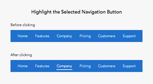
Use both shape and color contrast to highlight the selected button. Using color only may make it hard for colorblind users to distinguish it.
The standard way to highlight with shape is to place a strong underline under the label. You could also place an outline around the label. But make sure it doesn’t compete with any call to action buttons in the bar.
The button label should also appear as the main page heading. But highlighting it in the navigation bar makes it extra clear to prevent any confusion.
2. Low Color Contrast on Selected Button
Many sites use low color contrast to distinguish the selected button. This is a mistake because it slows users down from recognizing where they are in the site hierarchy.
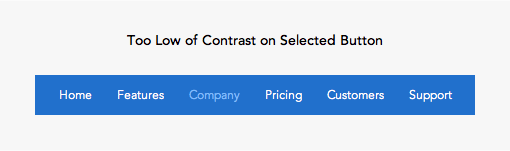
The low color contrast makes the button label hard to read. This forces the user to have to recall what they clicked. It’s much faster if users can recognize the selected button through a visual cue.
The selected button should have the highest color contrast of all the buttons. This allows users to recognize the active button at a quick glance.
Use a contrast checker to get the contrast ratio between the button label and background.
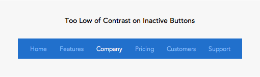
3. Low Color Contrast on Inactive Buttons
The color contrast of inactive buttons should have lower contrast than the selected. But not so low that the labels are hard to read. Too low of contrast can make users miss buttons and think they are disabled.
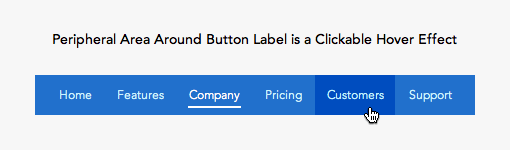
4. Not Making Area Around Label Clickable
Navigation bar buttons have whitespace around it that separates it from other buttons. You should make each button’s peripheral whitespace a clickable area. This will give the buttons a larger click target so that users can navigate faster.
5. No Hover and Focus Effect on Buttons
Putting a hover effect on your navigation buttons makes them easier to click. This lets users know when their mouse cursor is in a clickable area. Without a hover effect, users will assume their cursor always needs to hit the text label to activate the button. This makes the hit target smaller which requires more precision from the user.
Not every user uses a mouse. Screen reader users who use a keyboard to navigate need a focus effect when they tab between options. The focus effect is a good accessibility practice for all types of clickable elements.
Visual Cues on the Navigation Bar
The navigation bar is often the first thing the user clicks to navigate a site. Users need visual cues when they click a button so that they know where they are and where they can go.
Make your buttons intuitive by avoiding these common mistakes. Neglecting the visual cues on your navigation bar can affect user engagement. Without clear visual cues, users are navigating in the dark.
Book

Affiliate

You might want to add “focus effect” along with hover, since they have almost the same functionality.
I usually use the same CSS rule on both.
Definitely agree with adding :focus to the :hover effect. It’s a really easy way to make your website more accessible for users who navigate using their keyboard.
The main mistake with main menus is not inverting its colors, i. e. not using light text on dark background. Current design trend — using dark text on white background — is absolutely wrong.
Sorry, I didn’t get it, can you explain better? You mean by color white on pure black?
Isn’t the convention that buttons should not be used for navigation but should be used for action (ie – submitting a response to something)