Many designers believe that you should always label your icons, so users know what they mean. This advice seems sensible, but it isn’t always optimal. There are cases when it’s better not to label them and allow users to learn what those icons mean. After they understand them, they’ll be able to use the interface faster than before.
A research study discovered that users searched significantly faster when items used icons instead of text labels. The reason this is possible is that icon recognition results in a quicker visual search than label reading. The difference in search time increases when the number of items on the screen increases.
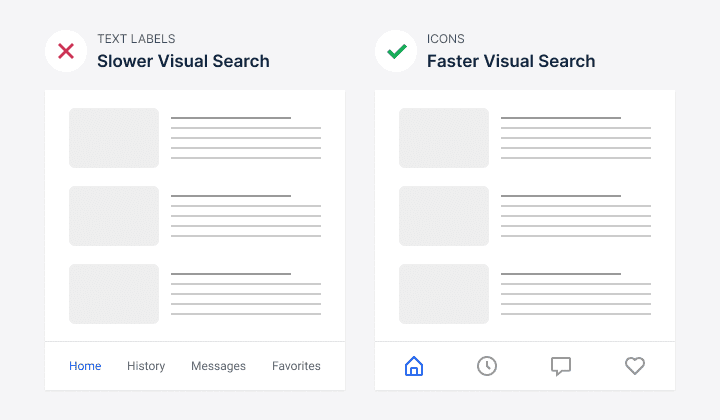
The reaction time for a set of fifteen items was twice as great in text search than in icon search. More labels together mean users have to read and process so many characters. With icons only, they can find their target item simply through visual recognition. Visual recognition occurs at a glance, while reading requires more cognitive processing.
However, visual recognition is useless if users don’t know what the icons mean. They first need to learn the icon language before they can benefit from visual recognition speed. Therefore, there’s an initial learning curve when using an icons-only approach. But after getting past the learning curve, the user’s search speed becomes faster and more intuitive.
Subscribe to read the full article
Subscribe now to learn how icons with labels affect the user experience. You’ll also learn the best approach to help users remember the meaning of your icons. For just $9/mo, you’ll get exclusive access to all our premium articles.
Book

Affiliate

This article misrepresents the results of the 2002 study. It specifically focuses on small screen sizes which, in 2002 was what… between 100×100 and 200x200px? This is the key point though “Visual search is significantly faster on small display when icons rather than text are used as targets and distractors. ”
The study tested Text OR Icons not Text AND Icons. It does not at any point suggest that Text + Icon is a bad thing.
That’s not to say you can’t use common icons in your interface (e.g. Magnifying Glass for search), but I haven’t seen a study to suggest that labeling that icon is detrimental to understanding the icon.
Study did focus on mobile screen sizes but the finding can apply to larger screens too. It’s just that it’s significantly faster on mobile.
It doesn’t suggest text + icon is a bad thing, but it suggests that text reading results in a slower visual search. When you display text, you trigger the cognitive process for reading. Also, I address the difference with text + icon in the full article. Did your read it?
Not everything is dictated through research. The research here is just to show how users perceive interfaces differently with icons.
In my brief research I see that most common mobile apps from Google or Microsoft are using both icons and labels, while Facebook and Instagram are using just icons. There are some other major apps that are using just icons, but it seems that bigger companies are going on the safe side.
The smartest thing to do is allow the customer to choose what they want for the interface, because we’re all solving for different issues. The image above shows text without any indicator that it’s a link, which is key to understanding purpose. It’s not that the words are a problem, it’s that words alone mean the customer has to both read and guess that it’s a button. Blue links are not sufficient either – color alone is a problem for people who are colorblind.
The end user usually wont go through setup or even know you’ve created excessive customization options. They also often don’t know what they want and if you serve up icon-only for a site with a hundred icons, you are guaranteed to run into learnability issues.