There are times to use toggle switches and times not to. When designers misuse them, it leads to confused and frustrated users. Knowing when to use them requires understanding the different types of toggle states and options.
Contextual States Vs. System States
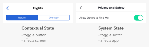
It’s easy for designers to confuse toggle switches and toggle buttons because they both manage states, but there’s a fundamental difference. Toggle switches are for system states, and toggle buttons are for contextual ones. A contextual state only affects the current screen in focus, while a system state takes effect everywhere on the app.
Many apps misuse toggle switches by using them for contextual states. For example, a common mistake is to use switches for search filters. The filters only apply to the context of search, not to the entire system. Therefore, the proper selection controls to use are checkboxes, not switches.
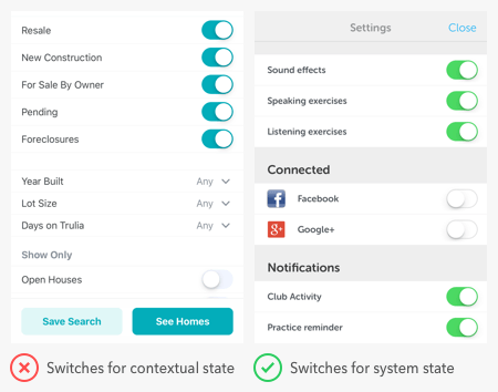
Users expect switches to render an immediate effect when they toggle it on. However, the search filter settings don’t take effect until after users press the “save” button. If there’s a delayed effect due to a separate button, switches are the wrong controls to use. A switch itself is a “button” that activates state. A separate button for the switch isn’t necessary.
It’s typical to find switches in a settings screen of an app because that’s where users go to manage system states. But you can also use them for modes that affect the app. The example below shows switches for privacy mode and dark mode.

Binary Options Vs. Opposing Options
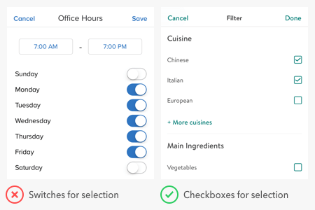
Switches are for binary options, not opposing options. A binary option represents a single state that is either on or off — or in other words, true or false. Opposing options are two separate states that are opposite but related to different user tasks.
Some apps make the mistake of using switches for opposing options. They place the option labels on opposite sides of the switch and use the direction of the thumb to indicate the state. This practice is a misuse of switches that confuses users because the visual cue isn’t clear. Not only that, but the switch has two different states without an off state as they would expect.
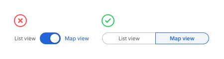
When you have opposing options, toggle buttons are the right control to use. In the example, “list view” and “map view” are the opposing options for users to toggle. A toggle button in this context works better than a switch because it groups the options and allows users to view them side-by-side. They’re also able to select each option directly and get clear visual feedback.
States Vs. Actions
Switches are for states and buttons are for actions. You should never use a switch in place of a button, or you’ll throw users off. When they see a call to action, they expect to interact with a button, not a switch.

The example shows an app using a toggle switch as a download button. This approach is a misuse of switches because downloading is a one-time action, not a persistent state. Turning the switch on downloads the content but ends after that. Turning the switch off doesn’t undownload it, which can mislead users.
Three Conditions for Using Switches
Next time you’re considering a toggle switch on your app, check if the situation meets these three conditions. If it does, you’ll know for sure that a toggle switch is the correct control to use.
Use a toggle switch if you are:
1. Applying a system state, not a contextual one
2. Presenting binary options, not opposing ones
3. Activating a state, not performing an action
Book

Affiliate

While I agree with your point that checkboxes should be used for selection, I believe checkboxes are not available in iOS (if I’m wrong, please point me in the correct direction). How does one design for selection within iOS in the scenario presented in toggle switch selection?
iOS uses rounded checkboxes. Think of the Mail app – when you select “Edit” (upper right hand corner on the list page of emails) rounded checkboxes appear beside each email. Then you multi-select the emails you need to perform some bulk action on (Delete, Flag, etc).
iOS doesn’t have check boxes but it would be easy to implement something suitable using SF Symbols. I just ran the app and there are circle and square images with checkmarks in them and the corresponding forms without.
Interesting article, however this only illustrates simple forms. What about forms where you want activated options to unroll a group of of sub-parameters which be both input fields and on/off options?
Great article!!! Very informative regarding the difference between actions and states that affect the app or the screen.
Interesting and informative article.
I absolutely agree to use controls in the way they are intended to be used. Still I am not convinced that users know and use controls intentionally on intuition (Contextual States Vs. System States).
In my observation another difference between checkboxes and toggles is that an toggle change results in instant action, e.g. something is happening right after the trigger, like a light switch in real life, too. Whereas a checkbox needs a confirming button so that the changes take effect.
Hi Anthony,
I have started following your article. Every day, I am learning new in UX design. Thank you so much for sharing your treasure on knowledge.
Thanks,
Sanju
The difference between “Binary Options Vs. Opposing Options” as you say is very subtle and often dependent upon framing – i.e. the label you use against the control.
For example, you indicate that a switch is the right control to use to enable dark mode, and this makes sense if you believe that the opposite of dark mode is the absence of dark mode, rather than the presence of light mode, and that light mode is not an actual thing, but merely the absence of dark mode. If you hold that light mode is the natural order of the universe, and dark mode is a departure from the norm, then a switch makes sense. If, however you, consider that light mode and dark mode are equally valid options and are to be put on equal footing, then you would go for a toggle button. Of course we may be have been primed to believe the former because UI’s have mostly used light mode without even the option for dark mode historically, but the binaryness/opposiness is not a natural attribute of the 2 options, merely a cultural one.
In the list view / map view example, you could opt for a switch if you consider one or the other to be the default.
Or is the point you are making merely that you think there shouldn’t be 2 labels either side of a switch? Personally, I do not think this would confuse users.
Excellent article but I disagree in the example from Headspace (States Vs. Actions). In that scenario, the toggle button will download all audios and KEEP them in the device. It is not possible to get the audios like a normal download would, outside the app. So that makes the action a system, permanent one. If I disable the toggle, it will remove all the downloads. So the system states are: user can listen offline, user can’t listen offline. Spotify also does that for downloading your musics offline and I agree the way it was made, because it affects the entire use of the app.
Your explanation is still very accurate and true, but you picked a wrong example, I think.
You’re right in advising an app’s UI should be consistent and should present all elements of one type in one way, but you’re wrong when preaching which should be which. That’s an arbitrary choice and can as well be chosen the other way around, as long as, technically, both choices can perform the required function.
An app should be entirely free to chose its own internal design conventions and, as long as they’re consistent, they’re not doing it wrong.
Design is a process of continually challenging conventions and trying to find better answers to both new and old problems. Without this challenge, there is no progress.
Without it, we would still be painting the same shapes on the same cave walls, not daring to think it can be done differently.
FYI- I am a consumer, not a site designer. I read the privacy disclosures before I continue on a site. When I encounter a list of options with a slider toggle that does not indicate which way is “on” and which way is “off,” I leave the site or unsubscribe, even though I would prefer to stay on the mailing list or shopping site. The options should be labeled.
Labeling a toggle state can be confusing, if the toggle doesn’t have enough contrast or the user has difficulties with a chosen color, reading “off” next to a toggle could mean “this toggle is turned off” or “click here to turn it off” there” .
Hi Anthony
A switch derives from real world light switch devices. If something is really expected from them -by analogy- is to produce significant contextual changes upon its use.
Also using it for opposing options is something that fits naturally into users’ mental models. To switch literally means to change between different states. I’m afraid you also got this wrong.
We can come up with our own elaborate representations and constructs, but what’s really important in UX is if our designs (and their parts) can easily conform into the common user mental model. In other words, if the user will get it.
I agree w/everything but the Binary Options Vs. Opposing Options thing. You got it wrong.