When building a mobile app, there comes a time when you have to decide whether to use solid or outline icons. Which style is better for user experience?
Some think the difference between them is just a matter of preference, but research shows there’s more to it than that–one style has a faster recognition rate than the other.
Knowing when to use solid or outline icons will make it easy for your users to navigate your mobile app. They’ll be able to recognize your icons faster and select the right options.
A research study, “Filled-in vs. Outline Icons: The Impact of Icon Style on Usability,” discovered that icon style affects task performance. Task performance was measured by the speed and accuracy of recognizing and selecting icons.
Solid icons were generally faster to recognize than outline icons, but with a few exceptions. And some icons showed no difference in task time. This has to do with characteristic cues.
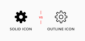
Characteristic Cues
Characteristic cues are what users use to identify icons. If characteristic cues are absent or hard to notice, the icon becomes unidentifiable.
![]()
For example, the tail of a comment bubble icon is its characteristic cue. Without it, it’s simply a circle. The keyhole on a lock icon is its characteristic cue. Without it, it’s easy to mistake the icon for a bag. The teeth on a cog icon is its characteristic cue. Without it, it looks like a doughnut.
The lock icon used in the study had no keyhole and was the most misidentified icon with over a quarter of all failures. The keyhole is a necessary characteristic cue because without it the icon looks like a bag, purse, or even a pot.
These characteristic cues are what users rely on for icon recognition. When using icons, make sure it includes all the characteristic cues users need to identify them. If an icon could look like a different object, consider adding extra characteristic cues to it.
When Outline Icons Are Faster
In addition to including characteristic cues, the cues must be salient or easy to notice. Sometimes the characteristic cues on certain icons are more salient in an outline style than solid style.
![]()
The study found three icons that were faster to recognize in outline style–comment bubble, trash can, and key. These icons have subtle characteristic cues that appear on the outer edges of the shape. Because of this, an outline style makes those cues easier to notice.
The comment bubble tail is easy to miss as a solid, but more apparent as outlines. The trash can lid is hard to notice in solid style, but more visible in an outline one. The key teeth are subtle, but the jagged edges are more distinct in an outline style.
![]()
When an icon’s characteristics cues are subtle and appear on the edges of a shape, use an outline style. This makes the cues more salient which results in faster recognition.
When choosing icons, it’s best to stick to a consistent style. Instead of mixing solid and outline styles, try to choose a set of icons that have salient characteristic cues with sharper angles that point outward.
![]()
For example, if you compare the comment, trash can, and key icon to ones with more salient cues you can see the difference. The more salient cues jut out and are easier to notice.
When Solid Icons Are Faster
Most icons represent physical objects in the real world. These objects are in a solid form and appear as silhouettes. Viewing icons as outlines is not a realistic representation of what most are used to seeing. This is why solid icons are faster to recognize.
![]()
Despite this, users are still able to recognize outline icons. But it’ll take them longer to do so if the icon’s shape outlines are too close together.
The study found that the thumb, scissors, phone, and tools icon were faster to recognize in a solid style. This is because the outline style of these icons all have narrow inner spacing on their cues that create visual noise.
![]()
It’s best to use solid icons for objects that have a narrow inner spacing. The silhouette form offers a simpler shape, making the icons more identifiable.
When Style Makes No Difference
The study found icons that were easy to recognize in either style. For example, the star, shopping cart, and flag icon all had similar recognition times.
![]()
This means the outline style for these icons didn’t slow users down. The reason is due to the wide inner spacing they have that reduces visual noise. The more narrow the inner spacing is, the more noise it creates, which interferes with recognition.
Icon Style for Button Selection
It’s common practice to use a solid icon to highlight the active button in a tab bar, while the other buttons remain in outline form. But this design practice is backward and should be the other way around.
![]()
Users need more recognition speed on options they haven’t discovered yet, not on the one they have already selected it. A solid icon for the active button isn’t necessary. It’s more important for the inactive buttons to get solid icons.
Use an outline icon to highlight the active button, not a solid icon. It offers a clearer change in style and color that reinforces the selected button.
Iconoclastic Guidelines
If task speed is important to your users, the icon recognition rate must be considered. And if you want a faster recognition rate, solid style icons are better. But there’s an exception to this rule that you should keep in mind. Knowing the exception to the rule allows you to make use of outline styles when the situation fits.
In summary, here’s what you should keep in mind when using icon styles:
- Icons consist of characteristic cues that need to be identifiable and salient
- Solid icons are faster to recognize unless their cues are subtle and not salient enough
- Outline icons are more recognizable when they have wide inner spacing
- Use outline icons if the solid version has subtle characteristic cues on the edges
- Use solid icons if the outline version creates narrow inner spacing
Book

Affiliate

Hi Team,
Great information you have provided, but when we are working on any screen we can’t use both of them that shows inconsistency, we need to use one style whether it is filled or outline. Please guide on that situation.
Guidelines for a consistent and recognizable icon style:
If you go with solid icons, choose an icon set with salient cues.
If you go with outline icons, choose an icon set without narrow inner spacing.
This is such a great article on how the finer details in a design can make all the difference to the user experience. You can quickly snap together an interface design but unless you spend time on the details you can never expect to deliver experiences that truly delight. I particularly like the tip around icon style for button selection – use solid icons for inactive buttons and outline icons for active buttons.
Indeed, it’s the details that make the UI design work.
Glad you liked the last tip. I actually wasn’t sure if I should include that in the article, but decided to last minute.
Nice article.
I would use both in some main icons to start, then test with some people to ensure the best path to take.
Thanks for this article.
One of the reasons why I like to read those articles is to remember me “You’re not your users !”. Because in some articles I tell myself “I totally disagree with that study, from my point of view it’s not faster to recognize at all !” (i.e. at chapter : Icon Style for Button Selection).
It’s what make UX difficult (and also so interesting), there is no absolute answer for everyone, the best solution is to find who is your user, and ask them what they think. 🙂
Thanks for all your work and articles it makes me always think on how I could improve our designs.
Thanks for this article.
“Use an outline icon to highlight the active button, not a solid icon. It offers a clearer change in style and color that reinforces the selected button.”
But Instagram’s icons are exactly the opposite !!!
Hi Sara, let me answer instead of Anthony here.
In Anthony’s last advice he is talking about chosing between app sections from a set of menu items, identified by icons were solid icon identifies the selected section and outline icons identify all the rest.
Those Instagram icons you are talking about are not identifying app sections, they identify actions. When user taps ‘comment’ or ‘share’ button, they do not switch states like in Anthony’s example, but open the action screen instead, where you don’t see all the other icons anymore — so there is no such task to visually separate one from another.
The only exception is the heart icon. And it’s style change also does not reflect a switch between sections, but a switch between the states of the button itself. In this case, showing an empty state (unliked/unfaved) with empty (outline) icon and filled state (liked/faved) with filled (solid) icon makes way more sense than otherwise. Two other icons just reflect the heart’s default style (which is outline)
Very useful and good detailed insights, thank you!
One thing that comes to mind: how about the context of icons? Example: On my Windows 10 taskbar I have logo’s of the different apps that are pinned or open, and to the right I have some icons that represent things like volume, network etc.
Windows 10 uses outline icons everywhere, and in this situation I find that a particularly smart choice. If they were solid icons they would have been visually closer to the app logo’s. While that distinction is very important.
This difference was even more important on the old Windows 10 Mobile, where app logo’s on the start screen were monochrome.
Great post! I really appreciate it. Could I translate it into Chinese and share with my friends? I will indicate the original source and the author information of this article.
The idea that the undiscovered icons should be given the solid icons means that the solid icons must have faster recognition. In the above case however, If the outline icons are more easily recognisable, Then shouldn’t the undiscovered icons be the outlined icons?