Tablet usage is exploding. One study estimates that “90 million Americans will use a tablet device in 2014″[1]. With this statistic, understanding how to design tablet interfaces is more important than ever. New research reports that users use tablet interfaces differently from desktop ones.
When using a desktop interface, users have an instinctual preference to vertically scroll. However, when using a tablet interface, users have an instinctual preference to horizontally swipe. Users use desktop and tablet interfaces differently, so you should design them differently too.
Horizontal Swiping Instinct
Eye tracking research shows that users “have an overwhelming instinct to swipe horizontally through a full screen photo gallery” [2]. This has design implications for interfaces with image-heavy content. The research further found that “participants who were given an iPad in landscape orientation swiped horizontally 93% of the time.
In portrait, they swiped horizontally 82% of the time. This is statistically significant evidence for a horizontal inclination and that the swipe direction isn’t just a random behavior.” [2]. Regardless of portrait or landscape orientation, most users instinctually prefer to swipe image-heavy interfaces horizontally.
Three Different Layouts Tested
In their research, they tested three tablet prototypes with different content layouts that each contained a combination of text and images. The first one was a traditional layout that’s most similar to what users regularly use on desktop interfaces. The layout places the content in columns which is ideal for vertical scrolling. Some story headlines were bigger than others, and some showed images while others did not. In an exit interview, only “35 percent preferred the traditional prototype” [3].

The second prototype they tested placed the content in rows. It was designed like a carousel, where horizontally swiping the page would show more content. The category headings were vertically aligned, and the story headlines were horizontally aligned. In the exit interview, a resounding “fifty percent of the readers preferred the carousel design.” [3]

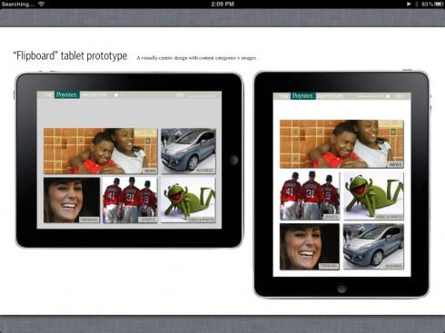
The third prototype they tested placed the content in tiles of various sizes, where images dominated the screen. Users could only see the category names first, and had to select a category before they could view the story headlines. In the exit interview, only “15 percent liked the flipboard.” [3]
Why Users Preferred the “Carousel” Layout
Out of the three prototypes, the “carousel” layout was the most friendly for horizontal swiping and the most efficient for finding a story. The user’s eyes didn’t have to work as hard to read the category headings or story headlines because they were vertically and horizontally aligned. This allows the user to scan down in one direction to find a category and scan across in another direction to find a story.
Users could horizontally swipe the page and continue scanning the same row of stories without breaking their gaze. Not only that but switching focus to another category requires little eye movement. As the user horizontally swipes, they’re able to maintain a consistent and efficient scanning pattern from page to page.

The traditional layout makes users work their eyes more because it doesn’t offer a clear, straight path for scanning categories and stories. Instead, the category headings and story headlines are scattered in different places on the page. Users have to move their eyes from column to column to scan the categories and stories.
There’s also a lot of variation in the text and image sizes that could easily cause the user’s eyes to unintentionally stray from what they’re focusing on to a more dominant element. The stories that have images will draw more attention than stories that don’t even if users aren’t particularly interested in it.

The “flipboard” layout was the most visual, but the large size of the images could cause users to look at content they’re not particularly interested in. Showing users just an image for each category makes it harder for them to choose one because they don’t understand the context behind the image.
The layout makes the user tap more than the other layouts because they have to choose a category before they can see any stories, and they have to tap all the way back to the category page when they want to view stories from a different category.
Designing a Horizontal Swipe Layout
Not all tablet interfaces work well with a horizontal swipe layout. But If your tablet interface is full of images, categories, and headlines, you should design it for horizontal swiping. Here are a few guidelines and examples to help you get started.
Organize your content in rows
The first challenge is to size and arrange your text and images to fit inside a content box. These boxes will become rows for each category. You can organize the text and images in a dynamic way so that your layout looks more appealing.
For example, in the first row, NPR places the headlines above the thumbnail images so that the headlines draw more attention. However, in the second and third rows, the larger images grab the user’s attention first.

Make your category headings stand out
Sometimes users only want to see content for a particular category. If your category headings aren’t distinct, it makes it harder for users to tell what type of story they’re looking at. MSN uses bold typography and vibrant colors to distinguish one categorical row from another.

Use partially visible content as a navigational cue
Users won’t know to horizontally swipe if you don’t give them a navigational cue. Let them know that there’s more to see by making the content partially visible on the edge of the page.

Avoid making multiple items on the page swipable
In a horizontal swipe layout, users expect that swiping the screen will turn the page. Don’t confuse users by putting multiple carousels on your page and making the page swipable. A research study found that “swipe ambiguity plagued users when multiple items on the same screen could be swiped. Carousels often caused this usability problem in apps that also relied on swiping to move between pages” [4].
Consider a split view for less back button hitting
Every time the user taps into a story they have to tap back to the category page to read another story. By giving users a split view of the category page and the story their reading, you make it easy for users to browse stories without needing to hit the back button each time.

Users Prefer Landscape Orientation
Based on the research, it’s clear that users prefer horizontal swiping on tablet interfaces. What’s also interesting is that “seventy percent said in the exit interview that they strongly prefer holding a tablet in horizontal or landscape orientation” [3]. This orientation is ideal for horizontal swiping because users have more width to see more content on a page.
With most users using their tablets in landscape orientation, it makes sense to design your interfaces for horizontal swiping. The use of tablets is rising, but understanding how users use them is just beginning.
References
[1] http://www.emarketer.com/Article/One-Three-Online-Consumers-Use-Tablet-by-2014/1008701
[4] http://www.nngroup.com/articles/ipad-usability-year-one/
Book

Affiliate

This article touches upon a really good point about scrolling. I only want to add that the users’ behavior is highly influenced by the type of tablet and the consistency with the platform interaction paradigms is important. For e.g. in iPad, you do have horizontal scrolling interactions but in some other tabs, it might not be used that abundantly.