To tap or not to tap — that is the question on the user’s mind when they see a call to action button.
The more buttons there are, the longer users take to decide. They have to examine each button to determine which one best meets their goal. Any uncertainty about the buttons could cause them to take no action or the wrong action.
You can prevent this by making the priority of each action intuitive. When users can see which button is important to their task, they’re able to take action right away. There are a few UX techniques you can use to make a big difference on the intuitiveness of your call to action buttons.

Order Buttons According to Scanning Pattern
A common mistake designers make is to place their main call to action first because they want users to notice it first. This is unnecessary because the button’s visual weight already makes it noticeable.
Not only that, but placing the main call to action first breaks the user’s natural scanning pattern. Users have to scan all the buttons and then reverse their scanning direction to go back to the main call to action.
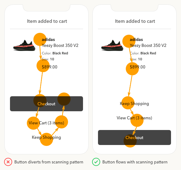
Instead of forcing users to re-scan buttons, place the main call to action last so users can get to it by scanning the buttons in a single top-to-bottom flow. This makes it efficient for them to examine each button before deciding. The bottom location is also the easiest for fingers to reach which further improves efficiency.
Distinguish Buttons from Text with an Outline
Another mistake made on apps is using text only to represent a button. Designers use text buttons to show which actions are lower priority. But this is a poor choice for call to actions because the text doesn’t have the appearance of a button. This can cause users to overlook those actions and only see the primary one.

Not only are text buttons harder to recognize, but they’re also smaller targets that are harder to tap. To make your low priority buttons easier to tap and recognize, place the text label inside a button outline without a solid color. Now, the buttons appear as buttons and don’t compete with the main call to action.
Add Color to Progressive Actions
The button with the highest priority is easiest to identify. It’s the action that leads users directly to their goal. If you’re unsure of your button priority, consider which action progresses users toward their goal and which action regresses them.
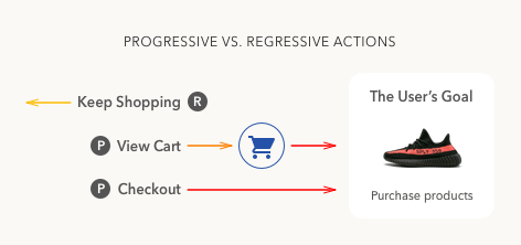
In the example, the “checkout” button has highest priority because it progresses users toward their goal the fastest. It should have the most visual weight and highest contrast. But it’s not clear which action has medium priority - ”view cart” or “keep shopping”.
The “view cart” action takes users to view the items they added to their cart, which then leads to checkout. The “keep shopping” action regresses users back to the product pages further away from the checkout.
Based on this analysis, “view cart” has a medium priority and “keep shopping” has a low priority. The “view cart” button deserves more visual weight and higher color contrast than the “keep shopping” button.
By understanding the user’s goal and examining how each action progresses users toward it, you’re able to establish button priority. Now, you’re ready to give each button the right amount of visual weight.

Color is an effective way to signify high priority buttons because it stands out from black text and grabs the user’s attention. Don’t use the same color on your buttons as your text. It weakens the button’s visual cue and makes it harder to notice.
Blue is the ideal color for call to actions because research shows it’s most preferred by all genders and age groups. It’s also the most common color used for page links, making it more familiar to users.
The research also found that users feel a sense of trust, security and reliability when they see blue. Users are more likely to tap buttons that evoke these feelings.

Also, don’t use the same exact color for two different buttons or users won’t know which one has a higher priority. And don’t use different colors for each one or you’ll confuse users and cause them to wonder what the colors mean. It would give each button the same visual weight and signal equal priority.
Instead, use a distinct color with the same hue for both buttons, but vary the saturation and brightness for the medium priority one. This makes the medium priority button lighter in visual weight than the high priority button. Now, both buttons aren’t competing and there’s a clear winner.
To enhance the contrast more, you can invert the display polarity. Use light text on a dark background for the primary button and dark on light for the secondary one. This gives the high priority action a brighter text label and the highest contrast possible.
Vary the Font Weight of Text Labels
Applying the current techniques is enough to distinguish priority, but there’s more you can do. The more intuitive you make each button the less the user has to think.

Using the same boldness on each text label puts the same amount of emphasis on them. It’s better to emphasize each text label differently based on priority. Vary the boldness of the text labels so that high priority buttons are the boldest and low priority buttons are the least bold. This way the weight of the text labels even indicate priority when users read them.
The example shows you how the “checkout” label is bolder and brighter than the rest. The “view cart” label is semibold and “keep shopping” label is medium. As a result, the text labels reflect the visual weight of each action. The text indicating “3 items” in the “view cart” label isn’t bolded because it is supplemental information that doesn’t represent the action taken.
Put an Icon on the High Priority Button
The last technique is the cherry on top that will make your buttons accessible to color blind users. Color blind users won’t be able to tell the difference between the visual weight of buttons. They need something more than color to serve as a visual cue.

Putting an icon on the high priority button adds the extra emphasis to set it apart. If you removed the button color and label, color blind users could still recognize the checkout button.
The icon strengthens the button’s cue and guarantees it’ll attract the most attention. Eye tracking research has shown that visual elements get more eye fixations than text.
Are Your Buttons Intuitive?
Your buttons aren’t intuitive if users are spending a long time on the action screen, or if you’re getting a low tap rate. If this is the case, use these techniques to sharpen the UX of your call to action buttons. You’ll see a difference in the before and after version that’ll blow you away.

Book

Affiliate

I’ve never thought of this before. Thanks for sharing!
We love your articles, Thank you so much for sharing this. 🙂
Thank you for this clear and practical article! Very helpful.
Thanks for this article, I had not really thought about the buttons being a different color than the text and adding in color progression. Good article.
Great article. I really like how you pin point and explain visual UX issues in common interfaces
Very nice article, please don’t stop 🙂
Great article! Love the thought of color and font weight.
1). For anyone maintaining a design library, having medium & semibold & Bold in a row of three cta’s (with the same size text) would cause more inconsistencies than actual value to a user distinguishing the very minimal weight changes (especially the progressive growth).
2). I’m sure you stacked the cta’s to create an example, but other ways of distinguishing hierarchy could be location and style. Having a shopping cart icon with a (3) in the top right toolbar (or action bar) could limit the cta’s at the bottom to just 2, (keep shopping & Checkout). This would keep consistency if the shopping cart lived in the toolbar everywhere else in the app or website (like most sites).
Awesome stuff. Thanks!
Cool~ Thank you for sharing your knowledge.
Nice post. Helpful 🙂
Author deemphasized a Focal Point by changing scanning flow in a first advice. Focal Point is a much much stronger cue than scanning pattern.
Thanks so much for putting this together its a real masterclass, this is a really tricky problem trying to accommodate regressive action buttons and your guide is really helpful.
I would suggest that the user’s primary goal is not always to purchase products.
In general >90% of users don’t complete the purchase.
People are searching, shopping, and just looking for ideas and inspiration most of the time.
That doesn’t contradict anything you’ve done, just something we should always be mindful of.
I think if we could add more soft actions such as ‘Like this product’, ‘Ask a question’ or ‘Save for later’ would be really helpful for people who are just browsing what’s on offer.
The soft actions in your last paragraph might belong on a product detail page. This article is focused on an ‘item added to cart’ popup.
Interesting article.
We user tested button placements at my company and users actually preferred the primary button to be on top in direct relation to the information above it. This wasn’t a shopping experience so maybe its different but it seems like theres an ongoing debate and conflicting articles about CTA placement.
Very interesting article. I would like to add some other point about the mobile buttons: make it sticky during the scroll so user can always access it.
Very interesting deepen of a subject that is very often took for granted because of an ingrained path.
But what’s the use of a “keep shopping” button in a listerpage? What’s happens when users click it?
I 90% agree with you; however, the top two buttons look disabled (especially the view cart button).
Which leads me to a post request! I’d love to see an article on disabled states on mobile.
Great and useful article, thank you!